You can use the combination of position: relative with position: absolute together with a pseudo element such as :before or :after, similar to the one I answered How to Make Tilt Button?
In this example I removed the pseudo element :after (we will only need one, in case the :before) will also need to exchange the border-top for border-bottom if you want the tilt to end at the top of the button.
If you want the slope on the side left (here you must adjust the border-bottom as per the height, or both should be the same size):
.botao {
  border: none; /*remove borda do elemento button*/
  color: #fff;
  position: relative;/*faz os elementos pseudos acompanharem o elemento com a classe*/
  display: inline-block;
  background-color: #CC0000;
  line-height: 20px; /*Centraliza o texto*/
  height: 20px;
  padding:0 10px;
  margin: 0 10px;
}

.botao:before {
  content: "";
  width: 0px;
  height: 0px;
  top: 0px;
  position: absolute;
  border-bottom: 20px solid transparent;
  border-right: 15px solid #CC0000;
  left: -15px;
}
<button class="botao">tag BUTTON</button>
<div class="botao">tag DIV</div>
If you want the slope on the side right, change right: for left: and border-right for border-left within the pseudo element (here you should adjust the border-top as per the height, or both should be the same size):
.botao {
  border: none; /*remove borda do elemento button*/
  color: #fff;
  position: relative;/*faz os elementos pseudos acompanharem o elemento com a classe*/
  display: inline-block;
  background-color: #CC0000;
  line-height: 20px; /*Centraliza o texto*/
  text-align: center;
  height: 20px;
  padding:0 10px;
  margin: 0 10px;
}

.botao:before {
  content: "";
  width: 0px;
  height: 0px;
  top: 0px;
  position: absolute;
  border-bottom: 20px solid transparent;
  border-left: 15px solid #CC0000;
  right: -15px;
}
<button class="botao">tag BUTTON</button>
<div class="botao">tag DIV</div>
Applying the effect very close to what you expect:
.botao {
  border: none; /*remove borda do elemento button*/
  color: #fff;
  font-size: 14pt;
  font-weight: bold;
  position: relative;/*faz os elementos pseudos acompanharem o elemento com a classe*/
  display: inline-block;
  background-color: #DC005E;
  line-height: 65px; /*Centraliza o texto*/
  text-align: center;
  height: 65px;
  margin-left: 20px;
  width: 260px;
}

.botao:before {
  content: "";
  width: 0px;
  height: 0px;
  top: 0px;
  position: absolute;
  border-bottom: 65px solid transparent;
  border-right: 20px solid #DC005E;
  left: -20px;
}
<button class="botao">tag BUTTON</button>
<div class="botao">tag DIV</div>
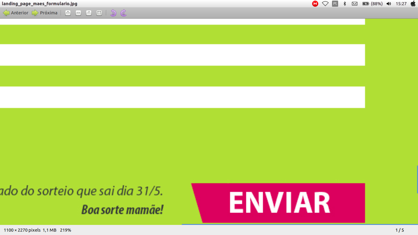
I tried it once with the trapeze, but it works with edges so I couldn’t write inside...
– Raylan Soares
give a look at this link http://stackoverflow.com/a/27720597/5650313
– Raylan Soares