Minimum height of screen size, with materialize?

Asked

Viewed 1,646 times

0

I’m trying to make a screen of login simple in the MaterializeCSS, In it I have a logo, a panel with the login form and the footer, as it is little content, on some screens the page ends and below is a blank content. As in the image:

tela de login

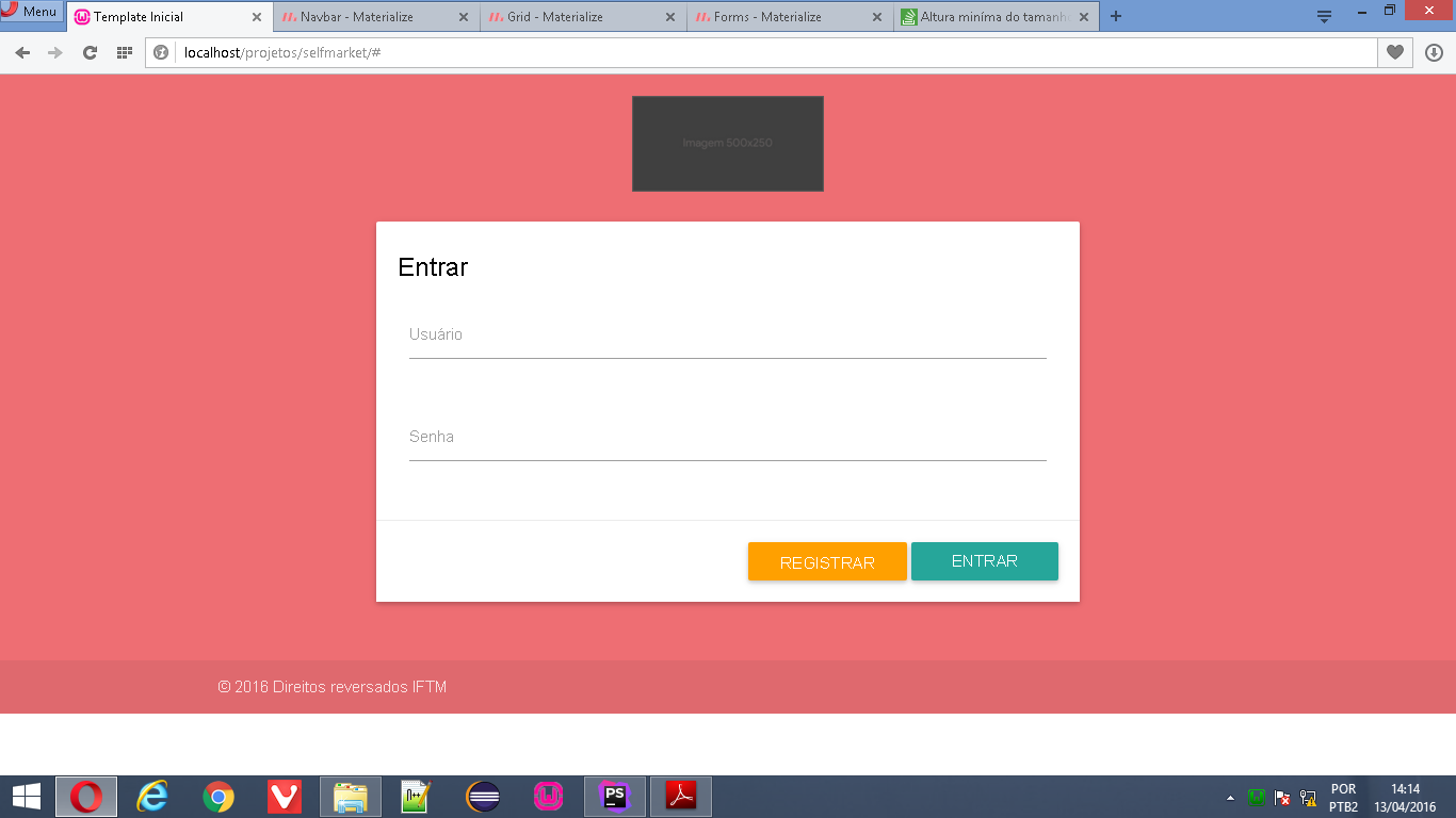
Notice after the footer, the page is white. I want to know how I extend my body (the light salmon color) so the page is always at the height of the monitor or larger, and never have that white space..

Follow the code of the page:

<?php
/**
 * Created by PhpStorm.
 * User: Leonardo Vilarinho
 * Date: 13/04/2016
 * Time: 13:07
 */
?>
<!doctype html>
<html lang="pt">
<head>
    <meta charset="UTF-8">
    <title>Template Inicial</title>
    <link rel="stylesheet" href="css/materialize.min.css">
</head>

<body>
    <div class="materialize-red lighten-2">
        <div class="row">
    </div>
        <div class="row">
            <div class="col s12 m12 ">
                <img src="img/img-l.jpg" width="180"  class="responsive-img materialboxed center-block" alt="Logomarca">
            </div>
        </div>
        <div class="row">
            <div class="col s12 m12 l6 offset-l3">
                <form>
                    <div class="card white darken-1">
                        <div class="card-content black-text">
                            <span class="card-title">Entrar</span>
                            <div class="row">
                                <div class="input-field col s12">
                                    <input id="username" type="text" class="validate">
                                    <label for="username">Usuário</label>
                                </div>
                            </div>
                            <div class="row">
                                <div class="input-field col s12">
                                    <input id="password" type="password" class="validate">
                                    <label for="password">Senha</label>
                                </div>
                            </div>
                        </div>
                        <div class="card-action right-align">
                            <button class="waves-effect waves-light btn amber darken-2"><i class="material-icons "></i>Registrar</button>
                            <button class="waves-effect waves-red btn"><i class="material-icons left"></i>Entrar</button>
                        </div>
                    </div>
                </form>
            </div>
        </div>
        <footer class="page-footer">
            <div class="footer-copyright">
                <div class="container">
                    &copy; 2016 Direitos reversados IFTM
                </div>
            </div>
        </footer>
    </div>
    <script src="js/jquery.min.js"></script>
    <script src="js/materialize.min.js"></script>
</body>

</html>

Q.S.: I have always worked with Bootstrap, I migrated today to Materializecss because of the most modern design.

2 answers

1


You need to make a "Sticky footer". There are several ways to do this.

For example, you can set a footer height and decrease that height from the previous section.

<body>
  <div class="page-wrap">      
    .
    .
    .          
  </div>
  <footer class="page-footer">
      <div class="footer-copyright">
          <div class="container">
              &copy; 2016 Direitos reversados IFTM
          </div>
      </div>
  </footer>
</body>

CSS code:

* {
  margin: 0;
}
html, body {
  height: 100%;
}
.page-wrap {
  min-height: 100%;
  margin-bottom: -20px; /* Altura do footer */
}
.page-wrap:after {
  content: "";
  display: block;
}
.page-footer, .page-wrap:after {
  height: 20px; 
}
.page-footer {
  background: orange;
}

0

Divide your html page with tags main and footer.
Sort of like this:

<body>
   <main> ...seu conteudo </main>
   <footer> ...seu rodape </footer>
</body>

then add this style into your css:

body { display: flex; min-height: 100vh; flex-direction: column; }

main { flex: 1 0 auto; }

So your baseboard(footer) will always stay at the bottom of the screen and when the contents get on it it descends alone.
Source: http://materializecss.com/footer.html (at the end of the page).

Browser other questions tagged

You are not signed in. Login or sign up in order to post.