There are elements block and inline, when using display: inline-block you create a block that sits on a line, so "text" effects like spacing and alignments will affect Divs.
Being "inline" you can apply the vertical-align thus:
.content-all{
height: 100%;
width: 100%;
background-color: yellow;
}
.content-descriptions{
height:120px;
width: 1020px;
background-color: green;
}
.content-descriptions-left {
display: inline-block;
width: 500px;
margin: 20px;
height: 80px;
font-size: 14px;
background-color:red;
vertical-align: top;
}
.content-descriptions-right {
display: inline-block;
width: 400px;
margin: 20px;
height: 80px;
font-size: 14px;
background-color: blue;
}
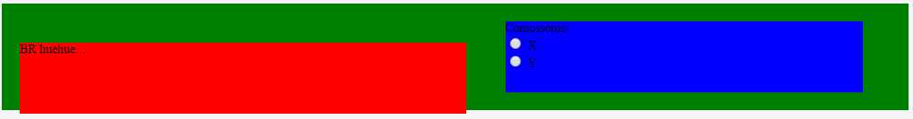
<div class="content-all">

    <div class="content-descriptions">

        <div class="content-descriptions-left">
            BR huehue...
            <br/>
            <br/>
        </div>

        <div class="content-descriptions-right">
            Comossomo:<br/>
            <input type="radio" value="0" name="opcoes" /> X<br/>
            <input type="radio" value="0" name="opcoes" /> Y
        </div>

    </div>

</div>
I noticed you used the fixed height height: 80px;, but if you need to do equal heights and increase as the content I recommend this reading:
The display: inline-block can give you some headache, because as I mentioned it is affected by text properties, you can use it to create columns, but if there is any CSS property for text like text-align the columns will be affected, in this case you can use the float and the clear: both (especially if you want the parent element to increase height according to the child elements), for example:
the pseudo :after in the "parent" element to apply the clear: both, for the elements float affect the "parent" element by being "floating" (not to be confused with position: absolute) and so the father no longer detects the height
.content-all{
height: 100%;
width: 100%;
background-color: yellow;
}
.content-descriptions {
width: 1020px;
background-color: green;
}
.content-descriptions:after {
content: "";
overflow: hidden;
clear: both;
height: 0;
display: block;
}
.content-descriptions-left, .content-descriptions-right {
margin: 20px;
height: 80px;
font-size: 14px;
}
.content-descriptions-left {
float: left;
width: 500px;
background-color:red;
}
.content-descriptions-right {
float: right;
width: 400px;
background-color: blue;
}
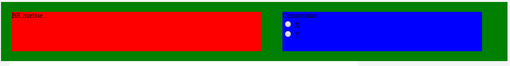
<div class="content-all">
    <div class="content-descriptions">
        <div class="content-descriptions-left">
            BR huehue...
            <br/>
            <br/>
        </div>

        <div class="content-descriptions-right">
            Comossomo:<br/>
            <input type="radio" value="0" name="opcoes" /> X<br/>
            <input type="radio" value="0" name="opcoes" /> Y
        </div>
    </div>
</div>
The float maintains the elements as block and different from inline-block CSS properties for text (such as text-align) will not affect them. The float works just to float (not to be confused with position: absolute), It is as if he were looking for spaces and trying to move based on the parent and siblings element. That is to say float: left it will try to move left until no longer find "space". At the moment it moves with float This affects the "close brothers" "dragging" them along.
When in the example I moved an element to left with float and another to right it’s as if they stay floating and stop having the break in as much space as there is, if the width of the parent is smaller than the floating elements these elements will break.
You can use the display: inline-block, but if you experience difficulties with CSS text properties that affect then maybe you can try the float.
notice that the red div is below the blue div, but I would like them to be the same height, preferably using the blue div as a reference.
– Jedaias Rodrigues
@Guilhermenascimento think this is it. Probably the best is to use padding on the top element.
– Bacco
I edited the question to be clearer, but the answers already solve well..
– Jedaias Rodrigues
@Guilhermenascimento actually wouldn’t even be baseline, it would probably be bottom. but the padding is better.
– Bacco
Really, that’s why I talked about padding. Then you treat everything as a block, and don’t dislodge. Treating block as text always has a side effect.
– Bacco
@Guilhermenascimento as it is a very specific problem, it would not help for much more information no. Even in the 1st version of it I had already given the +1. I think it’s explained well.
– Bacco
@Bacco worth it wasn’t even for the +1, it was more for the criticism of its "optics", like something left, missed or wrong, but it’s what you said even, not to mention for much more information, thank you =)
– Guilherme Nascimento