CSS solution
Your solution is good, but only for an odd number of columns:
box_parceiro:nth-child(odd)
If the number is odd, it will be a perfect checker, as the last of the first line will necessarily differ from the first of the next line.
Only with even numbers, it doesn’t work.
Anyway, has is a fairly simple solution for even columns. I demonstrated with four columns, but understanding the logic is easy.
If there are four alternating columns, the sequence of colors is this:
A B A B
B A B A
repeating next. That is, we have a cycle of 8 cells that repeats. In this cycle, we don’t need to specify the color of all cells, just put a standard color, and change another 4.
If our cycle is A B A B B A B A, we have the color B in positions 2, 4, 5 and 7. In this case, nth-child(Nn+I) can help us. Just change the N the size of the cycle, and the I by position:
li:nth-child(8n+2),
li:nth-child(8n+4),
li:nth-child(8n+5),
li:nth-child(8n+7) {
  ... cor ...
}
Javascript solution
If actually the amount of elements can vary when the user resizes the window, a possible solution would be to use a script.
I wrote one that alternates classes:
function quadriculado( id, cName ) {
    var c = document.getElementById( id );
    var toggle = 0;
    var line = 0;
    var lastY
    for( var i = 0; i < c.children.length; i++ ) {
        var y = c.children[i].getBoundingClientRect().top;
        var classes = c.children[i].className.replace( cName, '' );
        if( y !== lastY ) { lastY = y; line++; toggle = 0 } else { toggle = 1 - toggle };
        c.children[i].className = classes + ( toggle == line % 2 ? '' : ' ' + cName );
    }
}
The only care is to call the script in the event of resize also:
quadriculado( 'elemento', 'classe' );
window.addEventListener('resize',function(){quadriculado( 'elemento', 'classe' )} );
Another point to note is that, for simplicity, I used a basic substitution of string, then it is convenient to use a class name that is not contained in other classes of the internal elements.
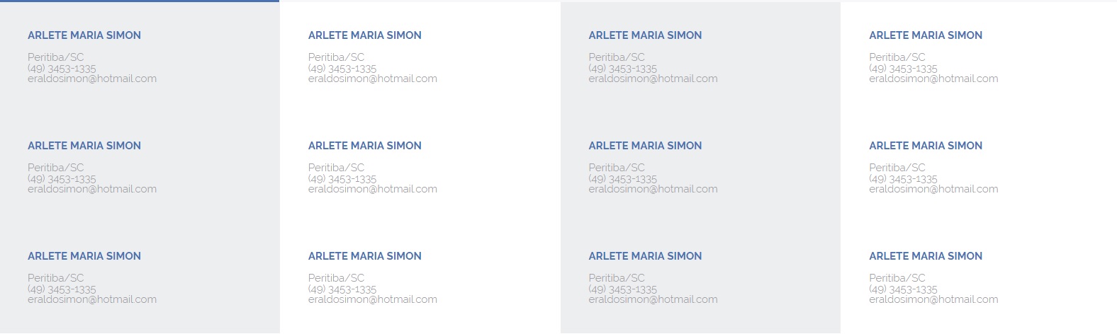
Demonstration of the two solutions:
Here, a demonstration of the CSS solution, suitable for fixed columns:
ul {
  position:relative;
  margin:0;
  padding:0;
}

li {
  width:25%;
  height:60px;
  display:block;
  float:left;
  list-style-type: none;
  margin:0;
  padding:0;
  background-color:#eee;
  box-sizing: border-box;
}

li:nth-child(8n+2),
li:nth-child(8n+4),
li:nth-child(8n+5),
li:nth-child(8n+7) {
  background-color:#ccc;
}
<ul>
  <li>1</li>
  <li>2</li>
  <li>3</li>
  <li>4</li>
  <li>5</li>
  <li>6</li>
  <li>7</li>
  <li>8</li>
  <li>9</li>
  <li>10</li>
</ul>
And here, the JS solution demonstration, suitable for variable column number during use.
To test, try using the "full page" mode and changing the window size. If you prefer, you can see directly on Codepen.
function quadriculado( id, cName ) {
	var c = document.getElementById( id );
	var toggle = 0;
	var line = 0;
	var lastY
	for( var i = 0; i < c.children.length; i++ ) {
		var y = c.children[i].getBoundingClientRect().top;
		var classes = c.children[i].className.replace( cName, '' );
		if( y !== lastY ) { lastY = y; line++; toggle = 0 } else { toggle = 1 - toggle };
		c.children[i].className = classes + ( toggle == line % 2 ? '' : ' ' + cName );
	}
}

quadriculado( 'q', 'x-odd' );
window.addEventListener('resize',function(){quadriculado( 'q', 'x-odd' )} );
.card {
  display:block;
  width:200px;
  height:60px;
  float:left;
  list-style-type:none;
  background-color:#eee;
}

.x-odd {
  background-color:#ddd;
}

ul {
  margin:0;
  padding:0;
}
<ul id="q">
	<li class="card">1</li>
	<li class="card">2</li>
	<li class="card">3</li>
	<li class="card">4</li>
	<li class="card">5</li>
	<li class="card">6</li>
	<li class="card">7</li>
	<li class="card">8</li>
	<li class="card">9</li>
	<li class="card">0</li>
</ul>

Post the code you’ve already made
– Gabriel Rodrigues