1
How do I exquisite one tooltip by hovering the mouse over the question mark ?
See the example in the figure below :
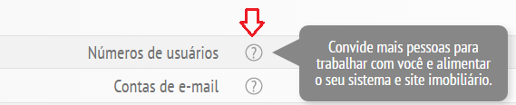
You can also view the example by clicking here.
1
How do I exquisite one tooltip by hovering the mouse over the question mark ?
See the example in the figure below :
You can also view the example by clicking here.
7
To show a "floating" widget in the mouseover:
.hm div {display:none;position:relative}
.hm:hover div {display:block;position:absolute;top:0;margin-left:40px}

/* daqui pra baixo é só estética para demonstração */
.hm {
  width:1.5em;height:1.5em;
  text-align:center;
  font:20px/1.5em "segoe ui",arial,helvetica,sans-serif;
  border:1px solid #999;
  border-radius:50%;
  color:#999;
}

.hm div {
  width:8em;
  color:#fff;
  background:#999;
  border-radius:5px;
  padding:5px;
}
<div class="hm">?<div>Batatinha quando nasce esparrama pelo chão.</div></div>The important thing is the first two lines of CSS.
To format the balloon as in the given example, here you already have the solution:
Just out of curiosity, I chose the phrase above because I like it exactly as it is. But if you have any error specifically from spelling, let me know.
spread
es parra.mar
(es+parra+(ra)ma+ar2) vtd 1 Disperse, spread, sprinkle. Vint and vpr 2 Disperse, spread
3
.wrapper {
  text-transform: uppercase;
  background: #ececec;
  color: #555;
  cursor: help;
  font-family: "Gill Sans", Impact, sans-serif;
  font-size: 20px;
  margin: 100px 75px 10px 75px;
  padding: 15px 20px;
  position: relative;
  text-align: center;
  width: 200px;
  -webkit-transform: translateZ(0); /* webkit flicker fix */
  -webkit-font-smoothing: antialiased; /* webkit text rendering fix */
}

.wrapper .tooltip {
  background: #1496bb;
  bottom: 100%;
  color: #fff;
  display: block;
  left: -25px;
  margin-bottom: 15px;
  opacity: 0;
  padding: 20px;
  pointer-events: none;
  position: absolute;
  width: 100%;
  -webkit-transform: translateY(10px);
     -moz-transform: translateY(10px);
      -ms-transform: translateY(10px);
       -o-transform: translateY(10px);
          transform: translateY(10px);
  -webkit-transition: all .25s ease-out;
     -moz-transition: all .25s ease-out;
      -ms-transition: all .25s ease-out;
       -o-transition: all .25s ease-out;
          transition: all .25s ease-out;
  -webkit-box-shadow: 2px 2px 6px rgba(0, 0, 0, 0.28);
     -moz-box-shadow: 2px 2px 6px rgba(0, 0, 0, 0.28);
      -ms-box-shadow: 2px 2px 6px rgba(0, 0, 0, 0.28);
       -o-box-shadow: 2px 2px 6px rgba(0, 0, 0, 0.28);
          box-shadow: 2px 2px 6px rgba(0, 0, 0, 0.28);
}

/* This bridges the gap so you can mouse into the tooltip without it disappearing */
.wrapper .tooltip:before {
  bottom: -20px;
  content: " ";
  display: block;
  height: 20px;
  left: 0;
  position: absolute;
  width: 100%;
}

/* CSS Triangles - see Trevor's post */
.wrapper .tooltip:after {
  border-left: solid transparent 10px;
  border-right: solid transparent 10px;
  border-top: solid #1496bb 10px;
  bottom: -10px;
  content: " ";
  height: 0;
  left: 50%;
  margin-left: -13px;
  position: absolute;
  width: 0;
}

.wrapper:hover .tooltip {
  opacity: 1;
  pointer-events: auto;
  -webkit-transform: translateY(0px);
     -moz-transform: translateY(0px);
      -ms-transform: translateY(0px);
       -o-transform: translateY(0px);
          transform: translateY(0px);
}

/* IE can just show/hide with no transition */
.lte8 .wrapper .tooltip {
  display: none;
}

.lte8 .wrapper:hover .tooltip {
  display: block;
}
<!-- normally this stuff would be on the html element -->
<!--[if lt IE 7]> <div class="ie ie6 lte9 lte8 lte7"> <![endif]-->
<!--[if IE 7]> <div class="ie ie7 lte9 lte8 lte7"> <![endif]-->
<!--[if IE 8]> <div class="ie ie8 lte9 lte8"> <![endif]-->
<!--[if IE 9]> <div class="ie ie9 lte9"> <![endif]-->
<!--[if gt IE 9]> <div> <![endif]-->
<!--[if !IE]><!--> <div> <!--<![endif]-->
<div class="wrapper">
I have a tooltip.
<div class="tooltip">I am a tooltip!</div>
</div>
</div>Original: http://jsfiddle.net/raving/87865bq7/
If you want something minimalist:
/* Tooltip container */
.tooltip {
    position: relative;
    display: inline-block;
    border-bottom: 1px dotted black; /* If you want dots under the hoverable text */
}

/* Tooltip text */
.tooltip .tooltiptext {
    visibility: hidden;
    width: 120px;
    background-color: black;
    color: #fff;
    text-align: center;
    padding: 5px 0;
    border-radius: 6px;

    /* Position the tooltip text - see examples below! */
    position: absolute;
    z-index: 1;
}

/* Show the tooltip text when you mouse over the tooltip container */
.tooltip:hover .tooltiptext {
    visibility: visible;
}
<div class="tooltip">Hover over me
<span class="tooltiptext">Tooltip text</span>
</div>Browser other questions tagged css
You are not signed in. Login or sign up in order to post.
Possible duplicate of It is possible to make a tooltip with pure CSS?
– Guilherme Nascimento
@Guilhermenascimento Hello, there is nothing duplicated, because I’m not asking how to make a TOOLTIP. The inquiry I do is another, read and understand the text.
– Gladison Neuza Perosini
I reversed the question because it completely changed the meaning of the original, and invalidated the existing answers. If.
– Bacco
After editing the meaning has totally changed, until then duplicates yes, there is no need to be aggressive arguing read "understand the text". I recommend you be understanding and if you disagree just comment "that’s not what I need, what I need is this ...". Ok? there was nothing in the original question about positioning. Thank you for understanding and recommend that you read the link be respectful =)
– Guilherme Nascimento