2
Could I give a different include for each resolution? Type...
if the resolution(width) is greater than 768 I want to display 2 columns(grid_6 and grid_6), opening the text on the side, ok.
but if it is a resolution less, I want to display only one column(grid_12) opening the text below each clicked element, and not at the end of everything as it occurs at the time.
How can I do that? Obs: each funnel element is a separate div with the image.
follows my code:
<script>
function funil(el){
$('#img_funil_1').css("-webkit-filter", "grayscale(70%)");
$('#img_funil_2').css("-webkit-filter", "grayscale(70%)");
$('#img_funil_3').css("-webkit-filter", "grayscale(70%)");
$('#img_funil_4').css("-webkit-filter", "grayscale(70%)");
$("#img_"+el.id).css("-webkit-filter", "grayscale(0%)");
$('#funil_1').hide();
$('#funil_2').hide();
$('#funil_3').hide();
$('#funil_4').hide();
$(el).fadeIn(500);
}
window.onload = function() {
funil(funil_1);
}
</script>
<div class="post-area grid_6">
<div class="posts-container funil">
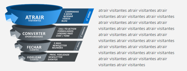
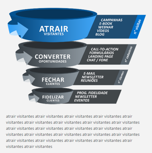
<div class="funil_1"><a id="img_funil_1" onclick="funil(funil_1)"><img src="images/funil/1atrair_visitantes.png"></a></div>
<div class="funil_2"><a id="img_funil_2" onclick="funil(funil_2)"><img src="images/funil/2converter_oportunidades.png"></a></div>
<div class="funil_3"><a id="img_funil_3" onclick="funil(funil_3)"><img src="images/funil/3fechar_clientes.png"></a></div>
<div class="funil_4"><a id="img_funil_4" onclick="funil(funil_4)"><img src="images/funil/4fidelizar_clientes.png"></a></div>
</div>
</div>
<div class="post-area grid_6">
<div class="posts-container">
<div id="funil_1">
<p>
atrair visitantes atrair visitantes atrair...
</p>
</div>
<div id="funil_2">
<p>
converter oportunidades converter oportunidades...
</p>
</div>
<div id="funil_3">
<p>
fechar clientes fechar clientes fechar clientes...
</p>
</div>
<div id="funil_4">
<p>
fidelizar clientes fidelizar clientes fidelizar...
</p>
</div>
</div>
</div>
grossly, I want that to happen when the resolution is less than 768:
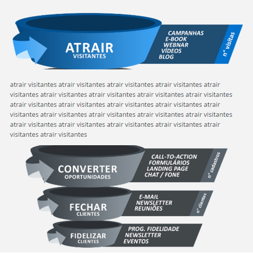
In a certain way it already happens, what I need is for the content to change place too, going down from the image to which it belongs.
– Raylan Soares
Then put a float:left as well. And did you try the example I showed you? I use it a lot, see in this project that I made http://www.engatevolpato.com.br/novo/index.asp, in the part below where it says launches, each item of those products would be yours . grid6, with 50% size (and of course with paddings and margins), when resizing the browser they get size 100%.
– Bruno Romualdo
I didn’t try, because the structure of mine is very different. On one side I have several stacked Ivs, and on the other side only one (visible) with the highest height, for all explanatory text. I understand how your project works, but this solution doesn’t apply to mine unless it suggests a change in structure. I’m sorry if I misunderstood
– Raylan Soares
kkkk I still think it will work kkk, would not have a test page for me to take a look.
– Bruno Romualdo
In this example from to better understand http://www.amasterpanfletagem.com.br/new/ below the banner there are two cards (which would be your two Divs .grid6) when resizing, the one on the right side goes down from the one on the left side, the difference is that in mine I put a margin on them not to be too close together.
– Bruno Romualdo
got it, I’ll try it here. I don’t have an online example at the moment.
– Raylan Soares
Anything post the css of the . grid6 class as well.
– Bruno Romualdo
I got it, it wasn’t exactly how I had in mind, but it worked well. thank you
– Raylan Soares