2
Hi, I was wondering if anyone here knows how I do to leave a responsive list, I’ll explain, see image:
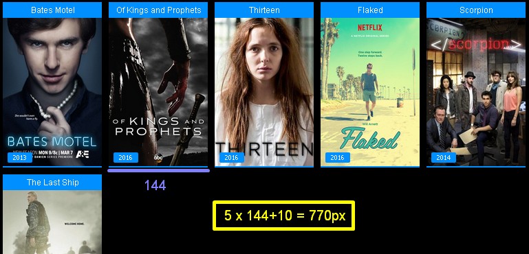
Here’s what’s in the image will appear to all monitors, regardless of their resolution, as I would in CSS so that this "series list" increases horizontally?
I’ll put the code down:
.cont_marg
{
    max-width:770px;
    margin:auto;
}
So I wanted something like:
If the screen is larger than 770+154, then max-width is set to 924... If the monitor is larger than 924+154, then max-width is set to 1078 And so on and so on...
I tried this code here in CSS, but it didn’t work out as I expected
@media only screen and (min-width: 154px) and (max-width: 307px) {
    .cont_marg
    {
        max-width:154px;
        margin:auto;
    }
}
@media only screen and (min-width: 308px) and (max-width: 461px) {
    .cont_marg
    {
        max-width:308px;
        margin:auto;
    }
}
@media only screen and (min-width: 462px) and (max-width: 615px) {
    .cont_marg
    {
        max-width:462px;
        margin:auto;
    }
}
@media only screen and (min-width: 616px) and (max-width: 769px) {
    .cont_marg
    {
        max-width:616px;
        margin:auto;
    }
}
@media only screen and (min-width: 770px) and (max-width: 923px) {
    .cont_marg
    {
        max-width:770px;
        margin:auto;
    }
}
@media only screen and (min-width: 924px) and (max-width: 1077px) {
    .cont_marg
    {
        max-width:924px;
        margin:auto;
    }
}
@media only screen and (min-width: 1078px) {
    .cont_marg
    {
        max-width:1078px;
        margin:auto;
    }
}
I believe using @media only screen and (min-width:770px){... for example.
– Raylan Soares
I edited the topic, check it out =/
– Giovana Santos
didn’t turn out like you expected, but it turned out like this? What was the mistake?
– Raylan Soares
It was just like that, I had the wrong code, it worked! Thanks! I’ll edit the topic with the corrected code! Thanks!
– Giovana Santos
Ahh blz, I’m glad you made it then.
– Raylan Soares
Giovana, don’t edit your question. If you solved the problem, keep the question code as is and post an answer with the correct code, so your question does not lose context and can help other people in the future.
– Filipe Moraes