0
I have a problem that at first is very basic, but I’ve tried everything that is way and is not working
The problem only occurs when opening the site on the smartphone.. if I simulate the resolution in the PC browser it works normal..
See the image below:
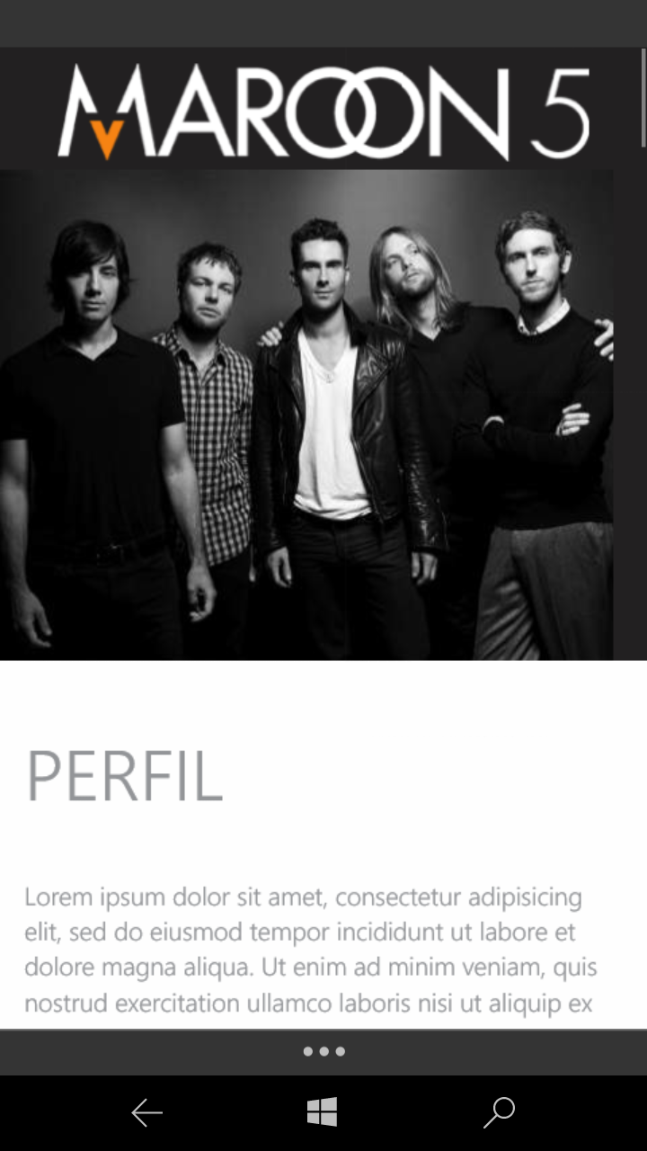
Notice that there is a right side margin.. I need the image and the logo to be 100% of the screen.. this problem only occurs on smartphone am using windows phone 10 EDGE.
I am using bootstrap 3 and already use the meta-tags below:
<meta name="viewport" content="width=device-width, initial-scale=1.0, maximum-scale=1.0, user-scalable=no">

<meta http-equiv="X-UA-Compatible" content="IE=edge,chrome=1">
in html the code is like this:
<div class="container-fluid">
        <div class="row">
        <div class="col-xs-12 col-sm-5 col-md-5">
                <h1 class="logo"><img class="img-responsive" src="logo.png" alt="logo"></h1>
            </div>
            <div class="col-xs-12 no-gutter">
                <img src="maroon5.jpg" alt="" class="img-responsive">
            </div>

        </div>
    </div>
my css is like this:
.no-gutter { padding: 0;}
I tried to put width:100%, padding:0 ! Mportant.. and other things.. but nothing takes that side margin away..
anyone has any idea?
Try to place this css inside a @media, to apply the rule for specific sizes for mobile devices?
– Thiago Verney
I’ve tried yes.. if I take this css rule the image centers, leaving a small margin on the sides.. however I need it to stretch staying as width:100%.. but it’s not rolling
– João Telles
Interesting that in the Edge Browser of my mobile the site does not even open, it gives error 501.. on computer, even in internet explorer, opens perfectly without errors
– João Telles
And what is before <div class="container-Fluid">?
– ninja_corp
I put it on the air for you to help me.. the site is here http://novo.sitesparabandas.com.br/ just inspect the source code.. before the container-Fluid comes a header with id #p_start.. and before that comes main navigation.. scripts, tags.. on the pc opens good.. in windows phone gives error 501.. and in other mobile browsers images do not reach width:100%
– João Telles
Cara is a windowsPhone few people use the same, I believe that if you solve the problem only for most used systems will not influence so much in the visualization of users, for example already tested and saw if the
– Gunblades
I don’t know if it influences, but this part '<script type="text/javascript" src="http://novo.sitesparabandas.com.br/layout/js/jquery-1.10.2.min.js"></script> <script type="text/javascript" src="http://novo.sitesparabandas.com.br/layout/js/jquery-migrate-1.2.min.js"></script> <script type="text/javascript" src="http://novo.sitesparabandas.com.br/layout/js/jquery-ui.js"></script> <script type="text/javascript" src="http://novo.sitesparabandas.com.br/lay/js/sys."></script>' would have to be at the bottom of the page before js bootstrap guess.
– anacvignola