1
I am using Bootstrap v3. And I need to filter table fields. I have chosen to use this example as a basis.
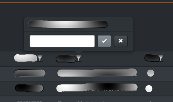
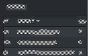
I’m now having a problem, when I’m viewing my table (it’s table-Responsive) on a mobile device, what happens is that the filter box disappears because it’s "inside the table", you can see in the images below:
Desktop
Mobile
I have here an example of my code:
HTML:
<div class="table-responsive">
<table id="example-table" class="table table-striped table-hover">
<thead>
<th> Campo x
<!--DEPOIS DE APLICADO O FILTRO BEGIN-->
<i data-original-title="Filtro para "Campo x""
class="glyphicon glyphicon-filter filterable editable editable-click editable-empty editable-open"
data-name="0" title="">
</i>
<div class="popover editable-container editable-popup fade bottom in">
<div class="arrow"></div>
<h3 class="popover-title">Filtro para "Campo x"</h3>
<div class="popover-content">
<div>
<form style="" class="form-inline editableform">
<div class="control-group form-group">
<div>
<div style="position: relative;" class="editable-input">
<input style="padding-right: 24px;"
class="form-control input-sm" type="text"><span
style="display: none;" class="editable-clear-x"></span>
</div>
<div class="editable-buttons">
<button type="submit"
class="btn btn-primary btn-sm editable-submit">
<i class="glyphicon glyphicon-ok"></i>
</button>
<button type="button"
class="btn btn-default btn-sm editable-cancel">
<i class="glyphicon glyphicon-remove"></i>
</button>
</div>
</div>
<div style="display: none;" class="editable-error-block help-block"></div>
</div>
</form>
</div>
</div>
</div>
<!--DEPOIS DE APLICADO O FILTRO END-->
</th>
...
</thead>
<tbody>
...
</tbody>
</table>
</div>
Jquery:
$('#example-table').filterable();
jsfiddle
I’ve looked everywhere and I can’t find anything on it. What’s going on and how I can fix it?