Grid Skeleton Responsive with Wordpress

Asked

Viewed 92 times

3

Next I’m building a website that needs to show the posts with wordpress, however I’m using the Skeleton grid framework, it works as follows:

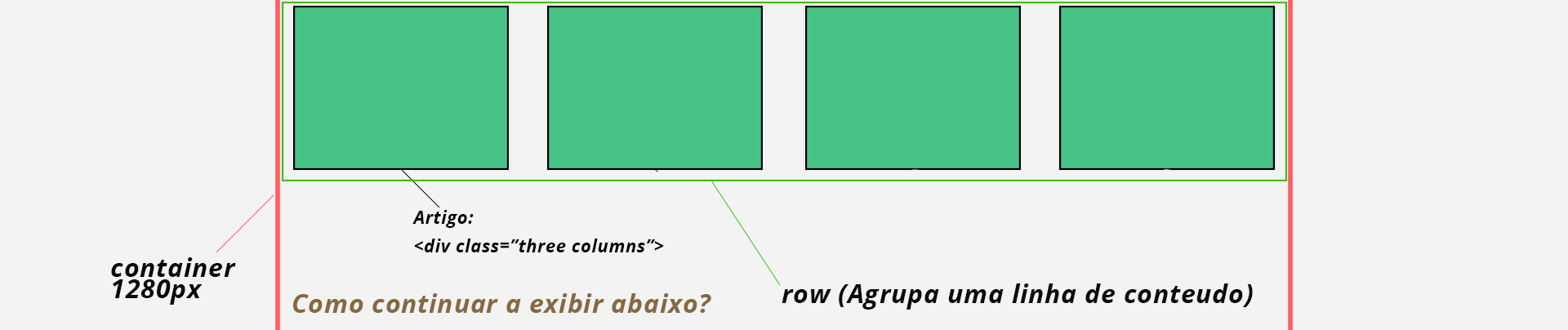
<div class="container">
    <div class="row">
       <div class="three columns"></div>
       <div class="three columns"></div>
       <div class="three columns"></div>
       <div class="three columns"></div>
    </div>
</div>

And so go....

But I’m having the following :

inserir a descrição da imagem aqui

And the Problem:

Wordpress has the following scheme of giving display in the posts:

<?php if ( have_posts() ) : while ( have_posts() ) : the_post(); ?>

<?php endwhile?>

<?php else: ?>

<?php endif; ?>

How I adapt the grid system for every 4 posts to give a <div class="row"> at the beginning and a </div> at the end, to be responsive?

Current situation:

<div class="row">
    <div class="three columns">
        <article class="articlebox">
            <header class="articleheader">
                <h2 class="article_title">Teste Bananinha</h2>
            </header>
        </article>
    </div>
    <div class="three columns">
        <article class="articlebox">
            <header class="articleheader">
                <h2 class="article_title">Teste Bananinha</h2>
            </header>
        </article>
    </div>
    <div class="three columns">
        <article class="articlebox">
            <header class="articleheader">
                <h2 class="article_title">Teste Bananinha</h2>
            </header>
        </article>
    </div>
    <div class="three columns">
        <article class="articlebox">
            <header class="articleheader">
                <h2 class="article_title">Teste Bananinha</h2>
            </header>
        </article>
    </div>
</div>

1 answer

2

There are several ways to resolve this issue. Below are some of the ways I’ve used.

1. CSS:

Instead of using the framework in this situation you can use pure CSS. It would look something like this:

HTML (generated by Wordpress):

<div class=" posts container">
    <div class="three"></div>
    <div class="three"></div>
    <div class="three"></div>
    <div class="three"></div>
    <div class="three"></div>
    <div class="three"></div>
    <div class="three"></div>
    <div class="three"></div>
</div>

CSS:

.posts {
    width: 1280px;
}

.posts .three {
    width: 25%;
}

However, a few more lines of code would be required to correct possible layout mismatches.

2. PHP:

You can also use a function to include the necessary code in the loop, that was the way I did at first. I made an example function, just put it in funcions.php and call it on the page you want:

Function:

function add_row( $current, $end = false, $columns = 4 ) {
    $row = ( $current % $columns ) === 0 ? true : false;

    if( $row && ! $end ) {
        echo '<div class="row">';
    }
    if( $row && $end) {
        echo '</div>';
    }
}

Example of use:

if ( have_posts() ):
    $count = 1;
    while ( have_posts() ):
        add_row($count); // Imprimi a tag de abertura
        the_post();
        add_row($count, true); // Imprimi a tag de fechamento
        $count++;
    endwhile;
endif;

With this modification the loop will generate the HTML you expect.

3. Jeet:

Or you can use the Jeet which is a grids system, it makes creating css grids much easier and faster. But for this you will also need to use a Runner task like Grunt or Gulp and a CSS preprocessor like Less or Sass or Stylus. Interesting that taking a look at the documentation of Skeleton saw that they support Less and Sass, you can see this here. Using these combined tools* you would have code like this:

HTML:

Serious the same as the first example.

Sass:

@import 'jeet/index';

.container {
  .three {
    col(3/12)
  }
}

*The combination I like due to learning curve is Gulp + Sass + Jeet.

  • I’m using the basic system with html plus css (generated by Wordpress), and it’s working perfectly, thank you!

Browser other questions tagged

You are not signed in. Login or sign up in order to post.