Page mode landscape does not fit

Asked

Viewed 360 times

0

I put a photo of the background, being 100% tall.

When I open the site by mobile (or Chrome/Firefox console) in landscape mode, the image background does not take up all the space.

In desktop mode and mobile mode in portrait position they are ok. Only LANDSCAPE so that is a problem.

I want in landscape mode, the content is to set the view window. How to do this?

enter image description here 
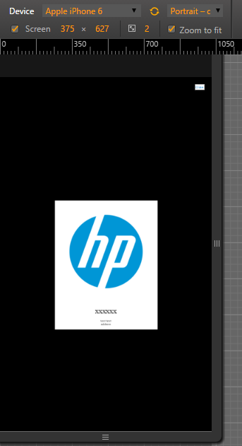
MOBILE: MODE PORTRAIT, OK.

enter image description here 
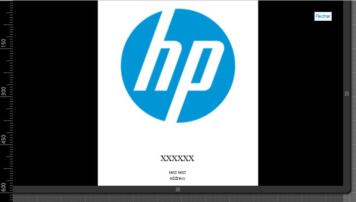
MOBILE: MODE LANDSCAPE, div doesn’t fit according to content.

OBS1: Run the Snippet on the browser console. In the mobile simulator for you to understand what I mean-do.

body, html {
  height:100%;
  padding:0;
  margin:0;

}
.block {
  height: 100%;
  width: 100%;
  text-align: center;
  background: black;

}

.block:before {
  content: '';
  display: inline-block;
  height: 100%; 
  vertical-align: middle;      
}

.centered {
  margin-top: 10%;
  display: inline-block;
  vertical-align: middle;
  max-width: 500px; 
  background: white;
}

.img-responsive {
  display: block;
  max-width: 100%;
  height: auto;
}
<div class="block">
     
    <div class="centered">
    
    <img src="https://upload.wikimedia.org/wikipedia/commons/6/6f/HP_logo_630x630.png" class="img-responsive" id="img_logo">
 <p style="color: black"> <a style="font-size:35px;"> xxxxxx</a> <br><br>text text <br> address <br>  </p>      
   </div>
  </div> 

I tried to remove the .block before: and:

@media(orientation: landscape){
  .background-image {
    min-height: 200%;
  }
}

But, this effect doesn’t only work in MOBILE mode. It works on both MOBILE and DESKTOP. I want it to work only on MOBILE.

  • Desktop also does not work right :/

  • @Zkk you did the test on the same device or just in simulators, sometimes the results differ a lot... Post your website and access on your mobile phone.

  • Both here in the stack and on my desktop machine is working. It’s just the image in the center and nothing else! Also put on the air and the same thing. Destkop OK. Mobile (only in LANDSCAPE mode) This error.

  • How can I fix this?

  • As I said the problem occurs on the desktop too and is due to the height: 100%. See the answer I formulated and the example I posted to try to correct.

2 answers

3


See if that’s what you wanted:

What I did was remove the .block:before, as you said, and added to .img-responsive one margin: auto to center.

Already the div.block and to the body instead of a height: 100% applied a height: auto and a min-height: 100%. A simple height: 100% will cause the body and .block adjust to the screen size and not to the elements when they exceed the screen. This setting is important in case you want to add new elements to your page, as they have not been through the same problem as before. With a height: auto to div.block will adjust to the size of your content, but with a min-height: 100%, this will not be reduced to a smaller size than the viewport.

Finally, I recommend that you remove the margin-top: 10% of div.centered, this top in percentage may result in some unpleasant situations, the best would be a fixed value, as 50px, for example. But that’s up to you. And if you want a distance from the content at the bottom, just add a padding-bottom: 50px /*por exemplo*/.

These reformulations will contribute to a more functional code and better adaptable to new elements.

body, html {
  height:100%;
  padding:0;
  margin:0;
}
.block {
  height: auto;
  min-height: 100%;
  width: 100%;
  text-align: center;
  background: black;
}
.centered {
  margin-top: 50px;
  display: inline-block;
  vertical-align: middle;
  max-width: 500px; 
  background: white;
}
.img-responsive {
  display: block;
  max-width: 100%;
  height: auto;
  margin: auto;
}
<div class="block">
  <div class="centered">
    <img src="https://upload.wikimedia.org/wikipedia/commons/6/6f/HP_logo_630x630.png" class="img-responsive" id="img_logo">
    <p style="color: black"> <a style="font-size:35px;"> xxxxxx</a>
      <br>
      <br>text text
      <br> address
      <br> </p>
  </div>
</div>

Example - Jsfiddle

  • 1

    That’s exactly what I needed. With this solution and a few more adjustments I got what I wanted, thanks for the help and the tip with the spacing div.centered.

2

So as said the problem occurs on the Desktop too, this is due to the height: 100%, because it does not work with the maximum page height but view-port, a simple way to solve would be to use the display: table in the .block, see an example:

body, html {
  height:100%;
  padding:0;
  margin:0;

}
.block {
  height: 100%;
  width: 100%;
  text-align: center;
  background: black;
  display: table;

}

.block:before {
  content: '';
  display: inline-block;
  height: 100%; 
  vertical-align: middle;      
}

.centered {
  margin-top: 10%;
  display: inline-block;
  vertical-align: middle;
  max-width: 500px; 
  background: white;
}

.img-responsive {
  display: block;
  max-width: 100%;
  height: auto;
}
<div class="block">
     
    <div class="centered">
    
    <img src="https://upload.wikimedia.org/wikipedia/commons/6/6f/HP_logo_630x630.png" class="img-responsive" id="img_logo">
 <p style="color: black"> <a style="font-size:35px;"> xxxxxx</a> <br><br>text text <br> address <br>  </p>      
   </div>
  </div> 

See the result in the image:

Imagem na tela landspace

  • 1

    Great option, very succinct and functional..

  • @Samirbraga Thanks! let me ask you a question? Why don’t you use Stack Snippet instead of jsfiddle? I was going to move your example to him, but I was curious. Anyway +1 in your answer

  • The Jsfiddle link leads to the result, so it can even resize on the console and check, but there’s no harm in using the Stack Snippet... I’ll even edit the answer. And thank you.

  • @Samirbraga understood, every way here he can also resize and still have the use of the tools in Firefox and Chrome, http://meta.pt.stackoverflow.com/a/4206/3635

  • 1

    You’re right...rsrs, it was the custom anyway. And having the two options is always good :).

  • Thanks for the help, it worked!! About the discussion, I see the Stack Snippet as a great visualization, but if a third party needs to edit something, Jsfiddle is simpler for that.

Show 1 more comment

Browser other questions tagged

You are not signed in. Login or sign up in order to post.