2
A few days ago I made a template in materializecss; today I stopped the phone and realized that it is not getting responsive.
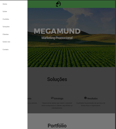
I’ll leave some prints to clarify:
Responsive (only when browser decreases)

Non-responsive (when accessed from a mobile phone even
Someone would know to shed some light on why this is happening?
This may be because the resolution of your phone is too large, so it takes the high resolution css and directs it to the pc. You can solve this by decreasing the range of resolution to which the mobile css properties are assigned. I think I was clear
– Tiago P.C
@Tiagop. C The worst is that I simulated all phones in Chrome and gave the same problem. My Galaxy S3 mini that has a screen considered small also looked like this. If you want to take a look: https://megamund-scofield17.c9users.io/index.html
– SCOFIELD
Doesn’t look like it went wrong, it looks okay.. What’s the problem?
– PauloHDSousa
@SCOFIELD, try putting this in the head of your html: <meta name="viewport" content="width=device-width, initial-Scale=1.0" />
– Tiago P.C
Ready @Guilhermenascimento ;)
– Tiago P.C