As spoken by the comments, I think is the best option for responsiveness:
the Bootstrap works with a system of grids (grids) to position the elements on the page.
This mechanism functions as a kind of abstract table, and is responsive (Responsive), mobile-oriented (mobile first) and fits according to the screen (Fluid), when it changes size or orientation.
Columns (columns), in Bootstrap, define the vertical divisions of
Rows (lines) of your layout.
Columns must always be inside the Rows, and they define spaces in the
Row so that you put the visual items or content that were
projected.
Then, in Bootstrap, you have rows (Rows) and columns (Columns) for
define a layout. It is exactly like a grid or matrix (or
table), however, using div’s with classes.
To create a column you can create a div with the prefixes
pre-defined by Bootstrap, as in the example:
<div class"container">
  <div class="row">
    <div class="col-md-6"> </div>
    <div class="col-md-6"> </div>
  </div>
</div>
In this example, we have a row (.Row) with two columns (.col-Md-6).
The number six, at the end of each column class, defines the space that
it occupies on the line. So, in this example, we would have the line (Row)
divided exactly in the middle by two columns, since we use the number
six.
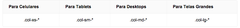
Column prefixes are used to indicate which screen types a
column will remain positioned as in the main design. Prefixes
have the following standard:
I suggest the links: How to use the grid, Documentation Bootstrap
Put HTML code too, but you’ll have to use
floatordisplay:inline-block.– KaduAmaral
if I use float it will not get responsive.
– wladyband
have you thought about using bootstrap?
– Marcos Henrique
agree to the use of bootstrap, even for you to better understand responsive behavior... then you can create your own grid system
– Marcelo Bonus
this project is configured for bootstrap, how do I get responsive?
– wladyband
you can use the bootstrap speaker system
– Marcos Henrique
Use the bootstrap grid, it is easier and avoids problem in breaking the layout on certain types of screens. Just adapt to your needs. http://getbootstrap.com/css/
– Júlio Rodrigues