6
I need to make this shape with CSS. But it can’t be with border.
Follows the form: 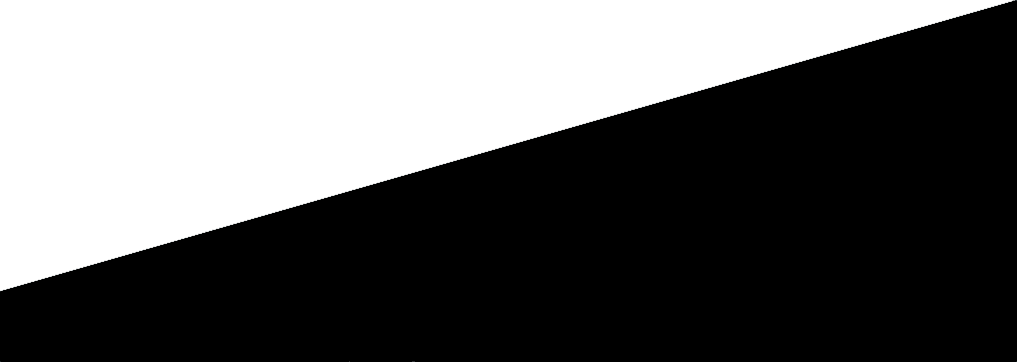
It cannot be with edge for the reason that forms using border do not allow me to position texts within them.
6
I need to make this shape with CSS. But it can’t be with border.
Follows the form:
It cannot be with edge for the reason that forms using border do not allow me to position texts within them.
6
Just one line of CSS, using gradient instead of solid color:
background: linear-gradient(170deg, #ffffff 0%,#fff 49.8%,#000 50.2%,#000 100%);
Here is a simple example, with prefix for several browsers:
#elemento {
  background: #ffffff;
  background: -moz-linear-gradient(-13deg, #fff 0%, #fff 49.8%, #000 50.2%, #000 100%);
  background: -webkit-linear-gradient(-13deg, #fff 0%,#fff 49.8%,#000 50.2%,#000 100%);
  background: linear-gradient(167deg, #ffffff 0%,#fff 49.8%,#000 50.2%,#000 100%);

  width:400px;
  height:180px;
  border: 1px solid red;
  text-align:center;
  color:#ccc;
  font-size:80px;
}
<div id="elemento">TEXTO<br>TEXTO</div>I put more prefixed versions to show the syntax difference in the angle part, but modern versions of browsers work well without prefixes.
I left a minimum "go" of 0.4 at the meeting of the center to improve the interpolation. It is worth saying that the browsers which are based on Chromium has a precarious implementation that leads to doing a little bit of serration, this is the programming problem of browser and not in the technique used. So much so that in IE11, for example, it is perfect.
this is even a better solution! + 1
@Chun I even liked the ingenuity of yours, but I found it relevant to place the gradient, because many people do not know that you can do "gradient without gradient", if you paste 2 solid colors in each other. Then edit the answer explaining better.
Very good answer, I really did not know that I could do this, I think very few people knew, thanks for the answer!! + 1
3
You can do it this way using the property transform: rotate();:
.container {
    height: 180px;
    width: 100%;
    border: 1px solid #000;
    position: relative;
    overflow: hidden;
}
.shape {
    background: #000;
    height: 150px;
    width: 112%;
    position: absolute;
    bottom: -50px;
    left: -8px;
    transform: rotate(-10deg);
}
.reshape {
    color: #fff;
    text-align: center;
}
<div class="container">
<div class="shape">
<div class="reshape">texto aqui</div>
</div>
</div>If you just want to rotate the text to the starting position:
.container {
    height: 180px;
    width: 100%;
    border: 1px solid #000;
    position: relative;
    overflow: hidden;
}
.shape {
    background: #000;
    height: 150px;
    width: 112%;
    position: absolute;
    bottom: -50px;
    left: -8px;
    transform: rotate(-10deg);
}
.reshape {
    color: #fff;
    text-align: center;
    transform: rotate(10deg);
    margin-top: 10px;
}
<div class="container">
<div class="shape">
<div class="reshape">texto aqui</div>
</div>
</div>Browser other questions tagged css css3
You are not signed in. Login or sign up in order to post.
It cannot be with edge because I cannot position text inside it if it is made with edge. It is for practical work.
– Tiago P.C
As you can see @Dan, they are different shapes, so there is no way to be duplicate.
– Tiago P.C
Use an image with the background that way, so, wow, since css doesn’t look like ;)
– Wallace Maxters
@Tiagop. C follows the same idea, it is geometric form, just a little more effort
– Danilo Pádua
No, because there most were made with border.
– Tiago P.C
@Wallacemaxters I’m trying to avoid using images because it weighs more than CSS. So I insist on trying to use CSS, if I can’t find some way to do this with css, I’ll use image.
– Tiago P.C
The problem is that it also works on all browsers, right. Have you tried SVG (or also think it’s heavy)? You could use two Divs, right? one with the border underneath and the other above with the text
– Wallace Maxters
The problem is the question of responsiveness, using more than one div, will become difficult to adapt in several resolutions. It would have to be something purely CSS of a div. Otherwise I think it’s best to use image.
– Tiago P.C
Take a look at this. http://www.html5rocks.com/en/tutorials/shapes/getting-started/? redirect_from_locale=en
– PauloHDSousa
Very good reference, @Paulohdsousa! Thank you, friend! ;)
– Tiago P.C