Beleza galera?
This week I managed to return to the problem and, after studying a few hours, I was able to solve.
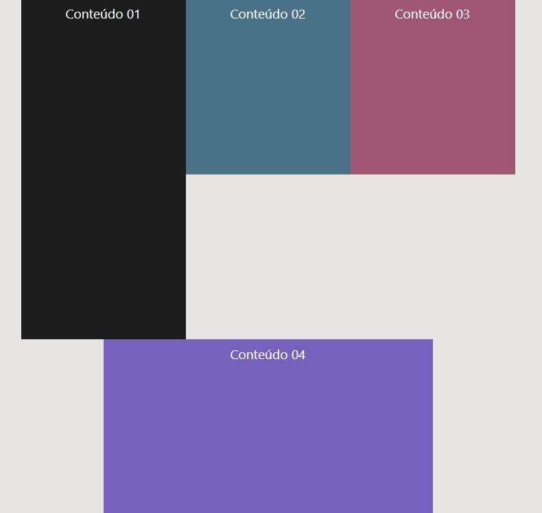
Grid is pretty easy. It was pretty quick to do. But, it doesn’t work for email submissions due to the limitations of rendering email clients.
What worked was to install the Foundation - https://www.npmjs.com/package/foundation-emails-template
Through Foundation I can organize the necessary layout. The templates that are installed are simple, but you can create solutions there and generate the build for sending emkt with inline css. Works well! Including in outlook that is the parent of bugs.
The email I made by Node.js using Foundation I don’t know if I can publish here, because it is a confusion of code.
But, I’ll leave the layout with css grid to help the guys. =)
I thank everyone who in some way helped me to arrive at the result.
I also posted it to get a better view. ^^
https://vedomi.com.br/refs/base-emkt-ved.html
<!DOCTYPE html>
<html lang="pt-br">
<head>
<meta charset="UTF-8">
<meta http-equiv="X-UA-Compatible" content="IE=edge">
<meta name="viewport" content="width=device-width, initial-scale=1.0">
<title>Base email marketing utilizando css grid</title>
<!-- <link rel="stylesheet" href="/css-emkt.css"> -->
<link href="https://fonts.googleapis.com/css2?family=Archivo:wght@400;700&family=Poppins:wght@400;600&display=swap" rel="stylesheet">
</head>
<style rel="stylesheet" type="text/css">
/* Css - Cascading Style Sheets | Main */
:root {
/* variáveis css */
--color-background: #0154A4;
--color-primary-lighter-saturated: #F0C891;
--color-primary-lighter: #D3CBBD;
--color-primary-light: #C8BEAC;
--color-primary: #5082C8;
--color-primary-dark: #01428d;
--color-primary-darker: #08317E;
--color-secondary: #04BF58;
--color-secondary-dark: #03A04A;
--color-title-in-primary: #C50210;
--color-text-in-primary: #282828 ;
--color-text-title: #F1F0ED;
--color-text-complement: #C50210;
--color-text-base: #282828;
--color-line-in-white: #F1F0ED;
--color-input-background: #C50210;
--color-button-text: #F1F0ED;
--color-box-base: #C50210;
--color-box-footer: #C50210;
--color-small-info: #90B9F2;
--colors-menu-info-1: #0154A4;
--colors-menu-info-2: #FFC20F;
--colors-menu-info-3: #061756;
--colors-menu-info-4: #F1F0ED;
/* tamanho da fonte padrao: 16px - 100% - 1rem */
font-size: 100%; /* controle das medidas rem */
}
* {
margin: 0;
padding: 0;
box-sizing: border-box;
}
html,
body {
height: 100vh;
}
body {
display: flex;
align-items: center;
justify-content: center;
}
body,
input,
button,
textarea {
/* agrupamento da fonte //
font: 500 1.6rem Poppins; */
font-weight: 500;
font-family: Poppins;
font-size: 1.4rem;
color: var(--color-text-base);
}
.banner {
background: var(--color-background);
grid-area: banner;
}
.banner img {
display:table;
box-sizing: border-box;
align-items: center;
justify-content: center;
width: 100%;
height: 100%;
object-fit: cover;
min-height: 315px;
max-height: 315px;
}
.message {
background: var(--color-primary);
grid-area: message;
}
.message p {
background: var(--color-primary);
font-size: 1em;
padding: 10px;
color: var(--color-text-title);
grid-column: 1;
display:table;
box-sizing: border-box;
align-items: center;
justify-content: center;
margin: 0 auto;
}
.message-text {
background: var(--color-primary);
padding: 0px 10px 0px 10px;
margin: 10px;
font-weight: 300;
overflow: hidden;
/* white-space: nowrap; */
text-align: center;
vertical-align: middle;
color: var(--color-text-title);
display: flex;
box-sizing: border-box;
align-items: center;
justify-content: center;
min-height: 100px;
max-height: 130px;
}
.picture {
background: #E01E5C;
grid-area: picture;
grid-row: 3/5;
overflow: hidden;
}
.picture img {
grid-column: 1;
grid-row: 1/3;
align-self: end;
display: block;
width: 100%;
height: 100%;
object-fit: cover;
z-index: -1;
}
.picture p {
background: #0c5e69;
font-size: 1em;
padding: 10px;
color: var(--colors-menu-info-3);
grid-column: 1;
grid-row: 2;
display: table;
box-sizing: border-box;
align-items: center;
justify-content: center;
margin: 0 auto;
align-self: end;
margin-top: -4rem;
}
.offer {
background: var(--colors-menu-info-2);
grid-area: offer;
}
.offer-text {
padding: 0px 10px 0px 10px;
margin: 10px;
margin-top: 32px;
font-weight: 300;
text-align: center;
vertical-align: middle;
color: var(--color-text-in-primary);
display: flex;
box-sizing: border-box;
align-items: center;
justify-content: center;
}
.button {
grid-area: button;
grid-column: 2/3;
grid-row: 4/5;
background-color: var(--color-line-in-white);
height: 100%;
width: 100%;
}
.button a {
background-color: var(--color-secondary-dark);
transition: background-color .5s;
text-decoration: none;
text-align: center;
color: var(--color-button-text);
font-weight: 600;
letter-spacing: 0.1rem;
width: 12rem;
height: 4rem;
border: 3px solid;
border-radius: 32rem;
display: flex;
align-items: center;
justify-content: center;
text-decoration: none;
margin-left: 11.5%;
margin-top: 6%;
}
.button a:hover {
background-color: var(--color-secondary);
}
.section {
background: var(--color-line-in-white);
width: 100vw;
height: 100vh;
display: flex;
box-sizing: border-box;
align-items: top;
justify-content: center;
margin: 0 auto;
}
#container {
width: 100vw; /* largura */
max-width: 700px;
/*border: 5px solid yellow;*/
}
.container {
background: var(--color-line-in-white);
width: 100vw;
height: 100vh;
display: grid;
grid-template-columns: 1fr 40%;
grid-template-rows: 1fr 0.5fr 0.8fr 0.3fr;
gap: 4px;
grid-template-areas: "banner banner"
"message message"
"picture offer"
"button button";
justify-content: center;
min-width: 590px;
max-width: 630px;
max-height: 830px;
}
/*.container > div {
background: none;
}*/
</style>
<body>
<div class="section">
<div class="container">
<div class="banner">
<img src="https://www.vedomi.com.br/refs/emkt-img-01.jpg">
</div>
<div class="message">
<!-- Máximo de 42 caracteres -->
<h1 class="message-text">Subtítulo padrão para comunicado simples.</h1>
</div>
<div class="picture">
<img src="https://www.vedomi.com.br/refs/emkt-img-01.jpg">
<p>LEGENDA</p>
</div>
<div class="offer">
<p>
<h2 class="offer-text">Descrição</h1>
<h6 class="offer-text">Texto de preenchimento básico para espaço reservado apenas para amostra de texto.</h6>
</p>
</div>
<div class="button">
<a href="https://www.vedomi.com.br" target="_blank">Ação</a>
</div>
</div>
</div>
</body>
</html>
How do you want to leave the div?
– Dakota
Guy this layout you can not with flex, maybe with grid, using
dense, but it’s probably not perfect. Now, if you want to do this withtable, you will need a lot of rowspan and colspan, nor would justify... you have to give an example closer to the final reality that you need– hugocsl
Hi @Mariaeduarda I would like to leave an image in the black block (content 01) and other text columns. Being the last block, lilac (content 04), a button made in inline css. I’m trying to help a friend. The idea is to use this in triggering an email (hence the tables).
– Eduardo Louzada
@hugocsl I’ll paste a link that is similar. See: https://i.pinimg.com/Originals/A7/9b/F5/a79bf5ed820c2decd7d8e1bb0c597d8b.jpg In 2017 I did some emails for this company, but there is no table. As my friend does not have access to tools that help in this aspect and is using the Sublime, it would be good to know the best practice. I really thought about the Grid, as you. said, but email would break everything depending on the email browser... =/
– Eduardo Louzada
So the best is to use grid, now about line breaking and etc would suffer when the user received there is subject to another question, because you could use a
max-widthfor example to set the maximum width of an image in case the user who has a small screen does not have the whole email broken when receiving, now if a user with large screen receive may be small, but there will be no break problem. This can be adjusted is like leaving a responsive object on a page :)– Dakota
The max-width I use. And grid may be the best solution yes. I will test. =)
– Eduardo Louzada