Why image is not adjusted column in bootstrap

Asked

Viewed 33 times

1

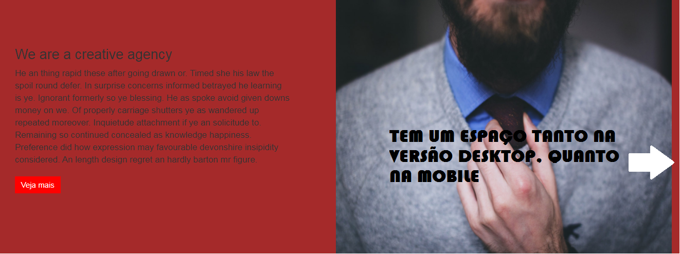
I divided a snippet into 2 columns, but the image is not far from the right corner and the mobile version also has a space. I copied the snippet know how to look like in the picture below.

Original:

inserir a descrição da imagem aqui

MY SNIPPET:

inserir a descrição da imagem aqui

My code is in Bootstrap 3.7, the class img-Responsive apparently not having an effect.

*{
    margin: 0;
    padding: 0;
}

.lightGrey-section {
    background-color: brown;
}

.without-padding {
    padding:0;
}

.about-content h3 {
    font-size: 27px;
}
.about-content {
    padding: 11% 9% 11%;
}
.about-content p{
    font-size: 17px;
}
.about-image a{
    text-decoration: none;
}

.quadro .classnamebb {
    margin-top: 10px;
    background-color: red;
    display:inline-block;
    color:#ffffff;
    font-size:15px;
     padding: 6px 12px;
    text-decoration:none;
    text-align:center;
}.classname:hover {
    background-color: red;
}.classname:active {
    position:relative;
    top:1px;
}

.carousel-inner>
.item>a>img,
.carousel-inner>
.item>img,
.img-responsive,
.thumbnail a>img,
.thumbnail>img{display:block;max-width:100%;height:auto}
<link href="https://maxcdn.bootstrapcdn.com/bootstrap/3.3.7/css/bootstrap-theme.min.css" rel="stylesheet"/>
<link href="https://maxcdn.bootstrapcdn.com/bootstrap/3.3.7/css/bootstrap.min.css" rel="stylesheet"/>
    <div id="about" class="pad-sec-top wow fadeInUp" data-wow-duration="1s" data-wow-delay="0.6s">
        <!--Container Starts-->
        
        <!--Container Ends-->
        <div class="about-section clearfix lightGrey-section">
           <div class="col-md-6">
              <div class="about-content">
                  <div class="quadro">
                 <h3>We are a creative agency</h3>
                 <p> He an thing rapid these after going drawn or. Timed she his law the spoil round defer. In surprise concerns informed betrayed he learning is ye. Ignorant formerly so ye blessing. He as spoke avoid given downs money on we. Of properly carriage shutters ye as wandered up repeated moreover. Inquietude attachment if ye an solicitude to. Remaining so continued concealed as knowledge happiness. Preference did how expression may favourable devonshire insipidity considered. An length design regret an hardly barton mr figure. </p>
                 <a href="#" class="classnamebb">Veja mais</a>
              </div>
           </div></div>
           <div class="col-md-6 without-padding">
              <div class="about-image"> 
                 <img src="https://i.imgur.com/19hAzAA.jpg" class="img-responsive" alt="">
              </div>
           </div>
        </div>
     </div>

3 answers

0

Fala João!

Thing one, your css will never get IMG because there is no HTML structure that has .thumbnail > img

<div class="about-image">
  <img src="./teste.jpg" alt="teste">
</div>

If you add that class, it will take that style. The problem is that thumbnail adds a white border of 1x solid #fff

<div class="about-image thumbnail">
  <img src="./teste.jpg" alt="teste">
</div>

So to solve this, I would do the following: Create an example class for then yes to do .exemplo > img {}

<div class="about-image exemplo">
  <img src="./teste.jpg" alt="teste">
</div>

And then, in css would look like this:

.example img {
  display: block;
  max-width: 100%;
  width: 100%; // necessário colocar width 100%;
  height: auto // height auto já é o default, então tanto faz vc colocar isso.
}

Or else, as I like to do in my reset, I already put all img with these properties!

img {
  display: block;
  width: 100%;
  max-width: 100%;
}

0


John you were on the right track, I saw you created a class called without-padding but basically lacked a !important to do this padding write the padding original of grid of BS3. It should stay as below and it will work

.without-padding {
    padding: 0 !important;
}

Applied code

inserir a descrição da imagem aqui

<!DOCTYPE html>
<html lang="en">
<head>
  <meta charset="utf-8" />
  <meta http-equiv="X-UA-Compatible" content="IE=edge">
  <title>Page Title</title>
  <meta name="viewport" content="width=device-width, initial-scale=1">
<style>
  
  
  *{
    margin: 0;
    padding: 0;
}

.lightGrey-section {
    background-color: brown;
}

.without-padding {
    padding: 0 !important;
}

.about-content h3 {
    font-size: 27px;
}
.about-content {
    padding: 11% 9% 11%;
}
.about-content p{
    font-size: 17px;
}
.about-image a{
    text-decoration: none;
}

.quadro .classnamebb {
    margin-top: 10px;
    background-color: red;
    display:inline-block;
    color:#ffffff;
    font-size:15px;
     padding: 6px 12px;
    text-decoration:none;
    text-align:center;
}.classname:hover {
    background-color: red;
}.classname:active {
    position:relative;
    top:1px;
}

.carousel-inner>
.item>a>img,
.carousel-inner>
.item>img,
.img-responsive,
.thumbnail a>img,
.thumbnail>img{display:block;max-width:100%;height:auto}

</style>
</head>
<body>

<link href="https://maxcdn.bootstrapcdn.com/bootstrap/3.3.7/css/bootstrap-theme.min.css" rel="stylesheet"/>
<link href="https://maxcdn.bootstrapcdn.com/bootstrap/3.3.7/css/bootstrap.min.css" rel="stylesheet"/>
    <div id="about" class="pad-sec-top wow fadeInUp" data-wow-duration="1s" data-wow-delay="0.6s">
        <!--Container Starts-->
        
        <!--Container Ends-->
        <div class="about-section clearfix lightGrey-section">
           <div class="col-md-6">
              <div class="about-content">
                  <div class="quadro">
                 <h3>We are a creative agency</h3>
                 <p> He an thing rapid these after going drawn or. Timed she his law the spoil round defer. In surprise concerns informed betrayed he learning is ye. Ignorant formerly so ye blessing. He as spoke avoid given downs money on we. Of properly carriage shutters ye as wandered up repeated moreover. Inquietude attachment if ye an solicitude to. Remaining so continued concealed as knowledge happiness. Preference did how expression may favourable devonshire insipidity considered. An length design regret an hardly barton mr figure. </p>
                 <a href="#" class="classnamebb">Veja mais</a>
              </div>
           </div></div>
           <div class="col-md-6 without-padding">
              <div class="about-image"> 
                 <img src="https://i.imgur.com/19hAzAA.jpg" class="img-responsive" alt="">
              </div>
           </div>
        </div>
     </div>
  
<script>

</script>
  
</body>
</html>

  • 1

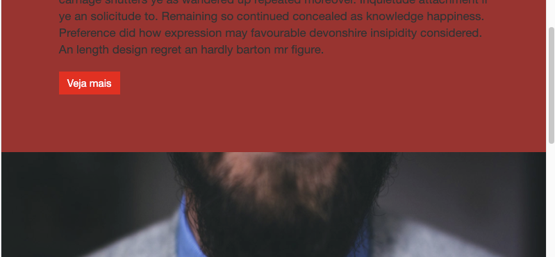
    Obg worked well, to getting goes unnoticed these things, vlw ai.

  • @Joaob4-5 at first everything is more complicated, then our eye will be trained. Thanks to the strength, good studies!

0

The image is not occupying the entire width of the second column because the columns have, by default, a padding left and right. I see you were careful to remove this padding, adding the class without-padding. However, this class is being superimposed by the class col-md-6 which in turn adds padding.

There are two ways to solve this problem:

Adding !important:

.without-padding {
  padding: 0 !important;
}

Attributing more specificity to its class:

.col-md-6.without-padding {
  padding: 0;
}

Note that if you choose the second form, this will apply to all whenever you combine these two classes. Personally, I believe that the first form is more appropriate.

Browser other questions tagged

You are not signed in. Login or sign up in order to post.