Menu and submenu difficulties

Asked

Viewed 39 times

0

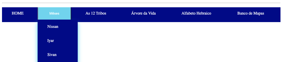
Hello comrades I am developing a software and I am having small difficulties in the menu and submenu. Submenu options are aligning to the right, however I wanted them to open down, I will demonstrate the following code:

body {
  background-color: rgb(0, 132, 255);
}

nav#titulos h1 {
  color: white;
  font-size: 30px;
  margin-top: -2px;
  text-align: center;
}

nav#titulos h2 {
  color: white;
  padding: 5px;
  font-size: 30px;
  text-align: center;
}

.dropbtn {
  background-color: darkblue;
}

.dropdow {
  float: left;
  overflow: hidden;
}

.dropdow .dropbtn {
  font-size: 16px;
  border: none;
  outline: none;
  color: white;
  padding: 14px 16px;
  background-color: darkblue;
  font-family: inherit;
  margin: 0;
}

.navbar a:hover,
.dropdown:hover .dropbtn {
  background-color: rgb(10, 214, 241);
}

.dropdown-content {
  display: none;
  position: absolute;
  background-color: darkblue;
  min-width: 160px;
  box-shadow: 0px 8px 16px 0px rgb(10, 214, 241);
  z-index: 1;
}

.dropdown-content a {
  float: none;
  color: darkblue;
  padding: 12px 16px;
  text-decoration: none;
  display: block;
  text-align: left;
}

.dropdown-content a:hover {
  background-color: darkblue;
}

.dropdown:hover .dropdown-content {
  display: flex;
  justify-content: space-between;
}

hr {
  border-color: white;
  margin-top: -20px;
}

nav#menu {
  display: flex;
  overflow: hidden;
  margin-top: -10px;
  background-color: darkblue;
  float: none;
  text-align: left;
  padding: 0px 0px 10px 0px;
}

nav#menu ul {
  margin: -5px 0;
  padding: 0;
  background-color: darkblue;
  overflow: hidden;
  right: auto;
  float: left;
}

nav#menu li {
  display: flex;
  border: none;
}

nav#menu ul li {
  display: inline;
  padding: -10px;
}

nav#menu li a {
  display: inline-block;
  color: white;
  padding: 19px 39px;
  margin: none;
  text-decoration: none;
  transition: background-color 1s;
}

nav#menu li a:hover {
  background-color: rgb(10, 214, 241);
}

nav#menu li.active {
  background-color: rgb(10, 214, 241);
  ;
}

h1 {
  color: white;
  text-align: center;
}

p {
  color: white;
  text-align: center;
}

p {
  text-align: center;
}

h2 {
  color: gold;
  text-align: center;
  text-decoration: none;
}

a {
  color: gold;
}

#imgpos {
  position: absolute;
  left: 5px;
  top: 10px;
}

nav#menu ul {
  width: 100%;
  display: table;
}

nav#menu ul li {
  display: table-cell;
  list-style: none;
}
<!DOCTYPE html>
<html lang="en">

<head>
  <meta charset="UTF-8">
  <meta name="viewport" content="width=device-width, initial-scale=1.0">
  <title>TesT</title>
  <link rel="stylesheet" href="testilo.css">


</head>

<body>
  <h1>Teste 2</h1>
  <h1> Desenvolvendo Menu</h1>
  <img src="cabala2.jpg" alt="Árvore" width="120" height="120" id="imgpos">

  <br>
  <hr> <br>

  <nav id="menu">
    <ul>

      <li><a href="index.html">HOME</a></li>
      <div class="dropdown">
        <button class="dropbtn">  
                   <li><a href="meses.html">Mêses</a></li>
                       
       
                   </button>
        <div class="dropdown-content">
          <ul>
            <li><a href="#nissan">Nissan</a></li>
            <li><a href="#iyar">Iyar</a></li>
            <li><a href="#sivan">Sivan</a></li>
            <li><a href="#tamuz">Tamuz</a></li>
            <li><a href="#av">Av</a></li>
            <li><a href="#elul">Elul</a></li>
            <li><a href="#tshrei">Tishrei</a></li>
            <li><a href="#cheshvan">Cheshvan</a></li>
            <li><a href="#kislev">Kislêv</a></li>
            <li><a href="#tevet">Tevêt</a></li>
            <li><a href="#shevat">Shevat</a></li>
            <li><a href="#adar">Adar</a></li>

          </ul>
        </div>
      </div>

      <li><a href="12tribos.html">As 12 Tribos</a></li>
      <li><a href="arvore.html">Árvore da Vida</a></li>
      <li><a href="alfabeto.html">Alfabeto Hebraico</a></li>
      <li><a href="banco.html">Banco de Mapas</a></li>


    </ul>
  </nav>
</body>

</html>

If you can help me, I’d be grateful.

1 answer

-1


You put the UL with display: table, which is not very recommended, since the children of this UL do not have display: table-cell, table-row, etc....

My suggestion is to put display: flex in that UL and flex-direction: column, so they will open vertically as you want

inserir a descrição da imagem aqui

<!DOCTYPE html>
<html lang="en">

<head>
<meta charset="UTF-8">
<meta name="viewport" content="width=device-width, initial-scale=1.0">
<title>TesT</title>
<link rel="stylesheet" href="testilo.css">
<style>
  body {
    baqckground-color: rgb(0, 132, 255);
  }

  nav#titulos h1 {
    color: white;
    font-size: 30px;
    margin-top: -2px;
    text-align: center;
  }

  nav#titulos h2 {
    color: white;
    padding: 5px;
    font-size: 30px;
    text-align: center;
  }

  .dropbtn {
    background-color: darkblue;


  }

  .dropdow {
    float: left;
    overflow: hidden;


  }

  .dropdow .dropbtn {
    font-size: 16px;
    border: none;
    outline: none;
    color: white;
    padding: 14px 16px;
    background-color: darkblue;
    font-family: inherit;
    margin: 0;


  }

  .navbar a:hover,
  .dropdown:hover .dropbtn {
    background-color: rgb(10, 214, 241);

  }

  .dropdown-content {
    display: none;
    position: absolute;
    background-color: darkblue;
    min-width: 160px;
    box-shadow: 0px 8px 16px 0px rgb(10, 214, 241);
    z-index: 1;


  }

  .dropdown-content a {
    float: none;
    color: darkblue;
    padding: 12px 16px;
    text-decoration: none;
    display: block;
    text-align: left;
  }

  .dropdown-content a:hover {
    background-color: darkblue;
  }

  .dropdown:hover .dropdown-content {
    display: flex;
    justify-content: space-between;

  }

  hr {
    border-color: white;
    margin-top: -20px;
  }

  nav#menu {
    display: flex;
    overflow: hidden;
    margin-top: -10px;
    background-color: darkblue;
    float: none;
    text-align: left;
    padding: 0px 0px 10px 0px;


  }

  nav#menu ul {
    margin: -5px 0;
    padding: 0;
    background-color: darkblue;
    overflow: hidden;
    right: auto;
    float: left;

  }

  nav#menu li {
    display: flex;
    border: none;


  }

  nav#menu ul li {
    display: inline;
    padding: -10px;


  }

  nav#menu li a {
    display: inline-block;
    color: white;
    padding: 19px 39px;
    margin: none;
    text-decoration: none;
    transition: background-color 1s;


  }

  nav#menu li a:hover {
    background-color: rgb(10, 214, 241);
  }

  nav#menu li.active {
    background-color: rgb(10, 214, 241);
    ;
  }

  h1 {
    color: white;
    text-align: center;

  }

  p {
    color: white;
    text-align: center;
  }

  p {
    text-align: center;

  }

  h2 {
    color: gold;
    text-align: center;
    text-decoration: none;
  }

  a {
    color: gold;
  }

  #imgpos {
    position: absolute;
    left: 5px;
    top: 10px;
  }

  nav#menu ul {
    width: 100%;
    display: table;
  }

  nav#menu ul li {
    display: table-cell;
    list-style: none;
  }
</style>

</head>

<body>
  <h1>Teste 2</h1>
  <h1> Desenvolvendo Menu</h1>
  <img src="cabala2.jpg" alt="Árvore" width="120" height="120" id="imgpos">

  <br>
  <hr> <br>

  <nav id="menu">
    <ul>

      <li><a href="index.html">HOME</a></li>
      <div class="dropdown">
        <button class="dropbtn">
          <li><a href="meses.html">Mêses</a></li>


        </button>
        <div class="dropdown-content">
          <ul style="display: flex; flex-direction: column;">
            <li><a href="#nissan">Nissan</a></li>
            <li><a href="#iyar">Iyar</a></li>
            <li><a href="#sivan">Sivan</a></li>
            <li><a href="#tamuz">Tamuz</a></li>
            <li><a href="#av">Av</a></li>
            <li><a href="#elul">Elul</a></li>
            <li><a href="#tshrei">Tishrei</a></li>
            <li><a href="#cheshvan">Cheshvan</a></li>
            <li><a href="#kislev">Kislêv</a></li>
            <li><a href="#tevet">Tevêt</a></li>
            <li><a href="#shevat">Shevat</a></li>
            <li><a href="#adar">Adar</a></li>

          </ul>
        </div>
      </div>

      <li><a href="12tribos.html">As 12 Tribos</a></li>
      <li><a href="arvore.html">Árvore da Vida</a></li>
      <li><a href="alfabeto.html">Alfabeto Hebraico</a></li>
      <li><a href="banco.html">Banco de Mapas</a></li>


    </ul>
  </nav>
</body>

</html>

  • @Tantara if you think the answer solved the problem remember to mark the answer as watch, just click on this icon and below the arrows next to the answer

  • So buddy, I did it, but the whole menu is going vertical.

  • @Tantara you have to why only in the UL that is within the other UL, and not in the main UL where is the first menu

  • I got it my dear, I just have to thank you comrade.

  • You know how I make this submenu a few inches below the button?

  • And how do I make it appear only when clicked options?

  • @Tantara speaks, my friend. I believe I have already answered what was asked in this your question, and you did not have the least sympathy to mark it as I suggested, or give a positive vote since you say you have helped... But you come and ask to solve two more problems. This is not the camaraderie we expect, so if you want other answers open another questions, and who knows someone else answers you

  • I’m going to mark it now, mate, I’m still new to this portal, I didn’t know where it was, I just gave it. Sorry for the delay in giving her, she was excellent.

Show 3 more comments

Browser other questions tagged

You are not signed in. Login or sign up in order to post.