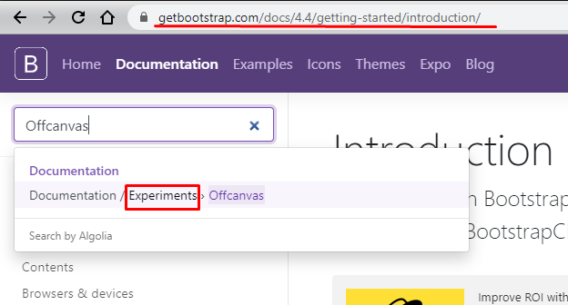
Face this exist in a documentation in the Bootstrap examples themselves. They call this type of menu offcanvas menu you can consult directly on the link https://getbootstrap.com/docs/4.4/examples/offcanvas
See that they themselves say that it is a model classified as experimental...!
Now let’s go to the code
Here is the simplified example with the code taken directly from the documentation , but see, that even if it was something original Bootstrap it was necessary to include some custom CSS and JS, but nothing more, it should not give 50 lines of code.
<!DOCTYPE html>
<html lang="en">

<head>
<meta charset="utf-8" />
<title>Page Title</title>
<meta name="viewport" content="width=device-width, initial-scale=1">
<link rel="stylesheet" type="text/css" media="screen" href="https://cdnjs.cloudflare.com/ajax/libs/font-awesome/5.8.2/css/all.min.css" />
<link rel="stylesheet" type="text/css" media="screen" href="https://stackpath.bootstrapcdn.com/bootstrap/4.3.1/css/bootstrap.min.css" />


<style>
  .bd-placeholder-img {
    font-size: 1.125rem;
    text-anchor: middle;
    -webkit-user-select: none;
    -moz-user-select: none;
    -ms-user-select: none;
    user-select: none;
  }

  @media (min-width: 768px) {
    .bd-placeholder-img-lg {
      font-size: 3.5rem;
    }
  }

  html,
  body {
    overflow-x: hidden;
    /* Prevent scroll on narrow devices */
  }

  body {
    padding-top: 56px;
  }

  @media (max-width: 991.98px) {
    .offcanvas-collapse {
      position: fixed;
      top: 56px;
      /* Height of navbar */
      bottom: 0;
      left: 100%;
      width: 100%;
      padding-right: 1rem;
      padding-left: 1rem;
      overflow-y: auto;
      visibility: hidden;
      background-color: #343a40;
      transition: visibility .3s ease-in-out, -webkit-transform .3s ease-in-out;
      transition: transform .3s ease-in-out, visibility .3s ease-in-out;
      transition: transform .3s ease-in-out, visibility .3s ease-in-out, -webkit-transform .3s ease-in-out;
    }

    .offcanvas-collapse.open {
      visibility: visible;
      -webkit-transform: translateX(-100%);
      transform: translateX(-100%);
    }
  }

  .nav-scroller {
    position: relative;
    z-index: 2;
    height: 2.75rem;
    overflow-y: hidden;
  }

  .nav-scroller .nav {
    display: -ms-flexbox;
    display: flex;
    -ms-flex-wrap: nowrap;
    flex-wrap: nowrap;
    padding-bottom: 1rem;
    margin-top: -1px;
    overflow-x: auto;
    color: rgba(255, 255, 255, .75);
    text-align: center;
    white-space: nowrap;
    -webkit-overflow-scrolling: touch;
  }

  .nav-underline .nav-link {
    padding-top: .75rem;
    padding-bottom: .75rem;
    font-size: .875rem;
    color: #6c757d;
  }

  .nav-underline .nav-link:hover {
    color: #007bff;
  }

  .nav-underline .active {
    font-weight: 500;
    color: #343a40;
  }

  .text-white-50 {
    color: rgba(255, 255, 255, .5);
  }

  .bg-purple {
    background-color: #6f42c1;
  }

  .lh-100 {
    line-height: 1;
  }

  .lh-125 {
    line-height: 1.25;
  }

  .lh-150 {
    line-height: 1.5;
  }
</style>

</head>

<body class="bg-light">
  <nav class="navbar navbar-expand-lg fixed-top navbar-dark bg-dark">
    <a class="navbar-brand mr-auto mr-lg-0" href="#">Offcanvas navbar</a>
    <button class="navbar-toggler p-0 border-0" type="button" data-toggle="offcanvas">
      <span class="navbar-toggler-icon"></span>
    </button>

    <div class="navbar-collapse offcanvas-collapse" id="navbarsExampleDefault">
      <ul class="navbar-nav mr-auto">
        <li class="nav-item active">
          <a class="nav-link" href="#">Dashboard <span class="sr-only">(current)</span></a>
        </li>
        <li class="nav-item">
          <a class="nav-link" href="#">Notifications</a>
        </li>
        <li class="nav-item">
          <a class="nav-link" href="#">Profile</a>
        </li>
        <li class="nav-item">
          <a class="nav-link" href="#">Switch account</a>
        </li>
        <li class="nav-item dropdown">
          <a class="nav-link dropdown-toggle" href="#" id="dropdown01" data-toggle="dropdown" aria-haspopup="true" aria-expanded="false">Settings</a>
          <div class="dropdown-menu" aria-labelledby="dropdown01">
            <a class="dropdown-item" href="#">Action</a>
            <a class="dropdown-item" href="#">Another action</a>
            <a class="dropdown-item" href="#">Something else here</a>
          </div>
        </li>
      </ul>
    </div>
  </nav>


  <main role="main" class="container">
    Lorem ipsum dolor sit amet consectetur adipisicing elit. Ipsum ipsam itaque accusamus, consequuntur dolorem optio expedita labore perferendis, sint sed aliquam modi a repudiandae nam consectetur praesentium perspiciatis. Quibusdam, qui!
  </main>

  <script src="https://code.jquery.com/jquery-3.2.1.min.js"></script>
  <script src="https://cdnjs.cloudflare.com/ajax/libs/popper.js/1.12.9/umd/popper.min.js"></script>
  <script src="https://stackpath.bootstrapcdn.com/bootstrap/4.2.1/js/bootstrap.min.js"></script>

  <script>
    $(function() {
      'use strict'

      $('[data-toggle="offcanvas"]').on('click', function() {
        $('.offcanvas-collapse').toggleClass('open')
      })
    })
  </script>
</body>

</html>
OBS: Here is a complete list of all official templates bootstrap https://getbootstrap.com/docs/4.4/examples/ all Free!