0
Hey guys I am new in CSS, and I’m having some difficulty formatting some things recently.
I attended a class to make this code navbar below and fitted a Parallax I had done yesterday already in this navbar so I could finally finish the site.
It turns out that when I entered the codes from Parallax, the menu defaced. I took the margin of some classes in css and it went back to the alignment, but not where I want it.
I want to put the items of my "li" aligned on the left along with the src img of "logo".
Can anyone help me? I’ll put the codes here and an image of how it is, so you can understand my idea.
* {
  box-sizing: border-box;
  margin: 0;
  padding: 0;
  color:#F06;
  justify-content: center;
  align-items: center;
}

header {
  display: flex;
  justify-content: flex-end;
  align-items: center;
  padding: 30px 10%;
  background: #24252a;
  border-radius:10px;
}

.logo {
  cursor: pointer;
  margin:0;
}

.nav__links {
  list-style: none;
  display: flex;
}

.nav__links a,
.cta,
.overlay__content a {
  font-family: "Montserrat", sans-serif;
  font-weight: 500;
  color: #edf0f1;
  text-decoration: none;

}

.nav__links li {
  padding: 0px 20px;
}

.nav__links li a {
  transition: all 0.3s ease 0s;
}

.nav__links li a:hover {
  color: #0088a9;
}

.cta {
  margin-left: 20px;
  padding: 9px 25px;
  background-color: rgba(0, 136, 169, 1);
  border: none;
  border-radius: 50px;
  cursor: pointer;
  transition: all 0.3s ease 0s;
}

.cta:hover {
  background-color: rgba(0, 136, 169, 0.8);
}


.container{
	position: relative;
    margin: 100px auto 0;
	max-width: 960px;
  background: linear-gradient(0deg, #000, #262626);
	font-size: 24px;
	padding: 25px;

}

.parallax {
	background:url(_images/background.jpg) no-repeat center;
	background-size: cover;
	background-attachment: fixed;
	height: 350px;

}

.container::before,
.container::after
{
    content: '';
    position: absolute;
    top: -2px;
    left: -2px;
    background: linear-gradient(45deg,#fb0094,#0000ff, #00ff00, #ffff00, #ff0000, #fb0094,#0000ff, #00ff00, #ffff00, #ff0000);
    background-size: 400%;
    width: calc(100% + 4px);
    height: calc(100% + 4px);
    z-index: -1;
    animation: animate 20s linear infinite;
}

.shadow::after
{
    filter: blur(20px);
}

@keyframes animate
{
    0%
    {
        background-position: 0 0;
    }
    50%
    {
        background-position: 300% 0;
    }
    100%
    {
        background-position: 0 0;
    }
}
<!DOCTYPE html PUBLIC "-//W3C//DTD XHTML 1.0 Transitional//EN" "http://www.w3.org/TR/xhtml1/DTD/xhtml1-transitional.dtd">
<html xmlns="http://www.w3.org/1999/xhtml">
<head>
<meta charset="utf-8">
<meta http-equiv="X-UA-Compatible" content="IE=edge">
<title>Navbar</title>
<meta name="description" content="">
<meta name="viewport" content="width=device-width, initial-scale=1">
<link rel="stylesheet" href="styles.css">
<link href="https://fonts.googleapis.com/css?family=Montserrat:500&display=swap" rel="stylesheet">
</head>
<body>
<header>
<img class="logo" src="_images/logo.png" alt="logo">
<nav>
<ul class="nav__links">
<li><a href="#">Services</a></li>
<li><a href="#">Projects</a></li>
<li><a href="#">About</a></li>
</ul>
</nav>
<a class="cta" href="#">Contact</a>
</header>
</div>
<div class="container">
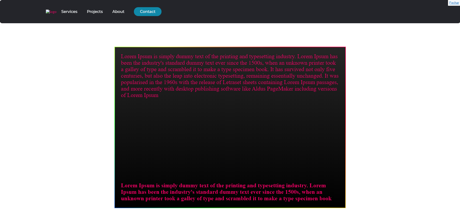
<p>Lorem Ipsum is simply dummy text of the printing and typesetting industry. Lorem Ipsum has been the industry's standard dummy text ever since the 1500s, when an unknown printer took a galley of type and scrambled it to make a type specimen book. It has survived not only five centuries, but also the leap into electronic typesetting, remaining essentially unchanged. It was popularised in the 1960s with the release of Letraset sheets containing Lorem Ipsum passages, and more recently with desktop publishing software like Aldus PageMaker including versions of Lorem Ipsum</p>
<div class="parallax">
</div>
<div id="paral2">
<p><strong>Lorem Ipsum is simply dummy text of the printing and typesetting industry. Lorem Ipsum has been the industry's standard dummy text ever since the 1500s, when an unknown printer took a galley of type and scrambled it to make a type specimen book</strong></p>
</div>
</div>
</body>
</html>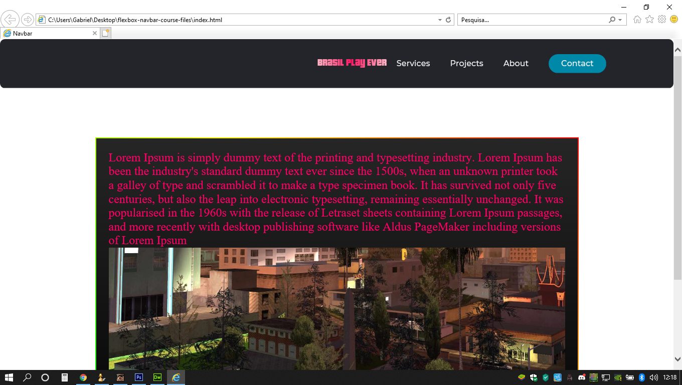
Thank you very much master!!!
– Mr Blood Creek
Can I take advantage and ask how I would make a spacing between the list items? to get better in this header
– Mr Blood Creek
@Mrbloodcreek vlw, put a margin-right on the menu items you should solve
– hugocsl