Problem with :Nth-Child() using margin-right

Asked

Viewed 57 times

2

I have a div .container with several Ivs .box where I want to show 5 Ivs per line when the width of the screen is greater than 1439px. Every div .box has a margin top and right of 15px, only that I want the last div .box each row has the right margin (margin-right) worthwhile 0 so that it doesn’t have right-hand spacing, to fit well inside the .container.

For that I used:

.box{
   width: 100%;
   max-width: calc(20% - 15px);
   height: 200px;
   background: red;
   margin: 15px 15px 0 0;
}

.box:nth-child(5n+5){
   margin-right: 0;
}

It works perfectly, but when you enter @media, where the resolution is less than 1440px, that I want to show, instead of 5, 4 Divs per line:

@media screen and (max-width: 1439px){

   .box{
      max-width: calc(25% - 15px);
   }

   .box:nth-child(4n+4){
      margin-right: 0;
   }

}

Notice I changed the formula of :nth-child() for 4n+4. It works, but the 5th div is still with the margin-right: 0 defined initial outside the @media, making her stick to the 6th div:

inserir a descrição da imagem aqui

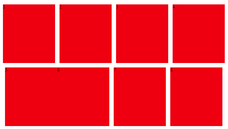
I tried to reset the margin-right of all the .box with margin-right: 15px before the .box:nth-child(4n+4) but still the 5th div continues with margin-right: 0:

@media screen and (max-width: 1439px){

   .box{
      max-width: calc(25% - 15px);
      margin-right: 15px; /* TENTEI RESETAR AQUI! */
   }

   .box:nth-child(4n+4){
      margin-right: 0;
   }

}

I believe this is due to the priority of classe + pseudo be greater than just classe.

How do I div them .box get back margin-right: 15px before applying the .box:nth-child(4n+4){ margin-right: 0; }?

Follows the code:

body{
   margin: 0;
}

.container{
   display: flex;
   justify-content: center;
   flex-wrap: wrap;
}

.box{
   width: 100%;
   max-width: calc(20% - 15px);
   height: 200px;
   background: red;
   margin: 15px 15px 0 0;
}

.box:nth-child(5n+5){
   margin-right: 0;
}


@media screen and (max-width: 1439px){
   
   .box{
      max-width: calc(25% - 15px);
      margin-right: 15px;
   }

   .box:nth-child(4n+4){
      margin-right: 0;
   }
   
}
<div class="container">
   <div class="box">1</div>
   <div class="box">2</div>
   <div class="box">3</div>
   <div class="box">4</div>
   <div class="box">5</div>
   <div class="box">6</div>
   <div class="box">7</div>
   <div class="box">8</div>
   <div class="box">9</div>
</div>

  • Vixi, Uncle Sam asking for css, then the stuff should be Oko! D

  • :D... it must be easy... I can’t see :/

2 answers

6


The dots

That class:

   .box:nth-child(4n+4){
      margin-right: 0;
   }

It doesn’t cancel that:

   .box:nth-child(5n+5){
      margin-right: 0;
   }

That doesn’t cancel that

   .box:nth-child(odd){
      margin-right: 30px;
   }

They are different rules, and one rule does not override the other since they are not equal.

I believe this is given by the priority of class + pseudo to be higher than just class.

Exactly, your reasoning is correct!


To solve

Vc can include Nth-Child(5n+5) in the previous rule type .box, .box:nth-child(5n+5) { } then she goes back to the pattern.

inserir a descrição da imagem aqui

  body{
      margin: 0;
   }
   
   .container{
      display: flex;
      justify-content: center;
      flex-wrap: wrap;
   }
   
   .box{
      width: 100%;
      max-width: calc(20% - 15px);
      height: 200px;
      background: red;
      margin: 15px 15px 0 0;
   }
   
   .box:nth-child(5n+5){
      margin-right: 0;
   }
   
   
@media screen and (max-width: 1439px){
  
  .box,
  .box:nth-child(5n+5) {
      max-width: calc(25% - 15px);
      margin-right: 15px;
  }

  .box:nth-child(4n+4){
      margin-right: 0;
  }
  
}
<div class="container">
  <div class="box">1</div>
  <div class="box">2</div>
  <div class="box">3</div>
  <div class="box">4</div>
  <div class="box">5</div>
  <div class="box">6</div>
  <div class="box">7</div>
  <div class="box">8</div>
  <div class="box">9</div>
</div>

  • I put an answer with what I found. Abs!

2

The @hugocss response works in this case, but I’ll leave a reply that works better when I have other @media where I want to show less Ivs per line, like 3 or 2.

Use only the n, which it will apply to all Ivs, so it will have the same weight of classe + pseudo before applying the formula xn+x, for the n refers to all elements of the selector:

body{
   margin: 0;
}

.container{
   display: flex;
   justify-content: center;
   flex-wrap: wrap;
}

.box{
   width: 100%;
   max-width: calc(20% - 15px);
   height: 200px;
   background: red;
   margin: 15px 15px 0 0;
}

.box:nth-child(5n+5){
   margin-right: 0;
}


@media screen and (max-width: 1439px){
   
   .box{
      max-width: calc(25% - 15px);
   }

   .box:nth-child(n){
      margin-right: 15px;
   }

   .box:nth-child(4n+4){
      margin-right: 0;
   }
   
}

@media screen and (max-width: 800px){
   
   .box{
      max-width: calc(33% - 15px);
   }

   .box:nth-child(n){
      margin-right: 15px;
   }

   .box:nth-child(3n+3){
      margin-right: 0;
   }
   
}
<div class="container">
   <div class="box">1</div>
   <div class="box">2</div>
   <div class="box">3</div>
   <div class="box">4</div>
   <div class="box">5</div>
   <div class="box">6</div>
   <div class="box">7</div>
   <div class="box">8</div>
   <div class="box">9</div>
</div>

  • 1

    It is interesting tb, depending on the amount of rule you make can save a few lines of code even, these Nth-chilt rules are sometimes a bit confusing even

Browser other questions tagged

You are not signed in. Login or sign up in order to post.