Place one col over another with bootstrap 4

Asked

Viewed 318 times

0

I need to place a column col-lg-7 of bootstrap 4 over another column col-lg-6 I’m wearing a container-fluid in the father div but I have no idea how to get the result of the image shown below: inserir a descrição da imagem aqui

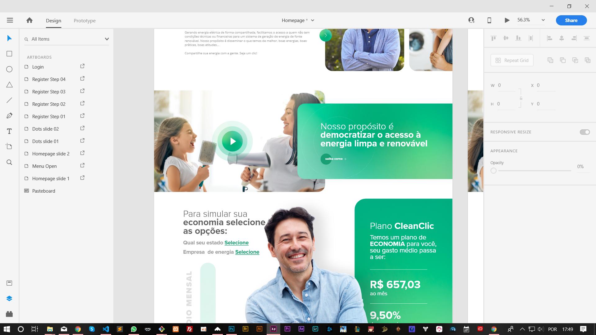
Follow my code realize that it is on the side of the other side but I need to superimpose the column with green color to be in the lap of the other column and picking 100% of the screen:

<section class="video" id="video">
        <div class="container-fluid">
            <div class="row">
                <div class="col-lg-7 video-popup">
                    <a href="#." class="thumbnail">
                        <div class="img">
                            <svg version="1.1" id="Capa_1" xmlns="http://www.w3.org/2000/svg" xmlns:xlink="http://www.w3.org/1999/xlink" x="0px" y="0px"
                                viewBox="0 0 41.999 41.999" style="enable-background:new 0 0 41.999 41.999;" width="30px" xml:space="preserve">
                                <path d="M36.068,20.176l-29-20C6.761-0.035,6.363-0.057,6.035,0.114C5.706,0.287,5.5,0.627,5.5,0.999v40
                                    c0,0.372,0.206,0.713,0.535,0.886c0.146,0.076,0.306,0.114,0.465,0.114c0.199,0,0.397-0.06,0.568-0.177l29-20
                                    c0.271-0.187,0.432-0.494,0.432-0.823S36.338,20.363,36.068,20.176z"/>
                            </svg>
                            <img src="assets/images/bg-video.jpg" class="img-fluid"/>
                        </div>
                    </a>
                </div>

                <div class="col-lg-5">
                    <div class="box">
                        <h1>teste</h1>
                    </div>
                </div>
            </div>
        </div>
    </section>

SCSS:

section.video{
  margin-top: 50px;
  .video-popup{
    padding: 0;

    .thumbnail{
      .img {
        position: relative;

        svg {
          top: 50%;
          left: 50%;
          position: absolute;
          transform: translate(-50%, -50%);
        }
      }
    }
  }

  .box{
    padding: 50px 0;
    background-image: url(../images/gradient.jpg);
    background-size: cover;
    background-position: center center;
    background-repeat: no-repeat;
  }
}

1 answer

2


Ta ai mano, basically you just need to create a class, to put right: 0, I called . right right, in the rest you use Bootstrap’s own classes as the position and padding classes

  .right {
      right: 0;
  }
<link rel="stylesheet" type="text/css" media="screen" href="https://stackpath.bootstrapcdn.com/bootstrap/4.3.1/css/bootstrap.min.css" />

<div class="container-fluid ">
    <div class="row position-relative">
        <div class="col-6 p-0">
            <img class="w-100" src="https://unsplash.it/100/20">
        </div>
        <div class="col-7 position-absolute pl-2 p-0 right" style="background: rgba(255,0,0,0.5)">
            Lorem ipsum dolor sit, amet consectetur adipisicing elit. Nostrum tempora similique repudiandae ut, molestiae aut magnam, minus voluptates possimus animi a dolores, quidem qui dicta facere quo laboriosam accusantium obcaecati!
        </div>
    </div>
</div>

Browser other questions tagged

You are not signed in. Login or sign up in order to post.