Place a fixed text inside an image - responsive with Bootstrap

Asked

Viewed 1,444 times

-1

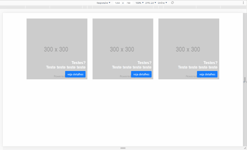
I’m trying to put a text and a button inside an image, but I’m not able to keep them responsive.

.dados {
    bottom: 10px;
    right: 0;
}

.text {
    font-family: "Arial Bold", Arial;
    font-weight: 700;
    font-size: 22px;
    color: #ffffff !important;
}
<!DOCTYPE html>
<html lang="pt-br">
<head>
  <title>Teste</title>

  <meta charset="UTF-8">
  <meta name="viewport" content="width=device-width, initial-scale=1.0">
  <meta http-equiv="X-UA-Compatible" content="ie=edge">

  <link rel="stylesheet" type="text/css" href="https://stackpath.bootstrapcdn.com/bootstrap/4.3.1/css/bootstrap.min.css" />
  <link rel="stylesheet" type="text/css" href="css/style.css" />

</head>
<body>
<div class="container">
<div class="row mt-4">
      <div class="col-4">
        <div class="position-relative">
          <img src="https://via.placeholder.com/300" alt="">
          <div class="position-absolute dados">
            <h3 class="text-right text">Testes?<br>Teste teste teste teste</h3>
            <button class="btn btn-primary float-right">veja detalhes</button>
          </div>
        </div>
      </div>
    </div>
  </div>
 </body>
</html>

I want this information to stay inside the image, in the lower right corner. Someone knows how to do it, so that you stay responsive?

1 answer

0

Guy basically what was missing was putting the class w-100 in the images to occupy them as much as possible 100% of the width of the container pai. So they don’t "sink" over each other. And the other thing was to put the Grid responsive, you used only col-4 in the container pai, but for smaller screens that 600px It was starting to get bad, so I put col-12 com-md-4 in the column, as well as themes MD is in 3 columns and below that is 1 column per row

inserir a descrição da imagem aqui

Follow the image code above:

.dados {
    bottom: 10px;
    right: 10px;
}

.text {
    font-family: "Arial Bold", Arial;
    font-weight: 700;
    font-size: 22px;
    color: #ffffff !important;
}
<link rel="stylesheet" type="text/css" media="screen" href="https://stackpath.bootstrapcdn.com/bootstrap/4.3.1/css/bootstrap.min.css" />

<div class="container">
    <div class="row mt-4">
        <div class="col-12 col-md-4 my-2">
            <div class="position-relative">
                <img class="w-100" src="https://via.placeholder.com/300" alt="">
                <div class="position-absolute dados">
                    <h3 class="text-right text">Testes?<br>Teste teste teste teste</h3>
                    <button class="btn btn-primary float-right">veja detalhes</button>
                </div>
            </div>
        </div>
    </div>
</div>

Browser other questions tagged

You are not signed in. Login or sign up in order to post.