How to center Brand logo on Bootstrap 4 and leave menu items below?

Asked

Viewed 645 times

1

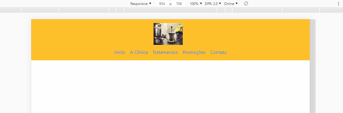
I am carrying out a project and I am having difficulty centralizing the logo and leave the menu items below, so that everything is part of the navbar and that when the break for mobile tablet occurs, the toggle icon is in the same line as the logo, and not below.

Code:

<!-- Início do Cabeçalho -->
  <header>
    <nav class="navbar navbar-expand-md">
      <div class="container">
        <!-- Logo do Site -->
          <a href="index.html" class="navbar-brand">
            <img src="../assets/img/logo-marca.png" height="75">
          </a>
        <!-- Menu Hamburguer -->
        <button class="navbar-toggler" data-toggle="collapse" data-target="#nav-principal">
          <i class="fas fa-bars text-white"></i>
        </button>
        </br>
        <div class="collapse navbar-collapse" id="nav-principal">
            <ul class="navbar-nav navbar-light ml-auto">
              <li class="nav-item">
                <a href="" class="nav-link"> Início </a>
              </li>
              <li class="nav-item">
                <a href="" class="nav-link"> A Clínica </a>
              </li>
              <li class="nav-item">
                <a href="" class="nav-link"> Tratamentos </a>
              </li>
              <li class="nav-item">
                <a href="" class="nav-link"> Promoções </a>
              </li>
              <li class="nav-item">
                <a href="" class="nav-link"> Contato </a>
              </li>
            </ul>
          </div>
          <!-- Fim do Menu -->
      </div>
    </nav>
  </header>
  <!-- Fim do Cabeçalho -->

How I’d like you to stay:

Imagem do Photoshop

2 answers

0


You can create a media query rule when the screen has 768px up, applying flex-direction: column; in the div .container. This way, the logo and menu will be aligned in column form, one below the other. When the screen is less than 768px, the burger menu will be on the same line as the logo, because the div .container will no longer be column-shaped. See:

There is no need to </br> after the <button>.

<script src="https://cdnjs.cloudflare.com/ajax/libs/jquery/3.3.1/jquery.min.js"></script>
<link rel="stylesheet" type="text/css" href="https://maxcdn.bootstrapcdn.com/bootstrap/4.1.0/css/bootstrap.min.css">
<link rel="stylesheet" href="https://use.fontawesome.com/releases/v5.7.2/css/all.css" integrity="sha384-fnmOCqbTlWIlj8LyTjo7mOUStjsKC4pOpQbqyi7RrhN7udi9RwhKkMHpvLbHG9Sr" crossorigin="anonymous">
<script src="https://maxcdn.bootstrapcdn.com/bootstrap/4.1.0/js/bootstrap.min.js"></script>

<style>
body{
   background: pink;
}

@media screen and (min-width: 768px) {
   .navbar-expand-md > .container{
      flex-direction: column;
   }
}
</style>


<!-- Início do Cabeçalho -->
  <header>
    <nav class="navbar navbar-expand-md">
      <div class="container">
        <!-- Logo do Site -->
          <a href="index.html" class="navbar-brand">
            <img src="https://www.cleverfiles.com/howto/wp-content/uploads/2016/08/mini.jpg" height="75">
          </a>
           <!-- Menu Hamburguer -->
           <button class="navbar-toggler" data-toggle="collapse" data-target="#nav-principal">
             <i class="fas fa-bars text-white"></i>
           </button>
           <div class="collapse navbar-collapse" id="nav-principal">
               <ul class="navbar-nav navbar-light ml-auto">
                 <li class="nav-item">
                   <a href="" class="nav-link"> Início </a>
                 </li>
                 <li class="nav-item">
                   <a href="" class="nav-link"> A Clínica </a>
                 </li>
                 <li class="nav-item">
                   <a href="" class="nav-link"> Tratamentos </a>
                 </li>
                 <li class="nav-item">
                   <a href="" class="nav-link"> Promoções </a>
                 </li>
                 <li class="nav-item">
                   <a href="" class="nav-link"> Contato </a>
                 </li>
               </ul>
             </div>
             <!-- Fim do Menu -->
      </div>
    </nav>
  </header>
  <!-- Fim do Cabeçalho -->

  • Thank you, the solution was very efficient and made the effect I wanted with the media!

0

One option is in the div that you put the class container, do not use this class, replace container for mx-auto and add tb to the class text-center. With this you will get the result as below. You don’t need CSS or @medias for this option. But it would be interesting to give more details of how you imagine responsiveness

inserir a descrição da imagem aqui

Follow the image code above:

<!DOCTYPE html>
<html lang="en">

<head>
<meta charset="utf-8" />
<title>Page Title</title>
<meta name="viewport" content="width=device-width, initial-scale=1">
<link rel="stylesheet" type="text/css" media="screen" href="https://stackpath.bootstrapcdn.com/bootstrap/4.2.1/css/bootstrap.min.css" />
<link rel="stylesheet" type="text/css" media="screen" href="https://cdnjs.cloudflare.com/ajax/libs/font-awesome/5.8.2/css/all.min.css" />
<style>

</style>
</head>

<body>

    <!-- Início do Cabeçalho -->
    <header>
        <nav class="navbar navbar-expand-md bg-warning">
            <div class="mx-auto text-center">
                <!-- Logo do Site -->
                <a href="index.html" class="navbar-brand">
                    <img src="https://unsplash.it/100/75" height="75">
                </a>
                <!-- Menu Hamburguer -->
                <button class="navbar-toggler" data-toggle="collapse" data-target="#nav-principal">
                    <i class="fas fa-bars text-white"></i>
                </button>
                <div class="collapse navbar-collapse" id="nav-principal">
                    <ul class="navbar-nav navbar-light ml-auto">
                        <li class="nav-item">
                            <a href="" class="nav-link"> Início </a>
                        </li>
                        <li class="nav-item">
                            <a href="" class="nav-link"> A Clínica </a>
                        </li>
                        <li class="nav-item">
                            <a href="" class="nav-link"> Tratamentos </a>
                        </li>
                        <li class="nav-item">
                            <a href="" class="nav-link"> Promoções </a>
                        </li>
                        <li class="nav-item">
                            <a href="" class="nav-link"> Contato </a>
                        </li>
                    </ul>
                </div>
                <!-- Fim do Menu -->
            </div>
        </nav>
    </header>

    <script src="https://code.jquery.com/jquery-3.2.1.min.js"></script>
    <script src="https://cdnjs.cloudflare.com/ajax/libs/popper.js/1.12.9/umd/popper.min.js"></script>
    <script src="https://stackpath.bootstrapcdn.com/bootstrap/4.2.1/js/bootstrap.min.js"></script>
</body>

</html>

  • Thanks for the code, it worked! On the question of responsiveness when arriving at breakpoints Sm and Md I would like to try to align the logo to the left and the toggle icon to the right, then I would need to use @medias?

  • The above boy’s solution met what I wanted, but thank you so much for your attention and help!

  • @Igorpereira may be possible, but you would have to search the flex classes of the https://getbootstrap.com/docs/4.3/utilities/flexbootstrap documentation/

Browser other questions tagged

You are not signed in. Login or sign up in order to post.