Align Ivs side by side in the center

Asked

Viewed 403 times

2

I’m having a hard time shaping the way it’s supposed to be in exercise... I wanted to leave the image attached inserir a descrição da imagem aqui

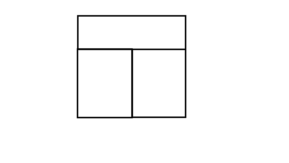
I’ll leave the code of my attempts:

.header{
    background-color: lightgrey;
    border: 1px solid;
    width: 47%;
    text-align: center;
    height: 100%;
    font-family: inherit;
    color:dimgrey;
    font-size: 27px;
    margin:auto;
    margin-top: 95px;
}
.info
{
  background-color: lightgrey;
  border: 1px solid;
  text-align: left;
  height: 100%;
  color:dimgrey;
  font-size: 10px;
  margin:auto;
}


#link{
 color:blue;
 font-size: 20px;
 font-family: arial;
}
<!DOCTYPE html>
<html>
<head>
  <link type="text/css" rel="stylesheet" href="login.css"/>
  <meta charset="utf-8">

  <div class="header">
   <h4 id="text">texto texto texto texto texto</h4>
  </div>
</head>
<body>
  <div class="info">
    <a id="link" href="https://www.google.com">Esqueceu o seu usuário ou senha?</p>
      <p> O uso de Cookies deve ser permitido no seu navegador</p>
      <p> Alguns cursos podem permitir o acesso a visitantes</p>
</div>
</body>
</html>

  • If possible, also add the HTML part where you use this CSS.

  • I added, but I only have the beginning... I’m trying to read some css materials and changing some things to see what to do

  • Exercise is with pure css? you already know the bootstrap tool ?

  • has to be pure css

3 answers

1

There are a thousand ways to do that, I’ll leave one that I consider the most modern that is with CSS Grid Layout, and even with this technique there are other ways to achieve the same result, such as grid-template-areas...

html,
body {
    width: 100%;
    height: 100%;
    margin: 0;
    padding: 0;
}

.container {
    height: 100%;
    display: grid;
    grid-template-columns: 1fr 1fr;
    grid-template-rows: 1fr 2fr;
    padding: 1rem; 
    box-sizing: border-box;
}

header {
    grid-column: 1 / -1;
}

header,
aside,
main {
    border: 1px solid #000;
    box-sizing: border-box;
}
<div class="container">
    <header class="header">header</header>
    <aside class="aside">aside</aside>
    <main class="main">main</main>
</div>

0


Solution 100% cross-browser, Adaptive Mixing and Responsive Web Design.

To test responsiveness.
Run the code and click the button entire page

*,
*:before,
*:after {
  margin: 0;
  padding: 0;
}
html,
body {
  height: 100%;
}
.bl-ui,
.bl-wrap {
  position: relative;
  height: inherit;
}
.bl-ui {
  border: solid 7px rgba(0,0,0,1);
  background: rgba(128,128,128,0);
}
.bl-header {
  position: relative;
  height: 33.33333333333333%;
  text-align: center;
  border-bottom: solid 7px rgba(0,0,0,1);
  background: rgba(0,255,0,0);
}
.bl-content {
  position: relative;
  height: 66.66666666666667%;
}
.bc-header__title {
  position: relative;
  top: 50%;
  background: rgba(255,255,0,0)
}
.bc-featured {
  position: relative;
  height: 50%;
  text-align: center;
}
.bc-featured:nth-of-type(1):after {
  content: ".";
  position: absolute;
  display: inherit;
  top: 100%;
  width: 100%;
  height: 7px;
  background: black
}
.bc-header__title,
.bc-featured__title {
  font-size: 1.1875rem;
  font-family: Helvetica, "sans-serif"  
}
.bc-featured__title {
  position: relative;
  top: 50%;
}
@media(min-width:719px) {
  .bc-featured {
    display: inline-block;
    width: 49.5%;
    height: 100%;
  }
  .bc-featured:nth-of-type(1):after {
    top: 0;
    right: -7px;
    width: 7px;
    height: 100%;
  }
}
<div class="bl-ui">
  <div class="bl-wrap">
    <header class="bl-header"><h2 class="bc-header__title">Header</h2></header>
    <main class="bl-content">
      <article class="bc-featured">
        <h2 class="bc-featured__title">Featured 1</h2>
      </article>
      <article class="bc-featured">
        <h2 class="bc-featured__title">Featured 2</h2>
      </article>
    </main>
  </div>
</div>

0

Friend,

I quickly made an idea, but it can be improved. I believe the best solution is using flexbox.

.container_flex {
    display: flex;
    flex-direction: column;
    width: 600px;
  }
  .container_flex div {
    display: flex;
    align-items: center;
    justify-content: center;  
  }
  .lin_border {
    border: 1px solid black;
  }
  .box1 {
    border-bottom: none;
  }
  .box2 {
    width: 50%;
    border-left: 1px solid black;
  }
  .box3 {
    border-left: none;
  }
<!DOCTYPE html>
<html>
<head>
  <link type="text/css" rel="stylesheet" href="login.css"/>
  <meta charset="utf-8">
</head>
<body>
<div class="container_flex">
    <div class="box1 lin_border">Box 1</div>
    <div class="flex2 lin_border">
      <div class="box2">Box 2</div>
      <div class="box2">Box 3</div>
    </div>
</div>
</body>
</html>

Browser other questions tagged

You are not signed in. Login or sign up in order to post.