Bootstrap navbar background image does not repeat in extended menu in responsive

Asked

Viewed 467 times

1

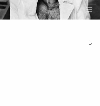
I have a problem with the responsive version of the navbar. I put a background image as below:

inserir a descrição da imagem aqui

For that, I did it that way:

.navbar{
    padding: 1.3rem 1rem;
    background: url('../imagens/barra-superior.png') no-repeat; 
    -webkit-background-size: cover;
    -moz-background-size: cover;
    -o-background-size: cover;
    background-size: cover;
}

But when I try to visualize in the responsive, this image "stretches". See:

inserir a descrição da imagem aqui

The dark gray background of the menu, is like this:

@media only screen and (max-width: 600px) {
    .navbar .navbar-collapse{
        z-index: 999999999999999999999999999999;
        background-color: #343A40;
        padding: 10px;
        margin-top: 20px;
    }
}

How do I make sure the image doesn’t stretch and stay on the gray background picking from end to end?

2 answers

3

Try removing the padding from the responsive menu: as an example below.

@media only screen and (max-width: 600px) {
    .navbar .navbar-collapse{
        z-index: 999999999999999999999999999999;
        background-color: #343A40;
        /*padding: 10px;*/
        margin-top: 20px;
    }
}
  • Hello Renan. Welcome! Unfortunately your tip did not work, I removed the padding: 10px, but the problem persists.

  • You have a link so we can see the project?

  • It is running locally.

1


Man you can fix this padding, using negative margins. All right it’s not very stylish, but customize the navbar BS is always kind of boring even. Besides, you’re using a div.container within the navbar with the rest of the contents inside. The class .container by default already have some spacings that I think are disturbing you... Qq way follows an option with some adjustments.

About Background there is not much to do, as you are using the size cover, it will grow to occupy all the size of the container, That would have been expected... I traded the cover for 100%, I think the result was a little better, but you’ll have to see what is the best option for you, and what is the best size for this image...

OBS: 600px is a @media which is a value that Bootstrap does not use! You will have responsiveness problems "breaking" your CSS rules because of this breacking point does not exist by default on the Bootstrap grid...

inserir a descrição da imagem aqui

<!DOCTYPE html>
<html lang="en">
<head>
    <meta charset="utf-8" />
    <title>Page Title</title>
    <meta name="viewport" content="width=device-width, initial-scale=1">
    <link rel="stylesheet" type="text/css" media="screen" href="https://stackpath.bootstrapcdn.com/bootstrap/4.2.1/css/bootstrap.min.css" />
    <link rel="stylesheet" type="text/css" media="screen" href="https://cdnjs.cloudflare.com/ajax/libs/font-awesome/5.8.2/css/all.min.css" />
<style>
    .navbar {
        padding: 1.3rem 1rem;
        background: url(https://www.placecage.com/400/100) no-repeat; 
        background-size: 100%;
    }
    @media only screen and (max-width: 600px) {
        .navbar .navbar-collapse{
            z-index: 999999999999999999999999999999;
            background-color: #343A40;
            padding: 10px;
            margin-top: 20px;

            margin-left: -16px;
            margin-right: -16px;
            margin-bottom: -22px;
        }
    }
</style>
</head>
<body>
    
        <nav class="navbar fixed-top navbar-expand-lg navbar-dark bg-dark fixed-top">
                <div class="container">
                  <a class="navbar-brand" href="index.html">
                      <!-- <img src="https://www.placecage.com/100/100" class="logo"> -->
                 </a>
                  <button class="navbar-toggler navbar-toggler-right" type="button" data-toggle="collapse" data-target="#navbarResponsive" aria-controls="navbarResponsive" aria-expanded="false" aria-label="Toggle navigation">
                    <span class="navbar-toggler-icon"></span>
                  </button>
                  <div class="collapse navbar-collapse" id="navbarResponsive">
                    <ul class="navbar-nav ml-auto">
                      <li class="nav-item">
                        <a class="nav-link" href="about.html">About</a>
                      </li>
                      <li class="nav-item">
                        <a class="nav-link" href="services.html">Services</a>
                      </li>
                      <li class="nav-item">
                        <a class="nav-link" href="contact.html">Contact</a>
                      </li>
                      <li class="nav-item dropdown">
                        <a class="nav-link dropdown-toggle" href="#" id="navbarDropdownPortfolio" data-toggle="dropdown" aria-haspopup="true" aria-expanded="false">
                          Portfolio
                        </a>
                        <div class="dropdown-menu dropdown-menu-right" aria-labelledby="navbarDropdownPortfolio">
                          <a class="dropdown-item" href="portfolio-1-col.html">1 Column Portfolio</a>
                          <a class="dropdown-item" href="portfolio-2-col.html">2 Column Portfolio</a>
                          <a class="dropdown-item" href="portfolio-3-col.html">3 Column Portfolio</a>
                          <a class="dropdown-item" href="portfolio-4-col.html">4 Column Portfolio</a>
                          <a class="dropdown-item" href="portfolio-item.html">Single Portfolio Item</a>
                        </div>
                      </li>
                      <li class="nav-item dropdown">
                        <a class="nav-link dropdown-toggle" href="#" id="navbarDropdownBlog" data-toggle="dropdown" aria-haspopup="true" aria-expanded="false">
                          Blog
                        </a>
                        <div class="dropdown-menu dropdown-menu-right" aria-labelledby="navbarDropdownBlog">
                          <a class="dropdown-item" href="blog-home-1.html">Blog Home 1</a>
                          <a class="dropdown-item" href="blog-home-2.html">Blog Home 2</a>
                          <a class="dropdown-item" href="blog-post.html">Blog Post</a>
                        </div>
                      </li>
                      <li class="nav-item dropdown">
                        <a class="nav-link dropdown-toggle" href="#" id="navbarDropdownBlog" data-toggle="dropdown" aria-haspopup="true" aria-expanded="false">
                          Other Pages
                        </a>
                        <div class="dropdown-menu dropdown-menu-right" aria-labelledby="navbarDropdownBlog">
                          <a class="dropdown-item" href="full-width.html">Full Width Page</a>
                          <a class="dropdown-item" href="sidebar.html">Sidebar Page</a>
                          <a class="dropdown-item" href="faq.html">FAQ</a>
                          <a class="dropdown-item" href="404.html">404</a>
                          <a class="dropdown-item" href="pricing.html">Pricing Table</a>
                        </div>
                      </li>
                    </ul>
                  </div>
                </div>
              </nav>
    
    <script src="https://code.jquery.com/jquery-3.2.1.min.js"></script>
    <script src="https://cdnjs.cloudflare.com/ajax/libs/popper.js/1.12.9/umd/popper.min.js"></script>
    <script src="https://stackpath.bootstrapcdn.com/bootstrap/4.2.1/js/bootstrap.min.js"></script>
</body>
</html>

  • Hugo ball show. Again, thanks! Today I must ask some more questions, because I have certain difficulties with CSS rs rs rs.

  • 1

    @Fox.11 hahaha Feel Free The goal is 200pt per day CSS is a little understood subject. But I’ll give you a hint, take a week, just a week, and do a CSS intensive, redo tutorials, watch videos etc, 80% of the CSS as a whole is not used, while the other 20% is used 80% of the time ;)

  • Perfect Hugo. Thanks for the tips. I’ll do that yes ;)

Browser other questions tagged

You are not signed in. Login or sign up in order to post.