1
I wanted to help to know if you can do a full page site navigation using only CSS with the idea that I have in mind. I saw a video lesson where using inputs of type radio and Labels to make the transition of the sections vertically with margin-top. I wanted to know some way to put the sections side by side and not one below the other, as indicated in the video, and make the transition horizontally. Follow the short code I copied from the video lesson.
HTML:
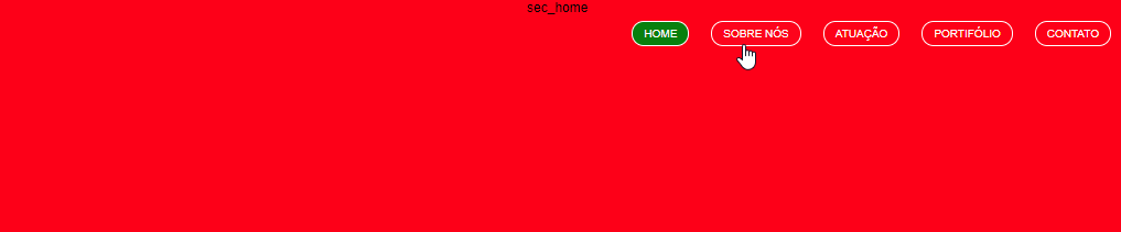
<nav class="links">
    <label for="home">Home</label>
    <label for="sobre">Sobre nós</label>
    <label for="atuacao">Atuação</label>
    <label for="portifolio">Portifólio</label>
    <label for="contato">Contato</label>
</nav>

<div class="scroll">
        <input type="radio" name="grupo" id="home" checked="true">
        <input type="radio" name="grupo" id="sobre">
        <input type="radio" name="grupo" id="atuacao">
        <input type="radio" name="grupo" id="portifolio">
        <input type="radio" name="grupo" id="contato">

        <section class="sections">

            <section class="bloco" id="sec_home"></section>

            <section class="bloco" id="sec_sobre"></section>

            <section class="bloco" id="sec_atuacao"></section>

            <section class="bloco" id="sec_portifolio"></section>

            <section class="bloco" id="sec_contato"></section>

        </section>
</div>
CSS
* {
    margin: 0px;
    padding: 0px;
}

body {
    width: 100vw;
    height: 100vh;
    font-family: arial;
    font-size: 12px;
}

.bloco {
    width: 100vw;
    height: 100vh;
    justify-content: center;
    align-items: flex-start;
    display: flex;
    overflow: hidden;
}

.links {
    width: 100%;
    height: 60px;
    position: fixed;
    display: flex;
    justify-content: flex-end;
    align-items: center;
}

.links label {
    margin: 10px 10px;
    padding: 5px 10px;
    border: 1px solid #ffffff;
    border-radius: 12px;
    cursor: pointer;
    transition: all 0.4s;
    text-align: center;
    font-size: 10px;
    color: #ffffff;
    text-transform: uppercase;
}

.links label:hover {
    color: #000000;
    background: #ffffff;
}

.scroll input {
    display: none;
}

.scroll {
    display: flex;
    width: 100vw;
    height: 100vh;
    overflow: hidden;
}

.sections {
    transition: all 0.4s;
}

#sobre:checked ~ .sections {
    margin-top: -100vh;
}

#atuacao:checked ~ .sections {
    margin-top: -200vh;
}

#portifolio:checked ~ .sections {
    margin-top: -300vh;
}

#contato:checked ~ .sections {
    margin-top: -400vh;
}
Another thing. I modified the Labels (appearance) to look like I wanted and added a different style to change with the Hover (mouse). In this example, would the label related to the display be stylized with the appearance of the Hover? Type, Section Contact being displayed, the Contact label is set to the same settings as the Hover and returns to normal when switching from Section.
Thanks for your attention.