0
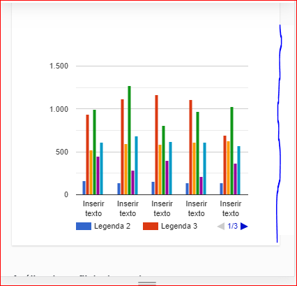
Problem: I created a chart using the google API, but I had to make the chart small so when it’s mobile it won’t break. The problem is desktop size becomes unviable.
How does it have to look: I would like the chart to occupy the size of col 12 desktop and when going to mobile it respects the width of the same.
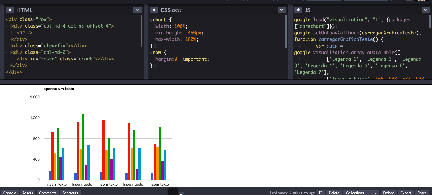
HTML code:
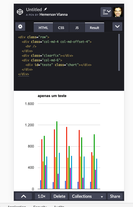
 <div class="row">

    <div class="col-sm-12">
        <div id="" class="card-white">
            <div class="panel-heading">

            </div>
            <div class="panel-body">

                <div class="row">


                        <div class="col-xs-12" id="teste" ></div>


                </div>


            </div>
        </div>
    </div>

</div>
Script:
 function carregarGraficoTeste() {
        // Some raw data (not necessarily accurate)
        var data = google.visualization.arrayToDataTable([
            ['Legenda 1', 'Legenda 2', 'Legenda 3', 'Legenda 4', 'Legenda 5', 'Legenda 6', 'Legenda 7'],
            ['Inserir texto', 165, 938, 522, 998, 450, 614.6],
            ['Inserir texto', 135, 1120, 599, 1268, 288, 682],
            ['Inserir texto', 157, 1167, 587, 807, 397, 623],
            ['Inserir texto', 139, 1110, 615, 968, 215, 609.4],
            ['Inserir texto', 136, 691, 629, 1026, 366, 569.6]
        ]);

        var options = {
            title: 'apenas um teste',
            legend: { position: 'bottom', maxLines: 2 },
            seriesType: 'bars',
            height: 300,
            width: 400

        };

        var chart = new google.visualization.ComboChart(document.getElementById('teste'));
        chart.draw(data, options);
    }
It worked, Johnny.
– Thiago Correa