Option 1
You have two options one is to hide one input and show another depending on the width of the screen, this option is only with CSS and Bootstrap Classes d-block and d-none using the bracking point -sm-
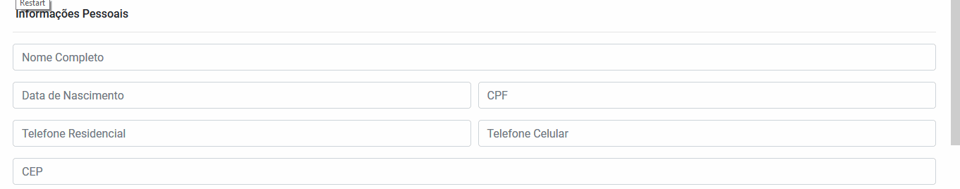
Code of the image above:
<link rel="stylesheet" type="text/css" media="screen" href="https://stackpath.bootstrapcdn.com/bootstrap/4.2.1/css/bootstrap.min.css" />

<div class="container">
    <div class="row">
        <div class="col">
            <div class="form">
                <div class="form-group">
                    <input type="date" class="form-control d-block d-sm-none" id="" aria-describedby="" placeholder="">
                    <input type="text" class="form-control d-none d-sm-block" id="" aria-describedby="" placeholder="">
                </div>
            </div>
        </div>
    </div>
</div>
Option 2
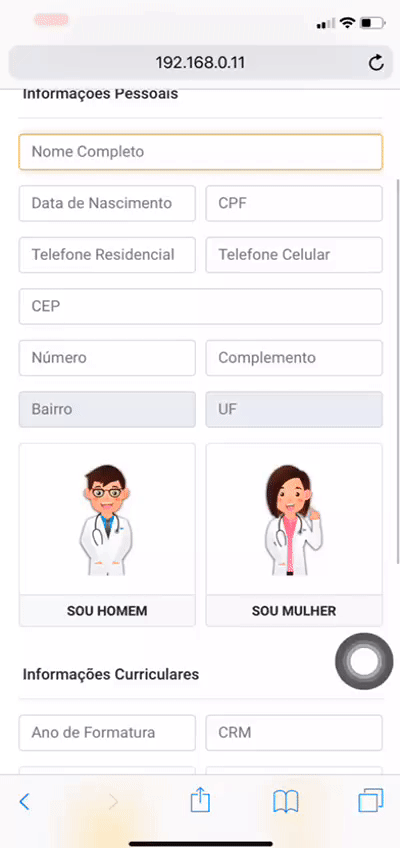
With JS when the screen is larger than X you change the type of input. In case I used what would be the breacking point -sm- bootstrap 540px. When the screen is larger than this I change the type attribute of input for text, if the screen is smaller it looks like type=date
Display all over the page to see input changing from one type to another. In this technique you show only one input and change its type, which is not possible to do in Bootstrap or even with CSS
function myFunction(x) {
    var inp = document.querySelector('#troca')
    if (x.matches) { // If media query matches
        document.getElementById('troca').type = 'date';
    } else {
        document.getElementById('troca').type = 'text';
    }
}

var x = window.matchMedia("(max-width: 540px)")
myFunction(x)
x.addListener(myFunction)
<link rel="stylesheet" type="text/css" media="screen" href="https://stackpath.bootstrapcdn.com/bootstrap/4.2.1/css/bootstrap.min.css" />

<div class="container">
    <div class="row">
        <div class="col">
            <div class="form">
                <div class="form-group">
                    <input type="date" class="form-control" id="troca" aria-describedby="" placeholder="">
                </div>
            </div>
        </div>
    </div>
</div>
What would that be
inputstandard? Would be thetype="text"?– Woss
@Andersoncarloswoss the standard is
type="date", when he is on mobile he will use the date, when he is on devices like notebook/desktop he will use thetype="text".– user148754
Should this answer if I resize the screen? For example, access the desktop and reduce the screen to the size of a mobile
– Woss