It has a very simple way for it one is using calc(), and flex and CSS variable. The other is the hake of padding and maintaining the Aspect-ratio in a more responsive way, because you will see that the padding-top which will create the height is relative to the width of the container
Technique with calc(), and flex and CSS variable
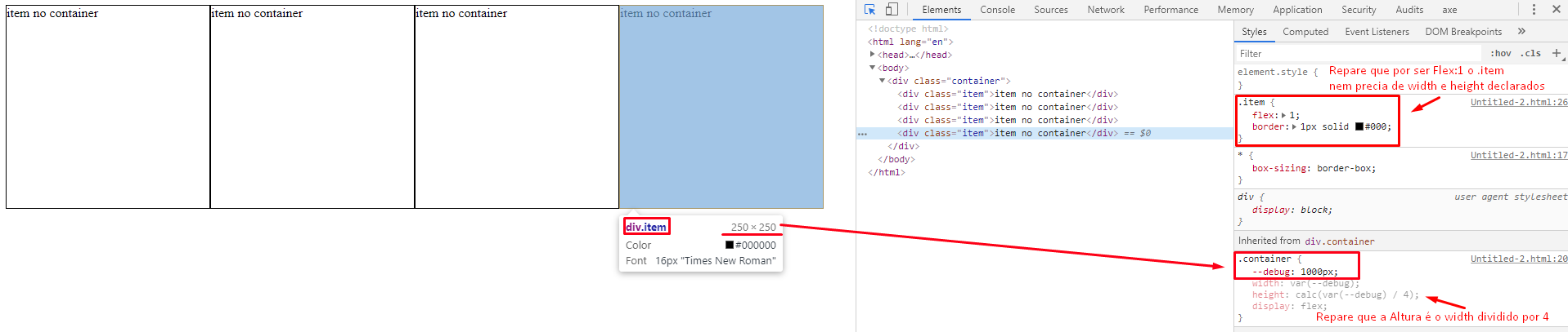
Note that I will declare a value in the variable --debug: ; in the case 1000px and then I’ll declare var(--debug) as width and in the height I’ll use the function calc() of CSS to split var(--debug) by 4, doing so calc(var(--debug) / 4).
Notice the Gif below that as I change the value of the variable --debug the width and proportionally the height tb is changing.
So what we have is a value only that is declared in the variable, this variable I use as width and that same variable of width i divided by 4 in heigth.
See I can still use one Media Queries to change the value of --debug and thus change the whole container proportionally changing only one value. You would have something like this CSS below. Also remembering that you can declare these variables directly in :root as you can read here What does -- specified in bootstrap css :root mean?
@media (max-width: 1000px) {
  .container {
    --debug: 768px;
  }
}
@media (max-width: 768px) {
  .container {
    --debug: 320px;
  }
}
Follow the image code above (Display full page to see responsiveness):
  * {
    box-sizing: border-box;
  }

  .container {
    --debug: 1000px;
    width: var(--debug);
    height: calc(var(--debug) / 4);
    display: flex;
    margin: auto;
  }

.item {
  flex: 1;
  border: 1px solid #000;
}

@media (max-width: 1000px) {
  .container {
    --debug: 600px;
  }
}
@media (max-width: 600px) {
  .container {
    --debug: 480px;
  }
}
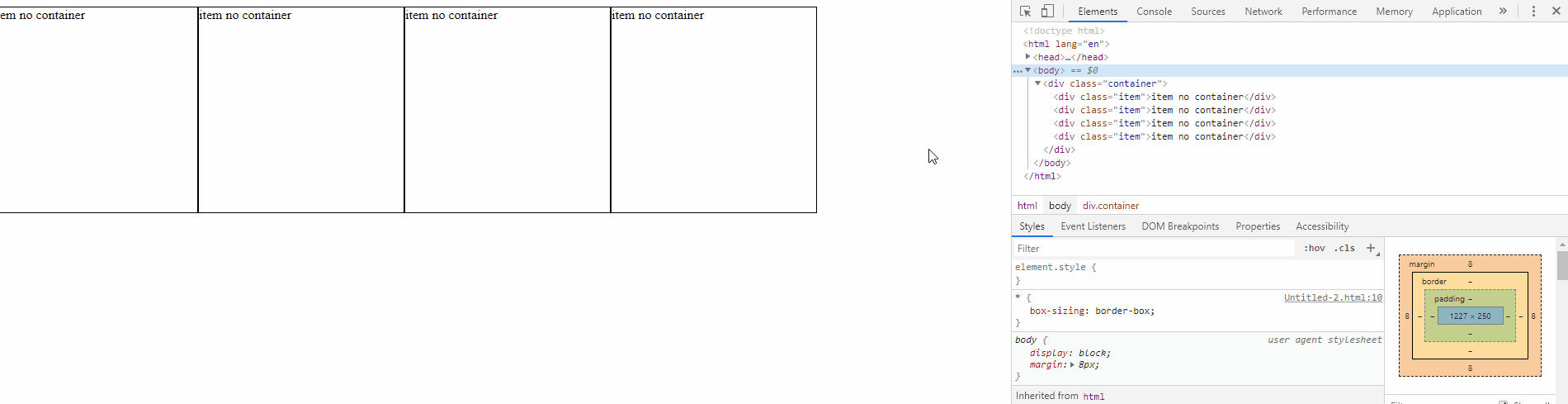
<div class="container">
  <div class="item">item no container</div>
  <div class="item">item no container</div>
  <div class="item">item no container</div>
  <div class="item">item no container</div>
</div>
Technique that leaves the Aspect-ratio of container using padding-top
Notice that I now have two containers, one .container and within it the container .pai who is the father of .item.
The padding-top is relative to the width of the element, so I have a first container no defined width and as a padding-top of 25%, that is to say 1/4 height of the element itself. For that padding not to push the internal content down I needed another container, the container .pai who is with position:absolute and has 100% of height and width of .container main that is his father.
That one container .pai has display:flex and their children flex:1 to be divided equally into 4 portions of the .pai.
* {
  box-sizing: border-box;
}
.container {
  position: relative;
  /* overflow: auto; */
  border: 1px solid #f00;
  padding-top: 25%;
}
.pai {
  position: absolute;
  width: 100%;
  height: 100%;
  top: 0;
  left: 0;
  display: flex;
}
.item {
  flex:1;
  border: 1px solid #000;
}
<div class="container">
  <div class="pai">
      <div class="item">item no container</div>
      <div class="item">item no container</div>
      <div class="item">item no container</div>
      <div class="item">item no container</div>
  </div>
</div>