Change the size of an image by device

Asked

Viewed 326 times

0

How do I change the size of an image according to the device? I have the code below:

 <div class="header-outs" id="header">
    <div class="slider">
     <div class="callbacks_container">       
        <ul class="rslides" id="slider4">
              <li>
           <div class="slider-img one-img">
              <div class="container">
           <div class="slider-info ">
                    <div class="bottom-info">
                 <div class="col-mb-4">
                 <img src="images/logo.png" class="logoMarca">
              </div>
              <div class="col-md-12 text-center">
                 <p style="font-size: 48px;
                          line-height: 80px; 
                          font-weight: 800; 
                          margin-top: -12px; 
                          text-shadow: 2px 2px #000;">SEJA BEM-VINDO <br>AO NOSSO SITE</p>
                                                  </div>
              </div>
                 </div>
              </div>
           </div>
          </li>
    ....

In CSS I tried that way, but I couldn’t:
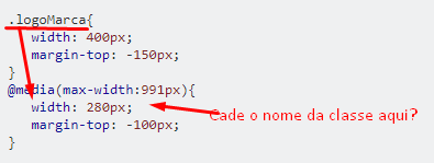
.logoMarca{
   width: 400px; 
   margin-top: -150px;
}
@media(max-width:991px){
   width: 280px; 
   margin-top: -100px;
}

I’m using Bootstrap 4 and I’ve tried img-Fluid, but nothing!

  • Enter full text markup (HTML), and don’t forget CSS either...

  • Hello Thiago. HTML code has more than 600 lines and CSS more than 1900. The section I passed is isolated, that is, before it comes the beginning of the body tag. If it makes it necessary to put all this?

  • When I say everything is only the part related to your question, for example in the HTML above can the code until it closes the first DIV, so the CSS you put the classes you used in the DIVS parent image.

3 answers

2


Use HTML5/CSS3 features (picture, srcset and Sizes) (See caniuse support)

https://css-tricks.com/responsive-images-css/

OR

Use bootstrap grid and responsiveness with multiple images

<div class="col-xs-4">
    <img src="images/logo.png" class="img-fluid">
</div>
<div class="col-md-4">
    <img src="images/logo2.png" class="img-fluid">
</div>
<div class="col-lg-4">
    <img src="images/logo3.png" class="img-fluid">
</div>

OR

Use multiple images and multiple classes

   <img src="images/logo.png" class="img-fluid logo">
   <img src="images/logo2.png" class="img-fluid logo2">
   <img src="images/logo3.png" class="img-fluid logo3">

   @media(max-width:991px){
      logo { display: none }
      logo2 { display: none }
      /* demais classes */
   }

OR

Use a div instead of img

<div class="logoMarca"></div>

.logoMarca{
   background-image: url("../images/logo.png"); /* Imagino que o CSS esteja em uma pasta separada*/
   background-size: contain;
   background-repeat: no-repeat;
   width: 400px; 
   margin-top: -150px;
}
@media(max-width:991px){
   width: 280px; 
   margin-top: -100px;
}
  • This solution is gambiarra, flees from good practices.

  • 1

    @THIAGODEBONIS can explain his best comment, what exactly in the 3 options "run away from good practices"? What would be the alternative?

1

The way you wrote your @media is wrong! You have to repeat the class name within the { .logoMarca {...} } of @media or else CSS won’t know which element to apply the properties to. (Your error has nothing to do with Bootstrap or img-Fluid or grid)

inserir a descrição da imagem aqui

In your code it is so see, note that you do not declare the class within the { } of @media

inserir a descrição da imagem aqui

The right is to declare the CSS as below and so it should work!

.logoMarca {
	width: 400px;
	margin-top: -150px;
}

@media(max-width:991px) {
	.logoMarca {
		width: 280px;
		margin-top: -100px;
	}
}
<img class="logoMarca" src="https://placecage.com/100/100">

0

Uses css grid or flex-box but if you prefer with @media put (min-width: 991px) to minimize the screen not maximum Here’s my grid template if you want to take a look: https://pastebin.com/P2Lz0qJz

  • Port the code in your reply here, the OS supports code and can even run, off an external domain may be deleted tomorrow or still someone may not have access

  • @media(Nin-width:991px){ width: 280px; margin-top: -100px; }

Browser other questions tagged

You are not signed in. Login or sign up in order to post.