How to create an infinite slide similar to Instagram?

Asked

Viewed 203 times

1

I’m trying to create an infinite slide similar to the one on the main instagram page, using only CSS3 and the BOOTSTRAP.

I’m having the following difficulties:

  • Create the right effect
  • Images should be over the white smartphone

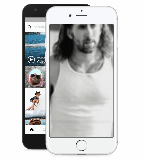
How the effect should work (see instagram site to better understand):

  • The first image should already be open
  • After certain seconds you must switch to the next image
  • Arriving at the last image he returns to the first

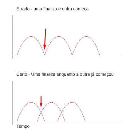
Figure illustrative of the problem inserir a descrição da imagem aqui

CSS3

    <style>


.foto {
    opacity: 0;
    animation-name: animacao;
    animation-duration: 20s;
    animation-iteration-count: infinite;
}

@keyframes animacao {
    25% {
        opacity: 1;
        transform: scale(1.1, 1.1);
    }

    100% {
        opacity: 0;
    }
}

.foto:nth-child(1) {
 animation-delay: 0;
}

.foto:nth-child(2) {
    animation-delay: 10s;
}

.foto:nth-child(3) {
    animation-delay: 15s;

}

.foto:nth-child(4) {
    animation-delay: 20s;

}

.foto:nth-child(5) {
    animation-delay: 25s;

}
    </style>

HTML5 + BOOTSTRAP

<div class="container-fluid h-100 mt-lg-0">
            <div class="row align-items-center h-100">
                <!-- SMARTPHONES IMAGE -->
                <div class="col-lg-7 d-none d-lg-block mb-5 py-5" style="border: 0px red solid; background-image: url('/dist/img/9364675fb26a.png');background-size: 28rem; background-position: top right; background-repeat: no-repeat;">
                    <div class="d-flex justify-content-end mt-4 mr-4 mb-5 pt-3 pr-3">
                        <div class="galeria">
                            <img src="/dist/img/d6bf0c928b5a.jpg" alt="Responsive image"  class="foto" style="border: 1px rgba(0,0,0, .2) solid; width: 15.5rem;">
                            <img src="/dist/img/177140221987.jpg" alt="Responsive image"  class="foto" style="border: 1px rgba(0,0,0, .2) solid; width: 15.5rem;">
                            <img src="/dist/img/ff2c097a681e.jpg" alt="Responsive image"  class="foto" style="border: 1px rgba(0,0,0, .2) solid; width: 15.5rem;">
                            <img src="/dist/img/b27a108592d8.jpg" alt="Responsive image"  class="foto" style="border: 1px rgba(0,0,0, .2) solid; width: 15.5rem;">
                            <img src="/dist/img/5e04169b9308.jpg" alt="Responsive image"  class="foto" style="border: 1px rgba(0,0,0, .2) solid; width: 15.5rem;">
                        </div>
                    </div>
                </div>
           </div>
      </div>
  • 1

    Eh to be running alone automatically passing the images?

  • @hugocsl yes dear! Infinitely..

1 answer

2


Your animation has a few problems, and the main thing is that it takes 0% to 25% to be visible, and then it takes 25% to 100% to disappear. This means that if the animation has 20s it takes 5s to appear and 15s to disappear, this is wrong because while it is disappearing will already have other elements appearing... you have to balance this time like 10s to appear and 10s to disappear.

Another problem is that in the element nth(5) you have a delay 25s which is longer than the animation time itself which is 20s, this cannot work, this timing will not hit! Bootstrap’s Grid tb I thought it was kind of strange the way you put it together, but I’m not even going into it... I’m going to focus on the animation...

inserir a descrição da imagem aqui

Notice that you should not finish one animation before starting another. And to control this you have to work on your @keyframes, making the animation start a little earlier and finish a little later than it would be the exact interval.

inserir a descrição da imagem aqui

As I did the animation with 4 image in a range of 10s I have 3 delays 2.5s, the first image does not need delay. And as mine @keyframes is 0% to 100% and have 4 image my animation has to happen between 0% and 25%, (100/4 = 25).

The detail is that I made the animation end in 30% and not 25% in order to make the overlap animation, as shown in the graphic. This means that the animation actually takes about 3s to happen, but the delay is 2.5s, so I start an animation "on top of each other", but in a controlled and equalized way.

Follow the image code above.

html,
body {
    width: 100%;
    height: 100%;
    margin: 0;
    padding: 0;
}

.box {
    position: relative;
    display: flex;
    justify-content: center;
    align-items: center;
    height: 572px;
}

.box .bg,
.box .slide {
    position: absolute;
}

.box .slide {
    height: 436px;
    width: 247px;
    background-color: rgba(51, 51, 51, 1);
    border-radius: 5px;
    transform: translate(44px, 4px);
    overflow: hidden;
    box-sizing: border-box;
    border: 1px solid #666;
}
.box .slide img {
    width: 100%;
    height: 100%;
    object-fit: cover;
    position: absolute;
    top: 0;
    left: 0;
    opacity: 1;
    animation: fade1 10s infinite linear;
}
.box .slide img:nth-child(1) {
}
.box .slide img:nth-child(2) {
    opacity: 0;
    animation-delay: 2.5s;
}
.box .slide img:nth-child(3) {
    opacity: 0;
    animation-delay: 5s;
}
.box .slide img:nth-child(4) {
    opacity: 0;
    animation-delay: 7.5s;
}
@keyframes fade1 {
    0% {
        opacity: 0;
    }
    0% {
        opacity: 0;
    }
    5% {
        opacity: 1;
    }
    25% {
        opacity: 1;
    }
    30% {
        opacity: 0;
    }
    100% {
        opacity: 0;
    }
}
<link rel="stylesheet" type="text/css" media="screen" href="https://stackpath.bootstrapcdn.com/bootstrap/4.2.1/css/bootstrap.min.css" />

<div class="container-fluid h-100 mt-lg-0">
    <div class="row align-items-center h-100">
        <!-- SMARTPHONES IMAGE -->
        <div class="col-lg-7 mb-5 py-5">
            <div class="d-flex justify-content-end mt-4 mr-4 mb-5 pt-3 pr-3">
                <div class="box">
                    <img class="bg" src="https://www.instagram.com/static/images/homepage/home-phones.png/43cc71bb1b43.png">
                    <div class="slide">
                        <img src="https://placecage.com/100/100">
                        <img src="https://placecage.com/100/105">
                        <img src="https://fillmurray.com/100/100">
                        <img src="https://fillmurray.com/100/105">
                    </div>
                </div>
            </div>
        </div>
    </div>
</div>

Browser other questions tagged

You are not signed in. Login or sign up in order to post.