0
Hello I have a problem formatting form in which input is overwriting the label when the screen is decreased and I wanted it to position above the input when the screen size was decreased.
Techo html
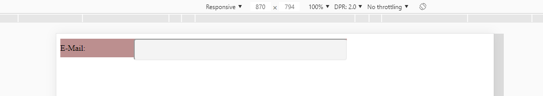
 <div class="container_form_user">
            <label class="label_form" for="">E-Mail:
                  <input class="input_form_user" type="text">
            </label>
 </div>
Css style
    .container_form_user{
    max-width: 570px;
    background-color: blue;
    position: relative;

}
.label_form{
    display: block;
    margin: 10px  0 10px;
    line-height: 37px;
    background-color:rosybrown;
}


.input_form_user{
    height:37px;
    max-width:420px;
    width: 100%;
    background-color: #f4f4f4;
    border-radius:5px;
    position: absolute;
    resize: none;
    right: 0;
}
The input has the same size as label_form and is in Absolute, as the label form has a margin above, the input does not respect this margin as child, so overwrite, try to put position: Absolute; for position: relative; in input
– Anderson Henrique
I had done this before and it worked, but the result I want is that the input is all shifted to the right and the label to the left that in relation to the container.
– Richard Carlos