Align images with CSS or bootstrap

Asked

Viewed 68 times

1

I have several images that are as follows:

inserir a descrição da imagem aqui

Code on the front end:

<div class="linha">
    <div class="coluna">
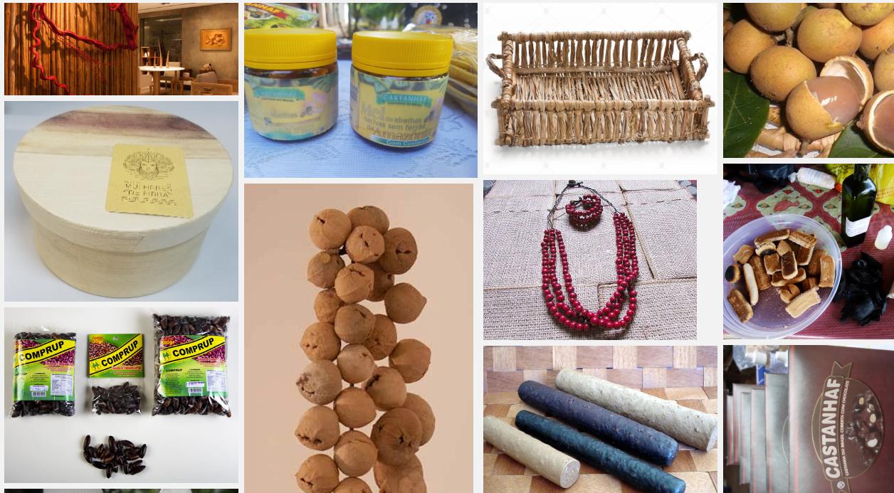
        <img src="~/Areas/ModuloPublico/Content/img/Home/Artesanato com cipó.jpg" style="max-height:100%;max-width:100%" alt="Artesanato com cipó">
        <img src="~/Areas/ModuloPublico/Content/img/Home/Artesanato com fibra de bananeira - Associação Mulheres de Fibra_editado.jpg" style="max-height:100%;max-width:100%" alt="Artesanato com fibra de bananeira - Associação Mulheres de Fibra">
        <img src="~/Areas/ModuloPublico/Content/img/Home/Castanha de cumbaru.jpg" style="max-height:100%;max-width:100%" alt="Castanha de cumbaru">
        <img src="~/Areas/ModuloPublico/Content/img/Home/Oleo de copaíba_editado.jpg" style="max-height:100%;max-width:100%" alt="Óleo de copaíba">
    </div>
    <div class="coluna">
        <img src="~/Areas/ModuloPublico/Content/img/Home/Mel de abelha nativa sem ferrão com Castanha do Brasil.jpg" style="max-height:100%;max-width:100%" alt="Mel de abelha nativa sem ferrão com Castanha do Brasil">
        <img src="~/Areas/ModuloPublico/Content/img/Home/minicolar com sementes_editada.jpg" style="max-height:100%;max-width:100%" alt="Minicolar com Sementes">
    </div>
    <div class="coluna">
        <img src="~/Areas/ModuloPublico/Content/img/Home/Cesto de buriti.jpg" style="max-height:100%;max-width:100%" alt="Cesto de buriti">
        <img src="~/Areas/ModuloPublico/Content/img/Home/Colar produzido com açaí.jpg" style="max-height:100%;max-width:100%" alt="Colar produzido com açaí">
        <img src="~/Areas/ModuloPublico/Content/img/Home/Guaraná em formato de bastão.jpg" style="max-height:100%;max-width:100%" alt="Guaraná em formato de bastão">
        <img src="~/Areas/ModuloPublico/Content/img/Home/Castanha do Brasil in Natura.jpg" style="max-height:100%;max-width:100%" alt="Castanha do Brasil in Natura">
    </div>
    <div class="coluna">
        <img src="~/Areas/ModuloPublico/Content/img/Home/Pitomba.jpg" style="max-height:100%;max-width:100%" alt="Pitomba">
        <img src="~/Areas/ModuloPublico/Content/img/Home/Biscoito de babaçu.jpg" style="max-height:100%;max-width:100%" alt="Biscoito de babaçu">
        <img src="~/Areas/ModuloPublico/Content/img/Home/Castanha do Brasil coberta com chocolate.jpg" style="max-height:100%;max-width:100%" alt="Castanha do Brasil coberta com chocolate">
        <img src="~/Areas/ModuloPublico/Content/img/Home/Farinha de babaçu aberta.jpg" style="max-height:100%;max-width:100%" alt="Farinha de babaçu aberta">
    </div>
</div>

CSS applied:

.linha {
    display: flex;
    flex-wrap: wrap;
    padding: 0 4px;
}

/* Create four equal columns that sits next to each other */
.coluna {
    flex: 25%;
    max-width: 25%;
    padding: 0 4px;
}

    .coluna img {
        margin-top: 8px;
        vertical-align: middle;
    }

/* Responsive layout - makes a two column-layout instead of four columns */
@media screen and (max-width: 800px) {
    .coluna {
        flex: 50%;
        max-width: 50%;
    }
}

/* Responsive layout - makes the two columns stack on top of each other instead of next to each other */
@media screen and (max-width: 600px) {
    .coluna {
        flex: 100%;
        max-width: 100%;
    }

How do I align images so that they are all the same size ?

  • edit and ask and post the code to make it easier for someone to help you.

  • edited posted the css being applied

  • The same size as? It has horizontal, vertical and square images.

2 answers

2


Your biggest problem even is that you’re using max- in the width and height in the image, when in fact it should use only width and height, without the max- in front. Because using max- vc limits the width of the image to the original file size, and not to the size available in container.

Adjusting it stayed that way

inserir a descrição da imagem aqui

Follow the image code above

* {
    box-sizing: border-box;
}
.linha {
    display: flex;
    flex-wrap: wrap;
    padding: 0 4px;
}

/* Create four equal columns that sits next to each other */
.coluna {
    flex: 25%;
    max-width: 25%;
    padding: 0 4px;
}

    .coluna img {
        margin-top: 8px;
        vertical-align: middle;
        object-fit: cover;
    }

/* Responsive layout - makes a two column-layout instead of four columns */
@media screen and (max-width: 800px) {
    .coluna {
        flex: 50%;
        max-width: 50%;
    }
}

/* Responsive layout - makes the two columns stack on top of each other instead of next to each other */
@media screen and (max-width: 600px) {
    .coluna {
        flex: 100%;
        max-width: 100%;
    }
}
<div class="linha">
    <div class="coluna">
        <img src="https://placecage.com/100/100" style=" height:auto; width:100%" alt="Artesanato com cipó">
        <img src="https://placecage.com/200/100" style=" height:auto; width:100%" alt="Artesanato com fibra de bananeira - Associação Mulheres de Fibra">
        <img src="https://placecage.com/100/200" style=" height:auto; width:100%" alt="Castanha de cumbaru">
        <img src="https://placecage.com/100/100" style=" height:auto; width:100%" alt="Óleo de copaíba">
    </div>
    <div class="coluna">
        <img src="https://placecage.com/200/100" style=" height:auto; width:100%" alt="Mel de abelha nativa sem ferrão com Castanha do Brasil">
        <img src="https://placecage.com/100/100" style=" height:auto; width:100%" alt="Minicolar com Sementes">
    </div>
    <div class="coluna">
        <img src="https://placecage.com/100/200" style=" height:auto; width:100%" alt="Cesto de buriti">
        <img src="https://placecage.com/200/100" style=" height:auto; width:100%" alt="Colar produzido com açaí">
        <img src="https://placecage.com/100/200" style=" height:auto; width:100%" alt="Guaraná em formato de bastão">
        <img src="https://placecage.com/100/100" style=" height:auto; width:100%" alt="Castanha do Brasil in Natura">
    </div>
    <div class="coluna">
        <img src="https://placecage.com/100/100" style=" height:auto; width:100%" alt="Pitomba">
        <img src="https://placecage.com/100/200" style=" height:auto; width:100%" alt="Biscoito de babaçu">
        <img src="https://placecage.com/100/200" style=" height:auto; width:100%" alt="Castanha do Brasil coberta com chocolate">
        <img src="https://placecage.com/100/100" style=" height:auto; width:100%" alt="Farinha de babaçu aberta">
    </div>
</div>

  • good morning friend, thanks for the answer, however I need all to be aligned equal, without having this "break" margin between them, that way the images are misaligned, and there is a lot of leftover from some images, I need them all to be the same size, or at least they "finish" on the same line, https://imgur.com/a/SEZ44fO in this case the penultimate image is very low, you would need it to end on the same line as the others even if you had to reduce the size of the photo.

  • In that case just put beyond the height:auto one max-height 100 px for example. Then in the class .coluna img { } you include a max-height: 100px; besides the other properties you already have there, ai vc will have this result http://prntscr.com/nrd4xe

  • pq only works with 100px? if I put 200px or 300px they already misalign again....

  • @Standalone really only worked pq 100px is the standard height of the smallest image. But for your case you will have to do differently. First you take the max-height: 100px; class .coluna img { }. Then in the tag img in the HTML where it is height:auto you put the same value for all image, like <img src="..." style=" height:150px; width:100%" >. You have to put the same height for all the images and then it will always be aligned and proportional. Test there when doubt speaks to me

  • thank you very much, that’s what I wanted!

  • @Standalone without any problems

Show 1 more comment

-2

  • Put Width and height on Ivs.
  • Place a class that will receive the images as background.
  • In the class put the background-repeat:no-repeat and background-sixe:cover attributes

Browser other questions tagged

You are not signed in. Login or sign up in order to post.