1
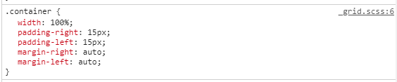
The banner of my site is running well on monitor up to 15 inches. From resolutions above these banners get very large and generate horizontal bar on the site. As in the image below: [![https://i.stack.Imgur.com/gwK2Z.jpg][1]][1]
Follows the code
html:
<div id="carouselExampleIndicators" class="carousel slide" data-ride="carousel">
  <ol class="carousel-indicators">
    <li data-target="#carouselExampleIndicators" data-slide-to="0" class=""></li>
    <li data-target="#carouselExampleIndicators" data-slide-to="1" class="active"></li>
    <li data-target="#carouselExampleIndicators" data-slide-to="2" class=""></li>
  </ol>
  <div class="carousel-inner slides">
    <div class="carousel-item">
      <img src="img/slider1.jpg" class="d-block w-100 slides" alt="...">
      <div class="carousel-caption">
          <h3>Criação de Sites</h3>
        </div>
    </div>
    <div class="carousel-item active">
      <img src="img/slider2.jpg" class="d-block w-100 slides" alt="...">
      <div class="carousel-caption">
          <h3>Design para Web</h3>
    </div>
    </div>
    <div class="carousel-item">
      <img src="img/slider3.jpg" class="d-block w-100 slides" alt="...">
      <div class="carousel-caption">
          <h3>Redes Sociais</h3>
    </div>
    </div>
  </div>
  <a class="carousel-control-prev" href="#carouselExampleIndicators" role="button" data-slide="prev">
    <span class="carousel-control-prev-icon" aria-hidden="true"></span>
    <span class="sr-only">Anterior</span>
  </a>
  <a class="carousel-control-next" href="#carouselExampleIndicators" role="button" data-slide="next">
    <span class="carousel-control-next-icon" aria-hidden="true"></span>
    <span class="sr-only">Próximo</span>
  </a>
</div>


css:


body {
  overflow-x: hidden;
  padding-top: 75px;
}


.slides {
    width: 100vw;
}

#carouselExampleIndicators {
    max-width: 100vw;
    overflow-x: hidden;
}
![https://i.stack.Imgur.com/gwK2Z.jpg][1]][1]](https://i.stack.imgur.com/gwK2Z.jpg][1]][1])
Here this code worked normal without scroll bar!
– hugocsl
What is the resolution and inches of your monitor? on large monitors per test site appears with horizontal bar http://whatismyscreenresolution.net/multi-screen-test?site-url=https://mdwebdesign.Tk/test.html&w=1920&h=1200 but the google Chrome console appears normal at all resolutions, Already in these test resolution sites, when the monitor is greater than 15 inches always appears horizontal bar
– matheusdouradobr
Look how it is here, without Horizontal bar https://imgur.com/jsknuHe. vc has the link of the site that is with the problem?
– hugocsl
Yes, the link is https://mdwebdesign.tk/
– matheusdouradobr
Dude your problem is that you put the Carousel inside a Container with a Row inside.... Actually in this case the carousel should not be "wrapped" by the container tag or Row. Caroucel must be off those tags, right on the body, or else take the class
container-fluidof Ction, and the classrowof the div outside the Carousel. If it works out, tell me which I put as answer– hugocsl
this link https://mdwebdesign.tk/teste.html is already without these tags and even in the test resolution sites the horizontal bar appears in the large resolutions http://whatismyscreenresolution.net/multi-screen-test?site-url=https://mdwebdesign.Tk/teste.html&w=1920&h=1200
– matheusdouradobr
Face here for me the screen does not have this scroll http://prntscr.com/noly77
– hugocsl
I believe that after overflow-x: Hidden in the body is all working well. Even some resolution test sites appear horizontal bar, By Chrome console does not appear bar and a colleague of mine tested on his 21 inch monitor and did not appear bar after I put overflow-x: Hidden in body
’s css;I think the error is now of these test resolution sites and not of the site itself, I believe it is running well in all resolutions Thank you
– matheusdouradobr
Yes Matheus the problem may be with these sites, they are not very reliable, I tested in various resolutions and nothing from the bar, and when I tested I took the body overflow and even then did not appear the bar. If it’s no problem for you I can post as an answer to you accept it , so the question is not open even if it has already been solved.
– hugocsl
OK Thank you I will do this, just help me please, because it appears in Chrome Island percentage in resolutions, there when I put at 100% if this in 1920 x 1200, the resolution goes to 1399 x 595
– matheusdouradobr
Dude, I left you the answer. About this problem with Dev Tools I do not know how to say why your is like this, maybe if your monitor is of high density type Retina, can present this behavior, in the most it should be possible to adjust the morning of the window dragging around here or typing the http number://prntscr.com/npjs5a
– hugocsl
Okay Hugo Thanks
– matheusdouradobr