How to add an image next to another HTML usage

Asked

Viewed 847 times

3

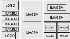
I would like to make a website with the image template below. I started the code and managed to formulate the first column, but I’m not able to add the second column at the top of the site. The code I’ve made so far is as follows::

     <header>
          <div id="parte1">
               <h1><img src="logo.png" alt="Logo do site"></h1>
               <p><a href="#"/a><img src="almox%20menu.png" alt="Botão menu almox"></a></p>
               <p><a href="#"/a><img src="GPI%20menu.png" alt="Botão menu GPI"></a></p>
               <p><a href="#"/a><img src="embalagem%20menu.png" alt="Botão menu embalagem"></a></p>
               <p><a href="#"/a><img src="menu%20backoffice.png" alt="Botão menu backoffice"></a></p>
               <p><a href="#"/a><img src="restrito%20menu.png" alt="Botão menu restrito"></a></p>
               <h2><img src="logo%20rodape.png" alt="Logo rodape"></h2>     

         </div>

         <div id="parte2">
              <p><a href="#"></a><img src="livro%20fiscal%20menu.png" alt="Botão menu livro fiscal"></p>
         </div>

     </header>
</body>
</html>
#parte1{
    width: 390px;
    margin: 0;
    background: rgb(8,8,8);
}

header h1{
    padding: 30px 50px 50px 50px;
}

header p{
    padding: 0px 50px 50px 50px;

}
header h2{

padding: 0px 60px 20px 110px;

}

#parte2{
   width: 430px;
   margin: 410px;
   background: rgb(8,8,8);

}

inserir a descrição da imagem aqui

1 answer

1

I made this model with Flex, but I would actually indicate the Grid, only that the Flex has a better support and is easier to adjust if you need.

It was very responsive even, but I suggest making some @media to treat small canvases.

inserir a descrição da imagem aqui

Follow the code of the image above, I did in the rush, can be optimized for sure, but I’ll leave it to you!

* {
  box-sizing: border-box;
  text-align: center;
}
html, body {
  width: 100%;
  height: 100%;
  margin: 0;
  padding: 0;
}
div {
  border: 1px solid #000;
}
.container {
  height: 100%;
  display: flex;
}
.b1 {
  width: 20%;
  height: 100%;
  display: flex;
  flex-direction: column;
}
.b1 * {
  margin: auto;
}
.b2 {
  width: 30%;
  height: 100%;
  display: flex;
  flex-direction: column;
  justify-content: space-between;
}
.b3 {
  width: 50%;
  height: 100%;
  display: flex;
  flex-direction: column;
}
.pai {
  /* align-self: flex-end; */
  /* margin-top: auto; */
  display: flex;
  flex-wrap: wrap;
  margin: auto 0 0;
  height: 50%;
}
.pai:first-child {
  flex-direction: column;
}

.d4 {
  min-width: 50%;
  display: flex;
  justify-content: center;
  align-items: center;
}
.img1 {
  width: 100%;
  height: 100%;
  object-fit: cover;
  /* max-height: 200px; */
}
img{
  display: block;
  margin: auto;
}
.box.bg {
  display: flex;
  justify-content: center;
  align-items: center;
  flex: 1;
}
.g {
  height: 60%;
}
.p {
  height: 40%;
}

  
<div class="container">
  <div class="b1">
    <div class="logo">logo</div>
    <img src="https://placecage.com/100/100"><br>
    <img src="https://placecage.com/100/100"><br>
    <img src="https://placecage.com/100/100">
    <div class="logo2">logo2</div>
  </div>
  <div class="b2">
    <div class="box bg">
      <img src="https://placecage.com/100/100">
    </div>
    <div class="box">
      <img class="img1" src="https://placecage.com/100/100">
    </div>
  </div>
  <div class="b3">
    <div class="pai">
      <div class="box bg">
        <img src="https://placecage.com/100/100">
      </div>
      <div class="box p">
        <img class="img1" src="https://placecage.com/100/100">
      </div>
    </div>
    <div class="box pai">
      <div class="d4 g">
        <img src="https://placecage.com/100/100">
      </div>
      <div class="d4 g">
        <img src="https://placecage.com/100/100">
      </div>
      <div class="d4">
        <img class="img1" src="https://placecage.com/100/100">
      </div>
      <div class="d4">
        <img class="img1" src="https://placecage.com/100/100">
      </div>
    </div>
  </div>
</div>

  • Thanks for your help!!

  • 1

    @Ketlyn if you think the answer answers the question remember to mark the next to the little arrows on the left at the top of my answer ;)

Browser other questions tagged

You are not signed in. Login or sign up in order to post.