2
The animation that I want is basically when I give Hover in the fingerprint div the border is in loading for 3 seconds (an animation of type progressbar, starting from 0 and reaching the end of the circle).
2
The animation that I want is basically when I give Hover in the fingerprint div the border is in loading for 3 seconds (an animation of type progressbar, starting from 0 and reaching the end of the circle).
3
Here is an example. The main point is to animate a pseudo-element in the :hover of div father. Thus you avoid to rotate directly the father and then the son too. Moreover in the interection-count of animation you put the value of 3 to rotate only 3x and then stop, ie 3 turns in 3 seconds (each spinner has 1s and since 3 spins totals 3 seconds, I left comments in the code). To give the appearance of spin of load just vc put one of the edges with transparent color, I used border-bottom-color: transparent; to give that effect.

Follow the image code above.
.icon {
  display: flex;
  justify-content: center;
  align-items: center;
  position: relative;
  width: 48px;
  height: 48px;
}
.icon::after {
  content: "";
  position: absolute;
  top: 0;
  left: 0;
  width: 100%;
  height: 100%;
  box-sizing: border-box;
  border: 5px solid #000;
  border-radius: 50%;
}
.icon:hover::after {
  animation: gira 1s linear; /* 1s é o tempo da animação de cada giro */
  animation-iteration-count: 3; /* 3 é a quantidade de giros, 3 giros = 3 segundos */
}
@keyframes gira {
  0% {
    transform: rotate(0deg);
    border-bottom-color: transparent;
  }
  100% {
    border-bottom-color: transparent;
    transform: rotate(360deg);
  }
}
<div class="icon">
  <img src="https://placecage.com/24/24">
</div>2
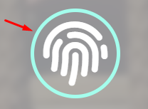
You can use spans along with the icon fingerprint. Then just work with one keyframes to make the animation by rotating two spans in sequence: the one on the right starts the animation immediately by completing the circle halfway, while the one on the left starts after 1.5 seconds when the right starts, and the two animations last 1.5 seconds, totaling 3 seconds of animation.
The duration time is adjustable, just change the values:
 // PRIMEIRA ANIMAÇÃO
.fingerprint:hover .progress-right .progress-bar{
   animation: loading 1.5s linear forwards;
                       ↑
                    duração
}

// SEGUNDA ANIMAÇÃO
.progress:hover .progress-left .progress-bar{
   animation: loading 1.5s linear forwards 1.5s;
                       ↑                    ↑
                    duração           tempo de atraso
}
If you want to make size adjustments, you do not touch anything except the properties width and height of the elements and font-size of the icon.
See working (mouse over the icon):
.progress *{
box-sizing: border-box;
}
.progress{
width: 130px;
height: 130px;
position: absolute;
top: 0;
left: 0;
}
.progress > span{
width: 50%;
height: 100%;
overflow: hidden;
position: absolute;
top: 0;
}
.progress .progress-bar{
width: 100%;
height: 100%;
border: 5px solid transparent;
position: absolute;
top: 0;
}
.progress .progress-left .progress-bar{
left: 100%;
border-top-right-radius: 80px;
border-bottom-right-radius: 80px;
border-left: 0;
-webkit-transform-origin: center left;
transform-origin: center left;
}
.progress .progress-right .progress-bar{
left: -100%;
border-top-left-radius: 80px;
border-bottom-left-radius: 80px;
border-right: 0;
-webkit-transform-origin: center right;
transform-origin: center right;
}
.progress .progress-right{
right: 0;
}
.progress .progress-bar{
border-color: #8fa09c;
}
@keyframes loading{
0%{
-webkit-transform: rotate(0deg);
transform: rotate(0deg);
}
100%{
-webkit-transform: rotate(180deg);
transform: rotate(180deg);
}
}
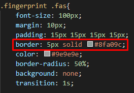
.fingerprint .fas{
font-size: 100px;
padding: 15px;
color: #9e9e9e;
}
.fingerprint{
display: inline-block;
width: 130px;
height: 130px;
position: relative;
margin: 10px;
}
.fingerprint:hover .progress-right .progress-bar{
animation: loading 1.5s linear forwards;
}
.progress:hover .progress-left .progress-bar{
animation: loading 1.5s linear forwards 1.5s;
}<link rel="stylesheet" href="https://use.fontawesome.com/releases/v5.7.2/css/all.css" integrity="sha384-fnmOCqbTlWIlj8LyTjo7mOUStjsKC4pOpQbqyi7RrhN7udi9RwhKkMHpvLbHG9Sr" crossorigin="anonymous">
<div class="fingerprint">
<i class="fas fa-fingerprint"></i>
<div class="progress">
<span class="progress-left">
<span class="progress-bar"></span>
</span>
<span class="progress-right">
<span class="progress-bar"></span>
</span>
</div>
</div>Browser other questions tagged css html5 animation loading css-border
You are not signed in. Login or sign up in order to post.
Show also the HTML of the element.
– Sam