1
I’m making a responsive site, starting with the menu, but I’m having the following problem:
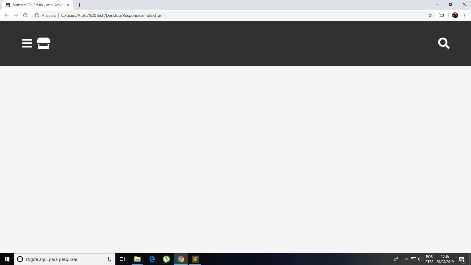
So, I need the icon that is on the side of the first, to be in the middle, in a way that is centralized also for the Mobile version.
Code:
   /* =============== RESET =============== */

* {
  font-family: 'Lato', sans-serif;
  box-sizing: border-box;
  text-decoration: none;
  font-weight: 300;
  font-size: 100%;
  outline: none;
  border: none;
  padding: 0;
  margin: 0;
}

body {
  background-color: #f5f5f5;
}

ul {
  list-style: none;
}

img {
  max-width: 100%;
}

i {
  color: white;
}


/* =============== HEADER =============== */

button i:hover {
  color: #D8D8D8;
}

.cabecalho {
  padding: 3% 4%;
  width: 100%;
  float: left;
  background: black;
  position: fixed;
  opacity: 0.8;
}

.menu {
  background: black;
  text-align: center;
  width: 56px;
  height: 56px;
  float: left;
  color: #fff;
  font-size: 1.8em;
}

.loja {
  background: black;
  color: white;
  text-align: center;
  width: 56px;
  height: 56px;
  font-size: 1.8em;
}

.pesquisar {
  background: black;
  float: right;
  color: white;
  text-align: center;
  width: 56px;
  height: 56px;
  font-size: 1.8em;
}
<!DOCTYPE html>
<html lang="PT-BR">
<head>
<meta charset="UTF-8">
<meta name="viewport" content="width=device-width, initial-scale=1">
<title>Alpha Tech - Eletrônica e Informática</title>
<link rel="shortcut icon" href="data/logos/favicon.png">
<meta name="keywords" content="alpha tech, loja, informatica, eletronica, conserto, reparo, tecnico">
<meta name="description" content="Faça seu orçamento! Consertamos Celulares, Tablet's, Notebook's, Monitores e muito mais! Vendemos também vários produtos relacionados a Eletrônica e Informática, entre em nossa loja virtual!">
<meta name="author" content="Vander Pires de Oliveira">
<meta name="copyright" content="Copyright © Alpha Tech">
<meta name="robots" content="index, follow">
<link rel="stylesheet" href="https://use.fontawesome.com/releases/v5.7.2/css/all.css" integrity="sha384-fnmOCqbTlWIlj8LyTjo7mOUStjsKC4pOpQbqyi7RrhN7udi9RwhKkMHpvLbHG9Sr" crossorigin="anonimous">
<link rel="stylesheet" href="_css/style.css">
<link href="https://fonts.googleapis.com/css?family=Lato" rel="stylesheet">
</head>
<body>
<header class="cabecalho">
<button class="menu">
<a href=""><i class="fas fa-bars fa-lg"></i></a>
</button>
<button class="loja">
<a href=""><i class="fas fa-store fa-lg"></i></a>
</button>
<button class="pesquisar">
<a href=""><i class="fas fa-search fa-lg"></i></a>
</button>
</header>
</body>
</html>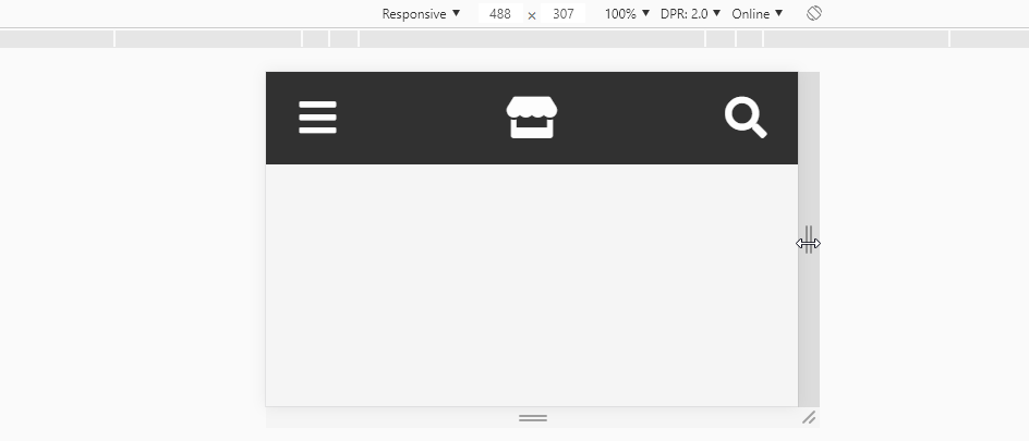
Thanks! It worked here the way you wanted it...
– zAllan
@zAllan without problems my dear!
– hugocsl