1
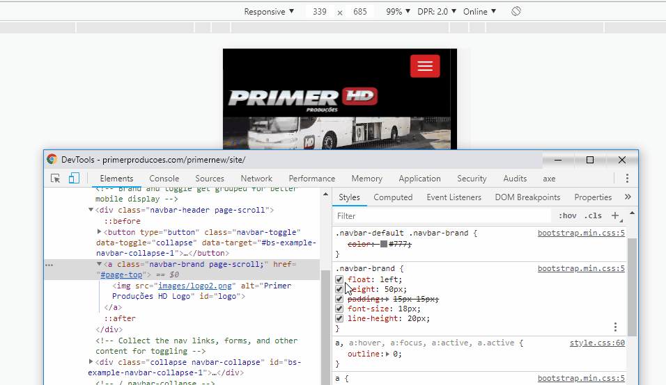
I am developing a site and I came across an error in which the logo is not displayed correctly when the site is opened on mobile, even in Responsive Design Mode Firefox it is displayed the way I wish, but when opening on the phone appears otherwise, instead of logo "drain" to the left of my navigation menu and stay at the top of the page, it gets below the navigation menu.
Follow the link so you can see the html: http://primerproducoes.com/primernew/site/
As it is on the cell phone: https://i.stack.Imgur.com/6twHm.jpg
The desired result would be this: https://i.stack.Imgur.com/fM7QN.png
I tried to change the width of the object that would be the most obvious to do but it does not change anything.
Thank you for your attention.
Actually this Boostrap came with the template I used, I’m having several problems with it, I have to read the documentation again more carefully. Thank you for the quick response :)
– Ronaldo Gueller
@Ronaldogueller has here the Navbar documentation of version 3 that I think you are using https://getbootstrap.com/docs/3./components/#navbar. Another thing is that unfortunately you can only give the answer as accepted for only one answer... But if you think it helped you can also use arrow keys to signal. Good luck in the project
– hugocsl