1
I have a div which contains some icons, which are aligned horizontally, but according to the size of the screen on which it is displayed a line break is generated, my goal is to prevent this from happening. even if icons are resized.
#share-buttons img {
    width: 75px;
    height: 75px;
    padding: 8px;
    border: 0;
    box-shadow: 0;
    display: inline;
    }
<!-- I got these buttons from simplesharebuttons.com -->
<div id="share-buttons">
<!-- Email -->
<a href="mailto:?Subject=Simple Share Buttons&Body=I%20saw%20this%20and%20thought%20of%20you!%20 https://cncharitas.org.br/">
<img src="https://i0.wp.com/simplesharebuttons.com/images/somacro/email.png?w=840&ssl=1" alt="Email" width="59" height="59">
</a>
<!-- Facebook -->
<a href="https://www.facebook.com/clubenavalcharitas/" target="_blank">
<img src="https://i1.wp.com/simplesharebuttons.com/images/somacro/facebook.png?w=840&ssl=1" alt="Facebook" width="59" height="59">
</a>
<!-- Google+ -->
<a href="https://plus.google.com/+ClubeNavalCharitasNiter%C3%B3i" target="_blank">
<img src="https://i1.wp.com/simplesharebuttons.com/images/somacro/google.png?w=840&ssl=1" alt="Google" width="59" height="59">
</a>
<!-- WhasApp-->
<a href="http://api.whatsapp.com/send?1=pt_BR&phone=5521971293327&text=entre%20em%20contato%20conosco" target="_blank">
<img src="https://i0.wp.com/cncharitas.org.br/wp-content/uploads/2019/02/whasapp.png?w=840&ssl=1" alt="WhatsApp" width="59" height="59">
</a>
<!-- intagram-->
<a href="https://www.instagram.com/cncharitas/" target="_blank">
<img src="https://i1.wp.com/cncharitas.org.br/wp-content/uploads/2019/02/intagram.png?w=840&ssl=1" alt="instagram" width="59" height="59">
</a>
</div>When the screen is small I get this result.
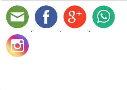
And I’d like something like:
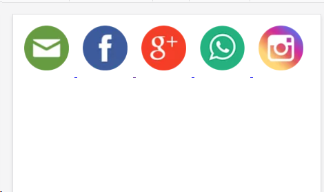
Icons have been reduced to suit the screen in question. This is possible?
A tip from... Watch out for the young vw, vw is not relative to the parent, it is relative to the screen, if the guy has a 42pol monitor this can get out of control and become extremely disproportionate to the other elements...
– hugocsl
Yes @hugocsl, had already put in the answer that "the
vwconsidering the maximum value of the width of the screen (disregarding the container size)", can decrease the size with media query– Costamilam