Column not floating beside

Asked

Viewed 56 times

0

I need the columns to float next to each other inside a card. For this I set the first column to occupy 8 spaces and the second 4.

col-8 e col-4 

But they’re not floating next to each other.

I need the following behavior. Como esta

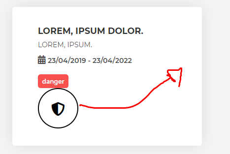
But even the first being col-8 and the second col-4 it does not float beside, I have tried to decrease the values and even then without success. The only external css I am applying is relative to the sources.

    <div class="container">
  <div class="row">
    <div class="col-md-4">
      <div class="cards text-nowrap">
        <div class="col-8">
          <p>Lorem, ipsum dolor.</p>
          <p>Lorem, ipsum.</p>
          <i class="fas fa-calendar-alt"></i>
          <p>23/04/2019 - 23/04/2022</p><br>
          <button class="btn-danger mt-3">danger</button>
        </div>
        <div class="col-4">
          <div class="circle">
            <i class="fas fa-shield-alt"></i>
          </div>
        </div>
      </div>
    </div>
  </div>
</div>

1 answer

3


It’s not working for a COL must be the daughter of a ROW

In a grid layout, content must be placed Within columns and only columns may be immediate Children of rows.

PORTUGUÊS: "In a layout of grid, the content must be placed within columns and only columns may be immediate children of rows."

All COL must be the daughter of a ROW, then just put a ROW outside of COL that your grid will work as expected.

<link rel="stylesheet" type="text/css" media="screen" href="https://stackpath.bootstrapcdn.com/bootstrap/4.2.1/css/bootstrap.min.css" />
<link rel="stylesheet" type="text/css" media="screen" href="https://use.fontawesome.com/releases/v5.7.1/css/all.css" />


  <div class="container">
    <div class="row">
      <div class="col-md-4">
        <div class="cards text-nowrap">
          <div class="row">
            <div class="col-8">
              <p>Lorem, ipsum dolor.</p>
              <p>Lorem, ipsum.</p>
              <i class="fas fa-calendar-alt"></i>
              <p>23/04/2019 - 23/04/2022</p><br>
              <button class="btn-danger mt-3">danger</button>
            </div>
            <div class="col-4">
              <div class="circle">
                <i class="fas fa-shield-alt"></i>
              </div>
            </div>
          </div>
        </div>
      </div>
    </div>
  </div>

Tip: Young you need to stop 30 min to study the BS Grid, will help you a lot! https://getbootstrap.com/docs/4.0/layout/grid/#how-it-Works

Browser other questions tagged

You are not signed in. Login or sign up in order to post.