Responsive card

Asked

Viewed 753 times

2

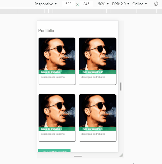
I’m trying to create responsive cards, I lined up the card elements using % but when I change the page ratio the elements are misaligned.
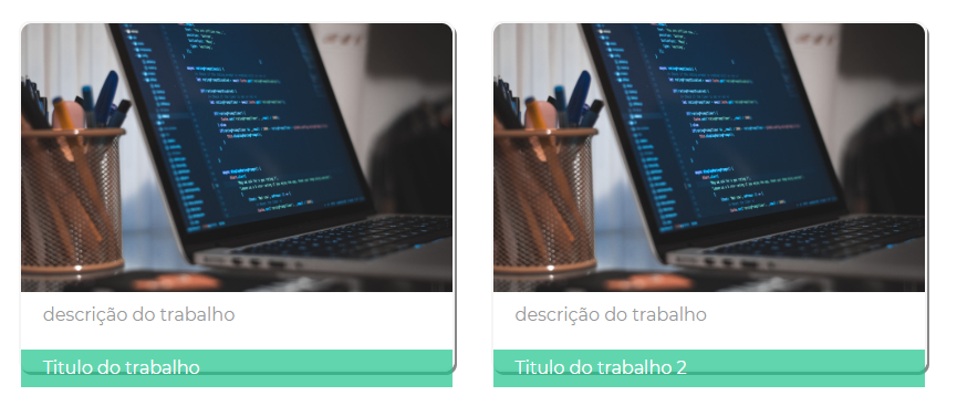
standard page size inserir a descrição da imagem aqui

reduced-screen inserir a descrição da imagem aqui

html

<section class="main-content-section">
            <h3>Portifólio</h3>
            <div class="row">
                <div class="col-2">
                    <article class="recent-works-card">
                        <a class="img-link" href="img/works.jpg"><img src="img/works.jpg" alt="Trabalhos" width="440px"></a>
                        <div class="ul-icons">
                            <i class="fab fa-github"></i>
                        </div>
                        <p class="recent-works-card-title">Titulo do trabalho</p>
                        <p class="recent-works-card-content"> descrição do trabalho</p>
                     </article>
                    </div>

                <div class="col-2">
                    <article class="recent-works-card">
                        <a class="img-link" href="img/works.jpg"><img src="img/works.jpg" alt="Trabalhos" width="440px"></a>
                         <div class="ul-icons">
                            <i class="fab fa-github"></i>
                        </div>
                        <p class="recent-works-card-title">Titulo do trabalho 2</p>
                        <p class="recent-works-card-content"> descrição do trabalho</p>
                    </article>
                </div>
            </div>

            <div class="row">
                <div class="col-2">
                    <article class="recent-works-card">
                        <a class="img-link" href="img/works.jpg"><img src="img/works.jpg" alt="Trabalhos" width="440px"></a>
                         <div class="ul-icons">
                            <i class="fab fa-github"></i>
                        </div>
                        <p class="recent-works-card-title">Titulo do trabalho 3</p>
                        <p class="recent-works-card-content"> descrição do trabalho</p>
                      </article>
                    </div>

                <div class="col-2">
                    <article class="recent-works-card">
                        <a class="img-link" href="img/works.jpg"><img src="img/works.jpg" alt="Trabalhos" width="440px"></a>
                         <div class="ul-icons">
                            <i class="fab fa-github"></i>
                        </div>
                        <p class="recent-works-card-title">Titulo do trabalho 4</p>
                        <p class="recent-works-card-content"> descrição do trabalho</p>
                    </article>
                </div>
            </div>

            <a href="#" title="veja mais" class="button-default">Veja o portifolio completo</a>

        </section>

CSS

body{
    font-family: 'Montserrat', sans-serif;
    color:#999;

}
hr{
   border-color: #f8f8f8;
    box-shadow: 1px 1px  #ededed;
}
h1, h2, h3, h4, h5, h6{
    color:#787878;
    font-weight: normal;
    margin: 0 0 1em;
}
h1{
    font-size: 36px;
}
h2{
    font-size: 30px;
}

h3{
    font-size: 26px;
}

h4{
    font-size: 22px;
}

a{
    transition: color .2 linear;
    text-decoration: none;
    color: #49bf9d;
    border-bottom: 1px dotted;
}

a:hover{
    border-bottom-color: transparent;
}

p{
    margin: 0 0 2em;
}
img{
    overflow: auto;
}
.ul-icons li{
    font-size: 35px;

    list-style-type: none;
    display: inline-block;
}
.ul-icons a{
    color:#999;
    border: none;
}
.ul-icons a:hover{
    color:#ccc;
}

table{
   width: 100%;
   margin: 2em 0 1em 0;
   border-collapse: collapse;
   text-align: left;
}
table td{
    padding: .75em;
}
table th{
    background: #ccc;
    padding: .75em;
}
.table tbody tr td{
    border-bottom: 1px solid #ccc;
}
.table tbody tr:first-child td{
    border-top:2px solid #666;

}

.table tbody tr:last-child td{
    border-bottom:2px solid #666;

}
.table tbody tr:nth-child(odd) td{
    background-color: #eee;
}

.row input, label, textarea, select{
    display: inline-block;
    width: 100%;
    box-sizing: border-box;

}
textarea{
    height: 10em;
}
input, textarea, select{
    border: none;
    background-color: #eaeaea;
    border-radius: 5px;
    padding: 15px;
    margin-bottom: 15px;
    border: 2px solid transparent;
}
input:focus, textarea:focus, select:focus{
    border: 2px solid #49bf9d;
    outline: none;

}
.footer-author{
    color: #49bf9d;
}
.button-default{
    background-color: #49bf9d;
    border: 2px solid #49bf9d;
    color: white;
    padding: .75em 1.5em;
    border-radius: 5px;
    font-size: .9em;
}

.button-empty{
    background-color: white;
    border: 2px solid #efefef;
    color: inherit;
    padding: .75em 1.5em;
    border-radius: 5px;
    font-size: .9em;
}

.button-empty:hover{
    color:#49bf9d;
    border: 2px solid #49bf9d;
    transition: .5s;
}
.img-perfil{
    border-radius:50%;
}
.img-link{
    border: none;
}


.main-nav{
    position: fixed;
    top:0;
    left: 0;
    height: 100%;
    width: 35%;
    padding: 124px 54px 72px; 
    box-sizing: border-box;
    background-image: url(../img/backg.jpg);
    background-repeat: no-repeat;
    background-position: right top;
    background-size: auto, cover;
    text-align: right;
}

.main-nav a{
    text-decoration: none;
    font-size:24px;
    color:#999;
    line-height: 1.5;
    transition: color .2s linear;
    border-bottom: none;

}

.main-nav a:hover{
    color: #49bf9d;
}
.main-nav ul{
    list-style-type: none;
}
.main-header{
    position: fixed;
    top:0;
    left: 0;
    height: 100%;
    width: 35%;
    padding: 124px 54px 72px; 
    box-sizing: border-box;
    background-image: url(../img/backg.jpg);
    background-repeat: no-repeat;
    background-position: right top;
    background-size: auto, cover;
    text-align: right;

}

.main-header-title{
    font-size:24px;
    line-height: 1.5;
    font-weight: normal;
    color: rgba(2555, 255, 255, .5);

}

.main-header-title strong{
    color: white;
    font-weight: normal;
}
.main-content{
    width: 65%;
    margin-left: 35%;
    padding: 124px 54px 72px; 
    box-sizing: border-box;
}
.main-content-section{
    padding-bottom: 100px;
    margin-top: 50px;
}
footer
{
   position: fixed;
    bottom: 0;
    left: 0;
    width: 28%;
    height: 18%;
    text-align: right;
    padding: 124px 54px 72px;
}
footer p{
    display: inline-block;
}

.recent-works-card .ul-icons .fa-github{
  font-size: 80px;
  top:35%;
  left:40%; 
  position: absolute;
  color: transparent;
}
.recent-works-card .ul-icons .fa-github:hover{
    transition: .8s;
    color: rgba(30, 197, 140, 0.7);
}

.recent-works-card{
    border: 2px solid #f5f5f5;
    margin-bottom:60px;
    box-shadow: 2px 3px #888888;
    position: relative;
    border-radius: 10px;

}
.recent-works-card:hover{
    transition: .5s;
    opacity: 0.7;
    color:inherit;
}
.recent-works-card img{
     width: 100%;
     overflow:auto;
     border-top-left-radius: 10px;
     border-top-right-radius: 10px;
}
.recent-works-card p{
    padding: 2% 5%;
}
.recent-works-card-title{
    width: 90%;
    top:295px;
    position: absolute;
    background-color: rgba(30, 197, 140, 0.7);
    color:white;

}
.team-card{
    text-align: center;

}
.team-card p{
    margin-bottom:15px;
}
.team-card-title{
    font-size: 24px;
    color:#787878;
}
.team-card img{
   max-width: 100%;
   overflow:auto;
   margin-bottom: 10px;
}

/* Grid */ 
.row{
    overflow:auto;
}
.col-2{
    width: 47.5%;
    float: left;
}
.col-2:first-child{
    margin-right: 2%;
}
.col-2:last-child{
    margin-left: 2%;
}
.col-2-3{
    width: 65%;
    float: left;
}
.col-1-3{
    margin-left:3%;
    width: 32%;
    float: left;
}
  • no, I created my own layout

  • You are using Bootstrap or another framework?

  • I’m not using any framework

  • should look similar to the first image, the markup icon is a github icon that is displayed only when the mouse is on the card

  • Have you tried trading these padding values in % for PX value to see if you can fix it? padding: 2%5%; put values in px that can sr that solves, but the fact is that your CSS is very confused... I believe is not the best way to put together this layout as a whole

  • Where are the ROW and COL-2 css classes? The card will have a set height or each card has a height?

  • added to classes in code

  • The error is in putting a fixed top on the recent-Works-card-title. The right would be to place this class inside the photo div and give a bottom: 0;, so this green box would always be below the photo, regardless of the image size

Show 3 more comments

1 answer

1


Dude I made a few simple adjustments to your code, but the main thing is that instead of giving a top:290px I put a margint-top negativo in the element. This is not the best practice, actually there are some details that I would change in this CSS as a whole, what I did was something to solve the current problem, but the best is when you have a time refactoring this CSS from card all... I took the padding % and went to px, I didn’t see much reason to use in px in this case.

inserir a descrição da imagem aqui

Follow the image code above.

body {
  font-family: 'Montserrat', sans-serif;
  color: #999;

}

hr {
  border-color: #f8f8f8;
  box-shadow: 1px 1px #ededed;
}

h1,
h2,
h3,
h4,
h5,
h6 {
  color: #787878;
  font-weight: normal;
  margin: 0 0 1em;
}

h1 {
  font-size: 36px;
}

h2 {
  font-size: 30px;
}

h3 {
  font-size: 26px;
}

h4 {
  font-size: 22px;
}

a {
  transition: color .2 linear;
  text-decoration: none;
  color: #49bf9d;
  border-bottom: 1px dotted;
}

a:hover {
  border-bottom-color: transparent;
}

p {
  margin: 0 0 2em;
}

img {
  overflow: auto;
}

.ul-icons li {
  font-size: 35px;

  list-style-type: none;
  display: inline-block;
}

.ul-icons a {
  color: #999;
  border: none;
}

.ul-icons a:hover {
  color: #ccc;
}

table {
  width: 100%;
  margin: 2em 0 1em 0;
  border-collapse: collapse;
  text-align: left;
}

table td {
  padding: .75em;
}

table th {
  background: #ccc;
  padding: .75em;
}

.table tbody tr td {
  border-bottom: 1px solid #ccc;
}

.table tbody tr:first-child td {
  border-top: 2px solid #666;

}

.table tbody tr:last-child td {
  border-bottom: 2px solid #666;

}

.table tbody tr:nth-child(odd) td {
  background-color: #eee;
}

.row input,
label,
textarea,
select {
  display: inline-block;
  width: 100%;
  box-sizing: border-box;

}

textarea {
  height: 10em;
}

input,
textarea,
select {
  border: none;
  background-color: #eaeaea;
  border-radius: 5px;
  padding: 15px;
  margin-bottom: 15px;
  border: 2px solid transparent;
}

input:focus,
textarea:focus,
select:focus {
  border: 2px solid #49bf9d;
  outline: none;

}

.footer-author {
  color: #49bf9d;
}

.button-default {
  background-color: #49bf9d;
  border: 2px solid #49bf9d;
  color: white;
  padding: .75em 1.5em;
  border-radius: 5px;
  font-size: .9em;
}

.button-empty {
  background-color: white;
  border: 2px solid #efefef;
  color: inherit;
  padding: .75em 1.5em;
  border-radius: 5px;
  font-size: .9em;
}

.button-empty:hover {
  color: #49bf9d;
  border: 2px solid #49bf9d;
  transition: .5s;
}

.img-perfil {
  border-radius: 50%;
}

.img-link {
  border: none;
}


.main-nav {
  position: fixed;
  top: 0;
  left: 0;
  height: 100%;
  width: 35%;
  padding: 124px 54px 72px;
  box-sizing: border-box;
  background-image: url(../img/backg.jpg);
  background-repeat: no-repeat;
  background-position: right top;
  background-size: auto, cover;
  text-align: right;
}

.main-nav a {
  text-decoration: none;
  font-size: 24px;
  color: #999;
  line-height: 1.5;
  transition: color .2s linear;
  border-bottom: none;

}

.main-nav a:hover {
  color: #49bf9d;
}

.main-nav ul {
  list-style-type: none;
}

.main-header {
  position: fixed;
  top: 0;
  left: 0;
  height: 100%;
  width: 35%;
  padding: 124px 54px 72px;
  box-sizing: border-box;
  background-image: url(../img/backg.jpg);
  background-repeat: no-repeat;
  background-position: right top;
  background-size: auto, cover;
  text-align: right;

}

.main-header-title {
  font-size: 24px;
  line-height: 1.5;
  font-weight: normal;
  color: rgba(2555, 255, 255, .5);

}

.main-header-title strong {
  color: white;
  font-weight: normal;
}

.main-content {
  width: 65%;
  margin-left: 35%;
  padding: 124px 54px 72px;
  box-sizing: border-box;
}

.main-content-section {
  padding-bottom: 100px;
  margin-top: 50px;
}

footer {
  position: fixed;
  bottom: 0;
  left: 0;
  width: 28%;
  height: 18%;
  text-align: right;
  padding: 124px 54px 72px;
}

footer p {
  display: inline-block;
}

.recent-works-card .ul-icons .fa-github {
  font-size: 80px;
  top: 35%;
  left: 40%;
  position: absolute;
  color: transparent;
}

.recent-works-card .ul-icons .fa-github:hover {
  transition: .8s;
  color: rgba(30, 197, 140, 0.7);
}

.recent-works-card {
  border: 2px solid #f5f5f5;
  margin-bottom: 60px;
  box-shadow: 2px 3px #888888;
  position: relative;
  border-radius: 10px;

}

.recent-works-card:hover {
  transition: .5s;
  opacity: 0.7;
  color: inherit;
}

.recent-works-card img {
  width: 100%;
  overflow: auto;
  border-top-left-radius: 10px;
  border-top-right-radius: 10px;
}

.recent-works-card p {
  padding: 5px 15px;
}

.recent-works-card-title {
  width: 100%;
  /* top:295px; */
  margin-top: -32px;
  box-sizing: border-box;
  position: absolute;
  background-color: rgba(30, 197, 140, 0.7);
  color: white;

}

.team-card {
  text-align: center;

}

.team-card p {
  margin-bottom: 15px;
}

.team-card-title {
  font-size: 24px;
  color: #787878;
}

.team-card img {
  max-width: 100%;
  overflow: auto;
  margin-bottom: 10px;
}

/* Grid */
.row {
  overflow: auto;
}

.col-2 {
  width: 47.5%;
  float: left;
}

.col-2:first-child {
  margin-right: 2%;
}

.col-2:last-child {
  margin-left: 2%;
}

.col-2-3 {
  width: 65%;
  float: left;
}

.col-1-3 {
  margin-left: 3%;
  width: 32%;
  float: left;
}
<section class="main-content-section">
  <h3>Portifólio</h3>
  <div class="row">
      <div class="col-2">
          <article class="recent-works-card">
              <a class="img-link" href="#"><img src="https://placecage.com/100/100" alt="Trabalhos" width="440px"></a>
              <div class="ul-icons">
                  <i class="fab fa-github"></i>
              </div>
              <p class="recent-works-card-title">Titulo do trabalho</p>
              <p class="recent-works-card-content"> descrição do trabalho</p>
            </article>
          </div>

      <div class="col-2">
          <article class="recent-works-card">
              <a class="img-link" href="#"><img src="https://placecage.com/100/100" alt="Trabalhos" width="440px"></a>
                <div class="ul-icons">
                  <i class="fab fa-github"></i>
              </div>
              <p class="recent-works-card-title">Titulo do trabalho 2</p>
              <p class="recent-works-card-content"> descrição do trabalho</p>
          </article>
      </div>
  </div>

  <div class="row">
      <div class="col-2">
          <article class="recent-works-card">
              <a class="img-link" href="#"><img src="https://placecage.com/100/100" alt="Trabalhos" width="440px"></a>
                <div class="ul-icons">
                  <i class="fab fa-github"></i>
              </div>
              <p class="recent-works-card-title">Titulo do trabalho 3</p>
              <p class="recent-works-card-content"> descrição do trabalho</p>
            </article>
          </div>

      <div class="col-2">
          <article class="recent-works-card">
              <a class="img-link" href="#"><img src="https://placecage.com/100/100" alt="Trabalhos" width="440px"></a>
                <div class="ul-icons">
                  <i class="fab fa-github"></i>
              </div>
              <p class="recent-works-card-title">Titulo do trabalho 4</p>
              <p class="recent-works-card-content"> descrição do trabalho</p>
          </article>
      </div>
  </div>

  <a href="#a mais" class="button-default">Veja o portifolio completo</a>

</section>

Browser other questions tagged

You are not signed in. Login or sign up in order to post.