2
I have a layout with a main div and inside it 2 Divs, each one being a column:
body{
   margin: 0;
}

#principal{
   display: flex;
   width: 80%;
   margin: 0 auto;
   position: relative;
}

#conteudo{
   width: calc(100% - 330px);
   height: 1500px;
   background-color: orange;
   margin-right: 30px;
}

#lateral{
   position: relative;
   width: 300px;
   height: 1100px;
   background-color: red;
   bottom: 0;
   right: 0;
}

#lateral span{
   position: absolute;
   bottom: 0;
   left: 0;
}
<div id="principal">
<div id="conteudo">
conteúdo
</div>
<div id="lateral">
coluna lateral
<span>fim da coluna lateral</span>
</div>
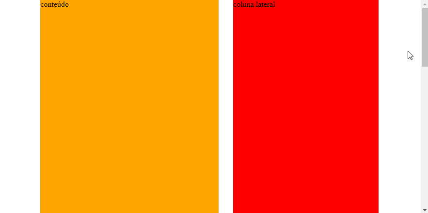
</div>When scrolling down, note that the div to the right (red) is smaller than the div to the left (orange).
The goal is for the red column to follow the scroll of the page normally, but when its end (bottom edge), once it enters the browser window area, it stops scrolling next to the window and becomes fixed (same behavior of Facebook’s right side column on desktop); and when scrolling the document back up, it goes back to normal by following the window scroll again.
I even managed to make programmatic logic with Javascript, but the problem is that by changing the property position from the div to fixed, she runs away from the main div, because the value fixed is related to the body, and not to its container, distorting the layout.
Behold:
window.onscroll = function(){

   // posição do scroll
   var scrol = window.pageYOffset;

   // altura do documento
   var w_alt = window.innerHeight;

   // pega a lateral
   var lat = document.getElementById("lateral");

   // altura coluna lateral
   var l_alt = lat.clientHeight;

   // se o valor do scroll for maior do que a diferença
   // da altura da lateral pela altura da janela
   if(scrol > l_alt - w_alt){

      // torna a lateral fixa
      lat.style.position = "fixed";

   }else{

      // volta para relative
      lat.style.position = "relative";

   }

}
body{
margin: 0;
}
#principal{
display: flex;
width: 80%;
margin: 0 auto;
position: relative;
}
#conteudo{
width: calc(100% - 330px);
height: 1500px;
background-color: orange;
margin-right: 30px;
}
#lateral{
position: relative;
width: 300px;
height: 1100px;
background-color: red;
bottom: 0;
right: 0;
}
#lateral span{
position: absolute;
bottom: 0;
left: 0;
}<div id="principal">
<div id="conteudo">
conteúdo
</div>
<div id="lateral">
coluna lateral
<span>fim da coluna lateral</span>
</div>
</div>How could I get this div fixed the way up but not get out of position inside the div #principal, that it simply stayed fixed when the scroll reached its height?
Note: must be in pure Javascript.
What browser support? Has to work in explorer? and edge mobile?
– Anderson Henrique
Hi @Andersonhenrique! No problem with support. Working on Chrome is already great.
– Sam