6
I saw this text template and I thought it was pretty cool, so I tried to replicate it and it didn’t work out so well... In fact I even managed to put a gradient that pleases me inside the text, but I could not do this color shading effect in the background.

I tried to use text-shadow: 0 0 40px red; in the text, but when I do shadow is above the text! Also it is of one color only. Note that in the reference image this shadow is multi-colored.
How can I get around this problem and get a multicolored shadow like the image? How do I get this gradient at the bottom of the text?
Follow the code with what I have so far.
html, body {
    width: 100%;
    height: 100%;
    margin: 0;
    padding: 0;
    background-color: rgb(31, 32, 34);
}

h1 {
  font-family: sans-serif;
  text-align: center;
  font-size: 20vw;
  width: 100%;
  margin: auto;
  position: relative;
  z-index: 2;
}
span {
  color: transparent;
  background-image: radial-gradient(#0ff 0%, #0f0 25%, #ff0 50%, #f0f, #00f 100%);
  -webkit-background-clip: text;
  -webkit-text-fill-color: transparent;
  background-size: 115% 80%;
  background-position: top left;
}
span.x {
  text-shadow: 0 0 40px red;
}
<h1><span>2018</span></h1>
<h1><span class="x">2018</span></h1>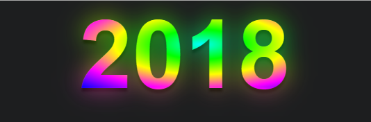
Good Ugo, I have that doubt too!
– RXSD
@Andréfilipe when we hit the eye seems simple, but when it comes to doing nothing of the right rss, the shadow seems to stay inside the text and not out, besides different from the box-shadow the text-shadow just to put a color... You have to be creative and have some technique to answer that...
– hugocsl
In the image you placed it seems that the text has the transparent background and the wrap that has the background with image or with the gradient, no?
– Laércio Lopes
@Laérciolopes may be that... But note that even if this is the case this shadow seems to follow the outline of the text, it is not a "square" shadow behind the text, it seems to follow the format of the text. If it is some other effect in the background I think valid tb, as long as it approaches the model, with the colored shadow in line with the text.
– hugocsl
@hugocsl In my view the background is responsible for the effect you are looking for, it applies a gradient mesh, this technique is relatively simple to build with SVG. An example can be found here: https://www.ls.graphics/meshgradients. Like this, I found an example: https://codepen.io/pieter-biesemans/pen/OQgBqV Anyway it would have to soften the gradient of the text and reduce the noise to have a very harmonic display with the background. An example with SVG for reference is this one I made: https://codepen.io/gferreiraa/pen/baOdzr
– Getulio Rafael Ferreira
@Getuliorafaelferreira very cool the gradient site. As they offer a version in Ai. it is very likely that one can export a same SVG. But I don’t know if that’s the case here. As I said, notice that the gradient of the shadow in the background seems to follow the outline of the text, as if it were a shadow, only with the colors of the gradient.... at the top I enter 2 and 0 da to notice better how the shadow accompanies the outline of the text. The technique I still don’t know what it was, only be that it’s not a square shade...
– hugocsl
@Getuliorafaelferreira I was able to solve with filter:Blur :D
– hugocsl
@Laérciolopes I was able to make a model using filter:Blur, if you are interested I left the details in the answer!
– hugocsl
@hugocsl Cool guy! I tried to reproduce my approach, I believe it can contribute somehow, my path was very close to what you used.
– Getulio Rafael Ferreira