Create dynamic menu that adjusts the size of the div

Asked

Viewed 187 times

2

Guys don’t know about css and would like to know how to create a menu that can have up to 5 options, so when I want to have only 4 options or 3 the menu width remains the same but div with the options fit the menu size, I will leave an example below

inserir a descrição da imagem aqui

inserir a descrição da imagem aqui the first menu (first image) has five options and size 100% of the user’s screen, I would like when necessary one or 2 of the options to disappear and the menu to continue 100% of the screen and the options to be larger to cover all the space that was empty as it was in the second menu (second image), and Sorry if it got a little complicated to understand...

<!DOCTYPE html>
<html lang="pt-br">

<head>
	<meta charset="UTF-8">
	<meta name="viewport" content="width=device-width, initial-scale=1.0">
	<meta http-equiv="X-UA-Compatible" content="ie=edge">
	<title>menu acesso rapido</title>
	<style>
		.grid-container {
			display: grid;
			grid-template-columns: 1fr 1fr 1fr 1fr 1fr;
			grid-template-rows: 90px;
			background-color: #005aa5;
			border-radius: 4px;
			color: #FFF;
			text-align: center;
		}
		.__row-menu{
			height: 80px;
			width: 2px;
		}
	</style>
</head>

<body>
	<div class="grid-container">
		<div class="__col-menu">
			<label>$
				<p>Transferencia</p>
			</label>
		</div>

		<div class="__col-menu">
			<label>$
				<p>Pagamento</p>
			</label>
		</div>

		<div class="__col-menu">
			<label>$
				<p>Consultas</p>
			</label>
		</div>

		<div class="__col-menu">
			<label>$
				<p>Gerenciamento</p>
			</label>
		</div>
		<div class="__col-menu">
			<label>$
				<p>Teste</p>
			</label>
		</div>
	</div>
</body>

</html>

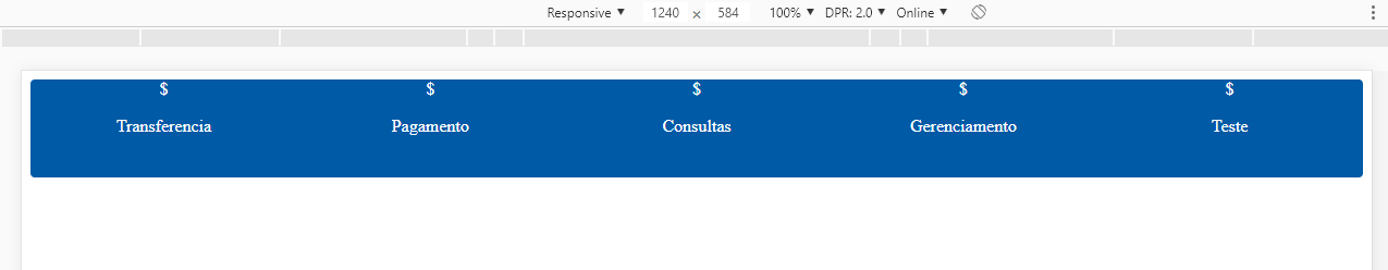
  • It was very clear friend, but edit your question and include what you have code, just so we know what is the best option for your case, since this can be done in several ways... Include your CSS and HTML in the question, even if it isn’t working as expected

2 answers

3


Like you’re wearing it Grid Layout my suggestion is to use a function of repeat (auto-fit, minmax) in the grid-template-columns and not fixed values of 1fr like you used to

inserir a descrição da imagem aqui

Here you can read more about the Flexible Grid: https://css-tricks.com/auto-sizing-columns-css-grid-auto-fill-vs-auto-fit/

But basically the rule repeat(auto-fit, minmax(100px, 1fr)) says the column grid will repeat itself repeat "infinitely" (for more or less items, as you may want to include some item and will have no problem), says that the item will automatically adjust the width to the container auto-fit and says that minmax each item will have in the mínimo 100px wide, and in the máximo 1fr, so we guarantee that everyone will have the same width, and that when it is less than 100px the item "falls" to the bottom line, but logically you can treat this by making the @media that needs...

Follow the code referring to the image above:

.grid-container {
  display: grid;
        grid-template-columns: repeat(auto-fit, minmax(100px, 1fr));
  grid-template-rows: 90px;
  background-color: #005aa5;
  border-radius: 4px;
  color: #FFF;
  text-align: center;
}
.__row-menu{
  height: 80px;
  width: 2px;
}
<div class="grid-container">
  <div class="__col-menu">
    <label>$
      <p>Transferencia</p>
    </label>
  </div>

  <div class="__col-menu">
    <label>$
      <p>Pagamento</p>
    </label>
  </div>

  <div class="__col-menu">
    <label>$
      <p>Consultas</p>
    </label>
  </div>

  <div class="__col-menu">
    <label>$
      <p>Gerenciamento</p>
    </label>
  </div>
  <div class="__col-menu">
    <label>$
      <p>Teste</p>
    </label>
  </div>
</div>

  • opa amigo, I have a doubt, like what you did there with the repeat, I would like to know if you have how to put this pattern <code>grid-template-Columns: 1fr 2px 1fr 2px 1fr;</code> using the repeat, will always be 1fr and dps a mini column between the current and the next column of the grid, has how to do this with repeat?

  • @Marcosnikito guy I understood what you want, would be like a "separator" between an item and another ne? Look I believe that using the grid is not the best solution for this, in your case the ideal would be a pseudo element in the item, or even a border-right ... If you get in doubt, it’s just open another question with the menu code that I help you do. But if you are going to open another question remember to mark some answer here as accepted by clicking on this icon below the arrows of the question you choose, you can only mark one as accepted unfortunately... Opening the new question tell me that I help you there. Abs

3

I wouldn’t use it grid for this solution, as the grid was created thinking of... well, grid. What you need is not to create a grid, but just to align the elements in the desired way. For this I prefer to use the flex, need only define display: flex in the menu item and flex-grow: 1 in menu items.

.grid-container {
  display: flex;
  background-color: #005aa5;
  border-radius: 4px;
  color: #FFF;
  text-align: center;
}
.__col-menu {
  height: 80px;
  width: 2px;
  flex-grow: 1;
  cursor: pointer;
}
.__col-menu:hover {
  font-weight: 800;
}
<div class="grid-container">
  <div class="__col-menu">
    <label>$
      <p>Transferencia</p>
    </label>
  </div>

  <div class="__col-menu">
    <label>$
      <p>Pagamento</p>
    </label>
  </div>

  <div class="__col-menu">
    <label>$
      <p>Consultas</p>
    </label>
  </div>

  <div class="__col-menu">
    <label>$
      <p>Gerenciamento</p>
    </label>
  </div>
  <div class="__col-menu">
    <label>$
      <p>Teste</p>
    </label>
  </div>
</div>

<hr>

<div class="grid-container">
  <div class="__col-menu">
    <label>$
      <p>Transferencia</p>
    </label>
  </div>

  <div class="__col-menu">
    <label>$
      <p>Pagamento</p>
    </label>
  </div>

  <div class="__col-menu">
    <label>$
      <p>Consultas</p>
    </label>
  </div>

  <div class="__col-menu">
    <label>$
      <p>Gerenciamento</p>
    </label>
  </div>
</div>

<hr>

<div class="grid-container">
  <div class="__col-menu">
    <label>$
      <p>Transferencia</p>
    </label>
  </div>

  <div class="__col-menu">
    <label>$
      <p>Pagamento</p>
    </label>
  </div>

  <div class="__col-menu">
    <label>$
      <p>Consultas</p>
    </label>
  </div>
</div>

<hr>

<div class="grid-container">
  <div class="__col-menu">
    <label>$
      <p>Transferencia</p>
    </label>
  </div>

  <div class="__col-menu">
    <label>$
      <p>Pagamento</p>
    </label>
  </div>
</div>

<hr>

<div class="grid-container">
  <div class="__col-menu">
    <label>$
      <p>Transferencia</p>
    </label>
  </div>
</div>

Browser other questions tagged

You are not signed in. Login or sign up in order to post.