How to make 7 columns with Bootstrap?

Asked

Viewed 800 times

3

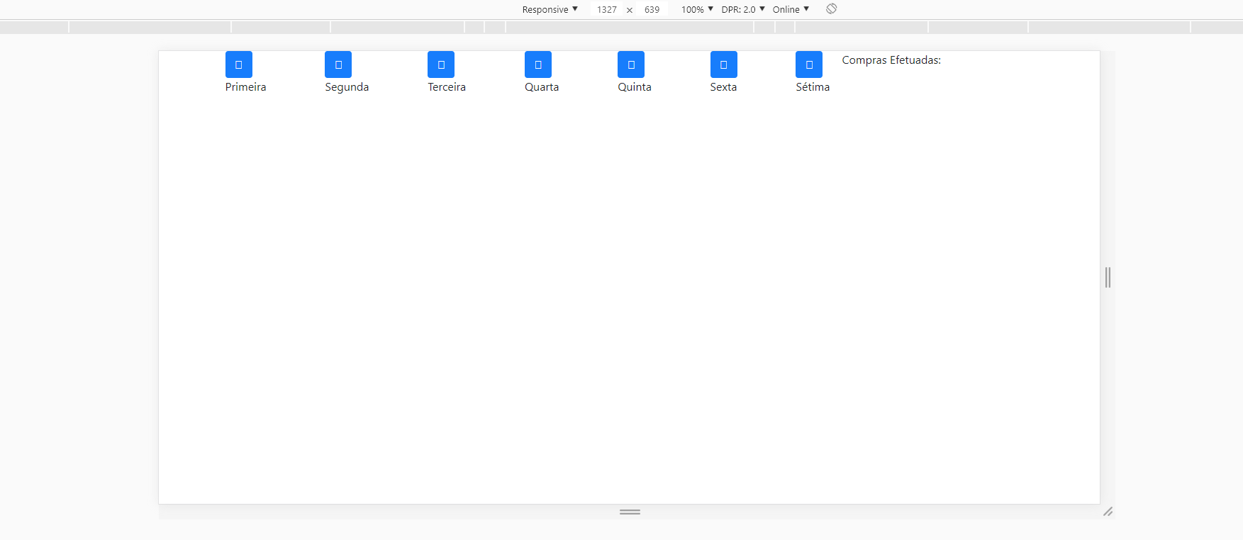
I have the following menu below:

inserir a descrição da imagem aqui

How I would make the columns stand next to each other (from the first to the seventh)?

I’m using Bootstrap 4. I tried with the code below, but there was this mess of kkkk photo

<div class="row">
        <div class="col-md-9" style="border-right: 2px solid #FFF">
          <div class="row">

        <div class="col-md-2">
          <a href="#" class="btn btn-primary btn-custom">
            <i class="fas fa-user-plus"></i>
          </a><br>
          Primeira coluna
        </div>
        <div class="col-md-2">
          <a href="#" class="btn btn-primary btn-custom">
            <i class="fas fa-user-plus"></i>
          </a><br>
        Segunda coluna
        </div>
        <div class="col-md-2">
          <a href="#" class="btn btn-primary btn-custom">
            <i class="fas fa-user-plus"></i>
          </a><br>
        Terceira Coluna
        </div>
        <div class="col-md-2">
          <a href="#" class="btn btn-primary btn-custom">
            <i class="fas fa-user-plus"></i>
          </a><br>
          Quarta Coluna
        </div>
        <div class="col-md-2">
          <a href="#" class="btn btn-primary btn-custom">
            <i class="fas fa-user-plus"></i>
          </a><br>
          Quinta Coluna
        </div>
        <div class="col-md-2">
          <a href="#" class="btn btn-primary btn-custom">
            <i class="fas fa-user-plus"></i>
          </a><br>
        Sexta Coluna
        </div>
        <div class="col-md-2">
          <a href="#" class="btn btn-primary btn-custom">
            <i class="fas fa-user-plus"></i>
          </a><br>
        Sétima Coluna
        </div>
  </div>
</div>
    <div class="col-md-3">
      <span>Compras Efetuadas:</span>
    </div>
</div>
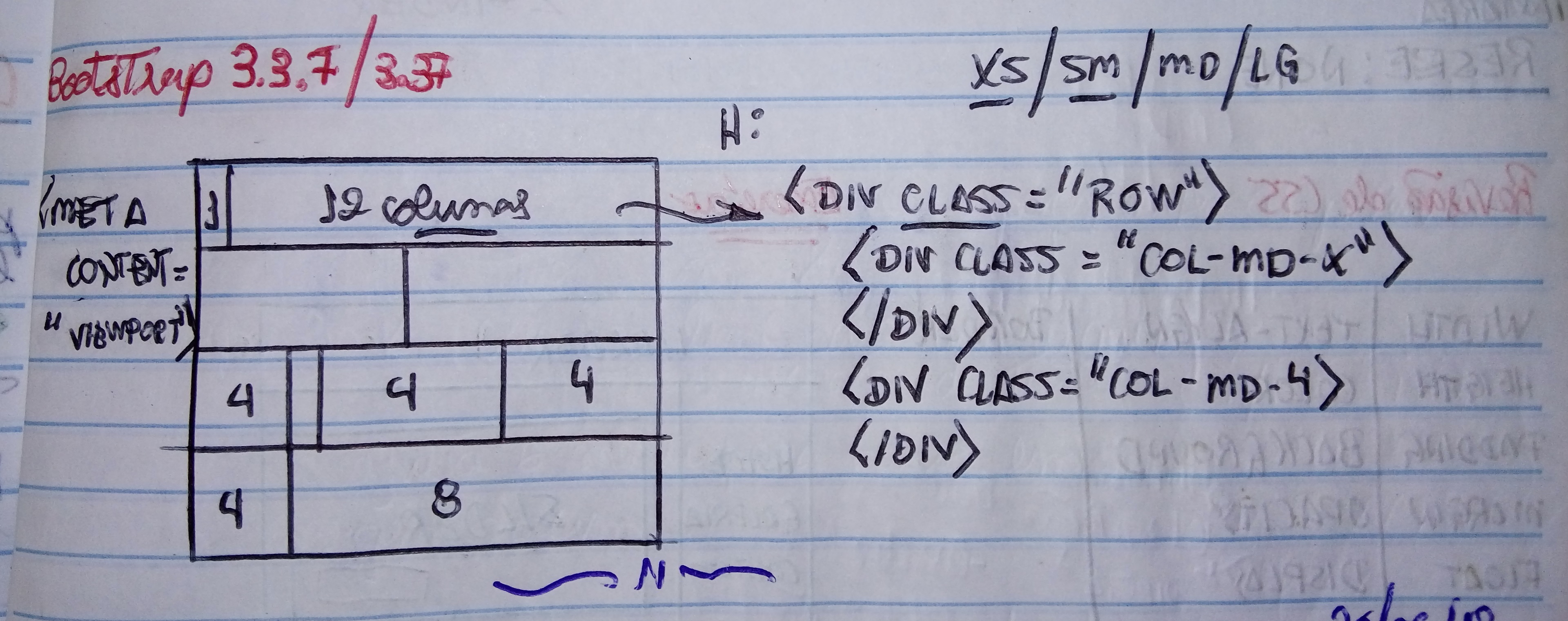
  • You can increase the size of your grid to one col-md-12 and assign all columns the size of col-md-2, one will fall down equal.

  • Hello William. Actually she is 09, because in the column that has 03 will be listed the purchases made.

4 answers

1

I was able to solve it this way:

CSS

@media (min-width: 768px){
  .seven-cols .col-md-1,
  .seven-cols .col-sm-1,
  .seven-cols .col-lg-1  {
    width: 100%;
    *width: 100%;
  }
}
@media (min-width: 992px) {
  .seven-cols .col-md-1,
  .seven-cols .col-sm-1,
  .seven-cols .col-lg-1 {
    width: 14.285714285714285714285714285714%;
    *width: 14.285714285714285714285714285714%;
    max-width: 14.285714285714285714285714285714% !important;
flex:none !important;
  }
}

@media (min-width: 1200px) {
  .seven-cols .col-md-1,
  .seven-cols .col-sm-1,
  .seven-cols .col-lg-1 {
    width: 14.285714285714285714285714285714%;
    *width: 14.285714285714285714285714285714%;
    max-width: 14.285714285714285714285714285714% !important;
flex:none !important;
  }
}

HTML

<div class="row seven-cols">
  <div class="col-md-1"></div>
  <div class="col-md-1"></div>
  <div class="col-md-1"></div>
  <div class="col-md-1"></div>
  <div class="col-md-1"></div>
  <div class="col-md-1"></div>
  <div class="col-md-1"></div>
</div>

Source of the code

1

@Fox.11. Analyzing your code, the Bootstrap framework allows you to create a maximum of 12 columns on a page, or even within a row (Row). They are not aligned, because adding up all the col-Md-x that you placed, you want to create 16 columns to position the 7 columns (blocks) in this container.


inserir a descrição da imagem aqui You can fix column numbering or in a simpler way, define an id for all these Divs that contain the col-Md-... class and in CSS make the following application:
Example:

#id_bloco{
  float: left;
  width: 14.2%; /*Seria a largura total 100% dividida por 7 colunas*/
}
<div id="id_bloco">BLOCO 1</div>
<div id="id_bloco">BLOCO 2</div>
<div id="id_bloco">BLOCO 3</div>
<div id="id_bloco">BLOCO 4</div>
<div id="id_bloco">BLOCO 5</div>
<div id="id_bloco">BLOCO 6</div>
<div id="id_bloco">BLOCO 7</div>

1

Next, the Bootstrap grid is based on flex, so automatically it will already split the divs in equal sizes, but for this you cannot explicitly define the value of these divs, then the first thing to do is remove the col-md-2 of divs within the row.

After that you will use these classes Flex original Bootstrap. These classes you will put in the row who is the father of 7 divs. And like I said at 7 divs you take the class col-md-2

justify-content-between: It will space the 7 divs also inside the container row
flex-lg-row: Up to canvases lg or 992px as div are next to each other
flex-column: On screens smaller than lg there’s gonna be a div per line
flex-nowrap: Does not leave the div fall to the bottom line even having a lot of content
(the div nuna will fall to the bottom line, what we will do to change the horizontal orientation, to vertical "column" when the screen is smaller than lg)

<div class="row justify-content-between flex-column flex-lg-row flex-nowrap"> 7 divs </div>

Official Flex Bootstrap documentation: https://getbootstrap.com/docs/4.1/utilities/flex/

inserir a descrição da imagem aqui

Follow the code referring to the image example above:
(Note that you have no CSS other than the original Bootstrap)

<link rel="stylesheet" type="text/css" media="screen" href="https://maxcdn.bootstrapcdn.com/bootstrap/4.0.0/css/bootstrap.min.css" />
  
<div class="container">
    <div class="row">
          <div class="col-md-9" style="border-right: 2px solid #FFF">
            <div class="row justify-content-between flex-column flex-lg-row flex-nowrap">
  
          <div class=" ">
            <a href="#" class="btn btn-primary btn-custom">
              <i class="fas fa-user-plus"></i>
            </a><br>
            Primeira coluna
          </div>
          <div class=" ">
            <a href="#" class="btn btn-primary btn-custom">
              <i class="fas fa-user-plus"></i>
            </a><br>
          Segunda coluna
          </div>
          <div class=" ">
            <a href="#" class="btn btn-primary btn-custom">
              <i class="fas fa-user-plus"></i>
            </a><br>
          Terceira Coluna
          </div>
          <div class=" ">
            <a href="#" class="btn btn-primary btn-custom">
              <i class="fas fa-user-plus"></i>
            </a><br>
            Quarta Coluna
          </div>
          <div class=" ">
            <a href="#" class="btn btn-primary btn-custom">
              <i class="fas fa-user-plus"></i>
            </a><br>
            Quinta Coluna
          </div>
          <div class=" ">
            <a href="#" class="btn btn-primary btn-custom">
              <i class="fas fa-user-plus"></i>
            </a><br>
          Sexta Coluna
          </div>
          <div class=" ">
            <a href="#" class="btn btn-primary btn-custom">
              <i class="fas fa-user-plus"></i>
            </a><br>
          Sétima Coluna
          </div>
    </div>
  </div>
      <div class="col-md-3">
        <span>Compras Efetuadas:</span>
      </div>
  </div>
</div>
  

1

There are two new concepts within Bootstrap 4. You can opt for the Flex Box concept or the traditional block concept.

My recommendation for the block you are following is that you try to think of the size of the columns as something that should fit the grid of 12 columns to go online.

.bloco {
display:flex;
align-items:center;
justify-content:center;
height:50px;
width:100%;
background-color:#ccc;
}
<link rel="stylesheet" href="https://maxcdn.bootstrapcdn.com/bootstrap/4.0.0/css/bootstrap.min.css" integrity="sha384-Gn5384xqQ1aoWXA+058RXPxPg6fy4IWvTNh0E263XmFcJlSAwiGgFAW/dAiS6JXm" crossorigin="anonymous">

<div class="container">
	<div class="row">
		<div class="col-xl-9 col-lg-9 col-md-9 col-sm-9 col-xs-9">
			<div class="row">
				<div class="col-1">
					<div class="bloco">1</div>
				</div>
				<div class="col-1">
					<div class="bloco">1</div>
				</div>
				<div class="col-1">
					<div class="bloco">1</div>
				</div>
				<div class="col-1">
					<div class="bloco">1</div>
				</div>
				<div class="col-1">
					<div class="bloco">1</div>
				</div>
				<div class="col-1">
					<div class="bloco">1</div>
				</div>
				<div class="col-1">
					<div class="bloco">1</div>
				</div>
			</div>
		</div>
		<div class="col-xl-3 col-lg-3 col-md-3 col-sm-3 col-xs-3">
			<!-- Espaço vazio -->
		</div>
	</div>
</div>

But I like the concept of Flex Box where you can play with the proportional spacings by Justify-content or align-items.

Browser other questions tagged

You are not signed in. Login or sign up in order to post.