3
I’d like to make a slide content with HTML and CSS, the slide that I need contains everything below the header. I will explain further...
Normally you use the menu to navigate through the pages, so by clicking this link the current page is redirected to another, but what I want is to have buttons on the main page and by clicking on them instead of redirecting the user to another page, simply scroll the content of the current page and display the content of the other page. In other words it would be like a slide of images, but with all the content of the page except the header.
I got a result similar to what I want using the following code:
.div {
display: none;
width: 0%;
height: 200px;
background-color: green;
}
.div:target {
display: block;
width: 100%;
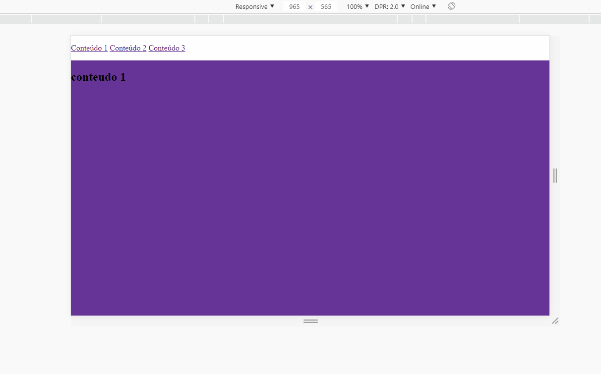
}<a href="#conteudo1">Conteúdo 1</a>
<a href="#conteudo2">Conteúdo 2</a>
<div id="conteudo1" class="conteudo">Conteudo da primeira div</div>
<div id="conteudo2" class="conteudo">Conteudo da segunda div</div>But this way I could not make the transition similar to a slide, "pushing" the current content to the left.
I wonder if I can use this code that way, or have some other better way to do it.
What is the function of this class
.div? By the way, the question is very vague. Ask the question also the structure of HTML/CSS that you have already assembled.– Sam
The Divs or Section will store all the content of the page, for example, the div 1 will have all the posts, the div 2 will have the contact form. I haven’t built any html structure yet, I’m still doing the tests to make it work.
– Emerson Matheus