Follow a flex model. Here’s a complete guide that can help you. https://css-tricks.com/snippets/css/a-guide-to-flexbox/
Display the code in full screen to see the responsiveness and how they behave. On screens smaller than 768px they get the bigger box above and the smaller ones below. On large screens they are side by side.
The values here are all in % so it’s very responsive, and the height of the container I left with 50vh, 50% of the height of body. But you can put a fixed value here in px if you want to leave the height always with a set size .container { height: 50vh; }
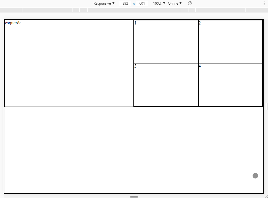
Follow the code referring to the image above:
OBS: I could have optimized the CSS more because some properties repeat a lot, but I prefer to leave it like this to facilitate understanding.
html, body {
    width: 100%;
    height: 100%;
    margin: 0;
    padding: 0;
}
* {
    box-sizing: border-box;
    border: 1px solid #000;
}
.container {
    width: 100%;
    height: 50vh;
    display: flex;
    justify-content: center;
    align-items: center;
}
.left {
    width: 50%;
    height: 100%;
    display: flex;
    justify-content: center;
    align-items: center;
}
.right {
    width: 50%;
    height: 100%;
    display: flex;
    justify-content: center;
    align-items: center;
    flex-wrap: wrap;
}
.box {
    width: 50%;
    height: 50%;
    display: flex;
    justify-content: center;
    align-items: center;
}
@media screen and (max-width:768px) {
.container {
    flex-direction: column;
}
}
.left, .right {
    width: 100%;
}
}
<div class="container">
    <div class="left">esquerda</div>
    <div class="right">
        <div class="box">1</div>
        <div class="box">2</div>
        <div class="box">3</div>
        <div class="box">4</div>
    </div>
</div>
With Float
Same layout above, but using Float. Just for teaching purposes so you can see what I’d look like using Float. Although I don’t recommend it, and it gets more complicated to align the internal elements at the center.
Display the code below
html, body {
    width: 100%;
    height: 100%;
    margin: 0;
    padding: 0;
}
* {
    box-sizing: border-box;
    border: 1px solid #000;
}
.container {
    width: 100%;
    height: 50vh;
}
.left {
    width: 50%;
    height: 100%;
    float: left;
}
.right {
    width: 50%;
    height: 100%;
    float: left;
}
.box {
    width: 50%;
    height: 50%;
    float: left;
}

@media screen and (max-width:768px) {
.left {
    width: 100%;
    height: 50%;
    float: left;
}
.right {
    width: 100%;
    height: 50%;
    float: left;
}
}
<div class="container">
    <div class="left">esquerda</div>
    <div class="right">
        <div class="box">1</div>
        <div class="box">2</div>
        <div class="box">3</div>
        <div class="box">4</div>
    </div>
</div>


First welcome, what have you tried to do?
– Alvaro Alves
Could you [Dit] the question and add your attempts as well as the result you got in each of them? Actually your question is almost a "do it for me," but I don’t think that’s what you want, is?
– Woss
Young even without seeing your code I tell you that the best solution for this is not with Float, because float is to adjust the flow of content, elements and text. To make layouts these days preferably for Flex and Grid or both Together if you need to.
– hugocsl
so I can’t float or Bootstrap
– Roney Berti
Can you do it... just don’t... I’ll make a simple example for you with Flex
– hugocsl
I expressed myself badly, I don’t really know how to do with float or bootstrap....
– Roney Berti
I edited my answer, put option with Flex and Float, the Float model do not recommend and will give you more work to align the contents in the center...
– hugocsl