Add the property -webkit-appearance: none; in his button to remove the default style of buttons from iOS:
.button{
   -webkit-appearance: none;
   padding: 15px 32px;
}
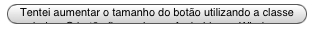
Before:
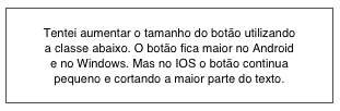
Afterward:
Now, so that the button does not have a white background appearing not to be a button, you can style it by adding a gradient background color, for example:
.button{
   -webkit-appearance: none;
   padding: 15px 32px;

   background: rgb(238,238,238); /* Old browsers */
   background: -moz-linear-gradient(top, rgba(238,238,238,1) 0%, rgba(204,204,204,1) 100%); /* FF3.6-15 */
   background: -webkit-linear-gradient(top, rgba(238,238,238,1) 0%,rgba(204,204,204,1) 100%); /* Chrome10-25,Safari5.1-6 */
   background: linear-gradient(to bottom, rgba(238,238,238,1) 0%,rgba(204,204,204,1) 100%); /* W3C, IE10+, FF16+, Chrome26+, Opera12+, Safari7+ */
   filter: progid:DXImageTransform.Microsoft.gradient( startColorstr='#eeeeee', endColorstr='#cccccc',GradientType=0 ); /* IE6-9 */
}
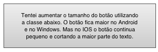
Will stay like this:
You can also use @media Rules so that the button only lose the default style from certain resolution, keeping the original style in desktop browsers. For example, up to a resolution of 768px, the style is applied to the button:
@media screen and (max-width: 768px){
   .button{
      -webkit-appearance: none;
      padding: 15px 32px;

      background: rgb(238,238,238); /* Old browsers */
      background: -moz-linear-gradient(top, rgba(238,238,238,1) 0%, rgba(204,204,204,1) 100%); /* FF3.6-15 */
      background: -webkit-linear-gradient(top, rgba(238,238,238,1) 0%,rgba(204,204,204,1) 100%); /* Chrome10-25,Safari5.1-6 */
      background: linear-gradient(to bottom, rgba(238,238,238,1) 0%,rgba(204,204,204,1) 100%); /* W3C, IE10+, FF16+, Chrome26+, Opera12+, Safari7+ */
      filter: progid:DXImageTransform.Microsoft.gradient( startColorstr='#eeeeee', endColorstr='#cccccc',GradientType=0 ); /* IE6-9 */
   }
}
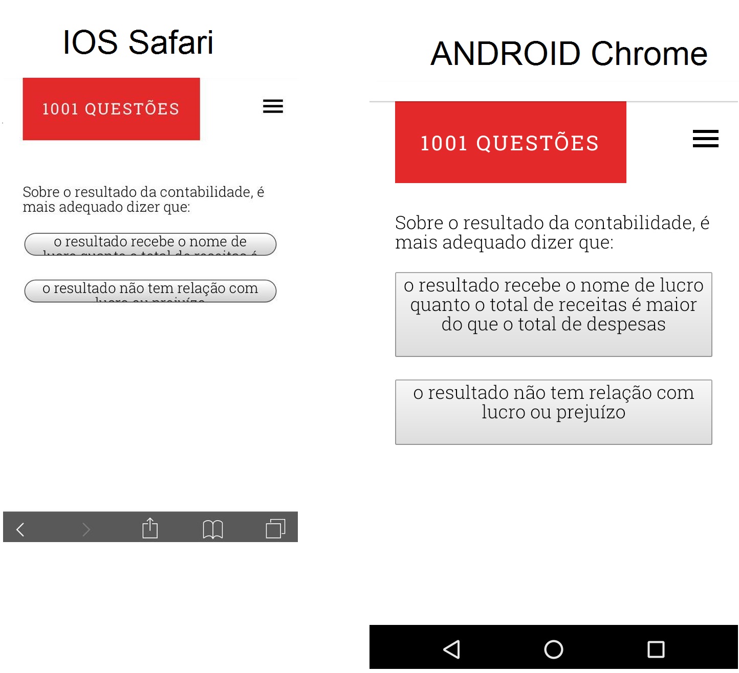
A suggestion is to always stylize your buttons (put background color, edges,
shadows etc.) and do not leave on account of the browser or OS, because each
a stylizes differently. This way you have more control over
look of the buttons matching the theme of your site.
Cool! Consider marking in the reply. As you’re new here, take a look at the page Tour. Abs!
– Sam