Put bar in Bootstrap menu

Asked

Viewed 621 times

2

I want to put a bar in the menu as example below:

Home | Instructor Course | Legal Advice

For this I am using the code below:

<div class="row">
        <nav class="navbar navbar-expand-lg navbar-light">
          <a class="navbar-brand" href="#">&nbsp;</a>
          <button class="navbar-toggler" type="button" data-toggle="collapse" data-target="#navbarNav" aria-controls="navbarNav" aria-expanded="false" aria-label="Toggle navigation">
            <span class="navbar-toggler-icon"></span>
          </button>
          <div class="collapse navbar-collapse" id="navbarNav">
            <ul class="navbar-nav">
              <li class="nav-item active">
                <a class="nav-link" href="#">Principal</a>
              </li>
              <li class="nav-item">
                <a class="nav-link" href="#">Curso de Instrutor</a>
              </li>
              <li class="nav-item">
                <a class="nav-link" href="#">Assessoria Jurídica</a>
              </li>
            </ul>
          </div>
        </nav>
      </div>

And in the CSS:

ul li
{
    display: inline;
}

li:before {
content: " | ";
}

li:first-child:before {
content: none;
}

Only it’s getting that way:
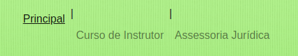
inserir a descrição da imagem aqui

How can I fix this?

2 answers

2


You can create the bar with a span for example and style it until you get the expected result:

.linha-vertical {
  border-left: 2px solid;
  box-sizing: border-box;
  margin: 10px 10px 0 10px;
  height: 20px;
}
<link rel="stylesheet" href="https://stackpath.bootstrapcdn.com/bootstrap/4.1.3/css/bootstrap.min.css">

<div class="row">
  <nav class="navbar navbar-expand-lg navbar-light">
    <a class="navbar-brand" href="#">&nbsp;</a>
    <button class="navbar-toggler" type="button" data-toggle="collapse" data-target="#navbarNav" aria-controls="navbarNav" aria-expanded="false" aria-label="Toggle navigation">
      <span class="navbar-toggler-icon"></span>
    </button>
    <div class="collapse navbar-collapse" id="navbarNav">
      <ul class="navbar-nav">
        <li class="nav-item active">
          <a class="nav-link" href="#">Principal</a>
        </li>
        <span class="linha-vertical"></span>
        <li class="nav-item">
          <a class="nav-link" href="#">Curso de Instrutor</a>
        </li>
        <span class="linha-vertical"></span>
        <li class="nav-item">
          <a class="nav-link" href="#">Assessoria Jurídica</a>
        </li>
      </ul>
    </div>
  </nav>
</div>

  • Olá Leandrade. Actually it would be like this: Home | Instructor Course | Legal Advice

  • But my example is like this, you tested it on whole page??

  • When I visualize your example here, it appears as that hamburger menu and I actually want one next to the other.

  • 1

    Guy pushes the button execute and whole page Which is more to the right, otherwise you won’t be able to see the result. Bootstrap automatically recognizes the width here of the site’s test window as mobile, then the menu gets the burger, click on the whole page that the code is doing what you want.

  • 1

    You are right Leandrade, I did not pay attention to that detail, I’m sorry for that. It worked! Thank you very much for the help.

0

<!DOCTYPE html>
<html lang="pt">
<head>
  <title>Bootstrap Example</title>
  <meta charset="utf-8">
  <meta name="viewport" content="width=device-width, initial-scale=1">
  <link rel="stylesheet" href="https://maxcdn.bootstrapcdn.com/bootstrap/4.1.3/css/bootstrap.min.css">
  <script src="https://ajax.googleapis.com/ajax/libs/jquery/3.3.1/jquery.min.js"></script>
  <script src="https://cdnjs.cloudflare.com/ajax/libs/popper.js/1.14.3/umd/popper.min.js"></script>
  <script src="https://maxcdn.bootstrapcdn.com/bootstrap/4.1.3/js/bootstrap.min.js"></script>
</head>
<body>

<nav class="navbar navbar-expand-sm bg-dark navbar-dark">
  
  <!-- Links -->
  <ul class="navbar-nav">
    <li class="nav-item">
      <a class="nav-link" href="#">Principal</a>
    </li>
    <li class="nav-item">
      <a class="nav-link" href="#">Curso de Instrutor</a>
    </li>
    <li class="nav-item">
      <a class="nav-link" href="#">Assessoria Jurídica</a>
    </li>
  </ul>
</nav>


</body>
</html>

  • Hello Wellington, I actually need to put a | among the menu items. Ex.: Home | Instructor Course | Legal Advice.

Browser other questions tagged

You are not signed in. Login or sign up in order to post.