side by side accordion effect

Asked

Viewed 120 times

1

I will have several accordions on the site, according to the categories, then I put them side by side, only when I click on one of the accordions, the ones that this side generates an undesirable spacing, I wanted to know how to solve this

inserir a descrição da imagem aqui

HTML

 <div class="seg-nt">
    <div class="caixa">
        <span class="open-nt">esportes</span>

        <div class="contentNT hide">
            01
        </div>
    </div>

    <div class="caixa">
        <span class="open-nt">politica</span>

        <div class="contentNT hide">
            02
        </div>
    </div>

    <div class="caixa">
        <span class="open-nt">policial</span>

        <div class="contentNT hide">
            03
        </div>
    </div>

CSS

.show{display: block;}
.hide{display: none;}
.seg-nt{
   padding: 00.80906148867314% 00.80906148867314%;
   width: 100%;
   overflow: hidden;
   box-sizing: border-box;
 }

.seg-nt .caixa{
   position: relative;
   float: left;
   margin: 0% 00.80906148867314% 00.80906148867314% 0%;
   padding: 00.80906148867314% 00.80906148867314%;
   width: 49.55555555555555%;
   border: 1px solid #e1e1e1;
   -webkit-border-radius: 3px;
   -moz-border-radius: 3px;
   border-radius: 3px;
}

.seg-nt .caixa:nth-child(-n+2){margin: 0% 00.80906148867314% 00.80906148867314% 0%;}
.seg-nt .caixa:nth-child(2n){margin: 0% 0% 00.80906148867314% 0%;}
.seg-nt .caixa:last-child{margin: 0%;}

.seg-nt .caixa span{
   position: relative;
   display: block;
   width: 100%;
   height: 30px;
   line-height: 30px;
   font-size: 1.3em;
   text-align: center;
   text-transform: uppercase;
   cursor: pointer;
}

.seg-nt .caixa .contentNT{
   float: left;
   height: 150px;
   border-top: 1px solid #e1e1e1;
   background-color: orange
}

JQUERY

$(function(){
  $('.open-nt').click(function(){
    var contentNT = $(this).parent().find('.contentNT');
        if(!contentNT.hasClass('show')){
        $('.caixa').find('.show').slideUp('fast', function(){
            $(this).addClass('hide').removeClass('show');
        });
        contentNT.slideDown('fast', function(){
            $(this).addClass('show').removeClass('hide');
        });
    }
});

});

  • 1

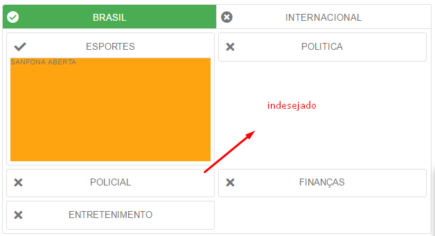
    And what would this unwanted space be? How do you want the behavior to be when one of them is open?

  • @hugocsl opa Ugo, I edited the image, when the sports accordion is open, the finance accordion would have to go up and fill that space, and so for all the accordions, whichever is open

  • Dude I tried to simulate your problem here but the question code is too far away from what’s in the image you posted... Are you using Bootstrap-like framewrok? Or is this "accordion" of yours some jQuery plug-in with extra CSS and everything in between?

  • opa Hugo, only has the jquery library in it, looks at the problem here https://jsfiddle.net/moya2018/Lhcz2e7p/14/

2 answers

2


Dude you can use column-count to do this, because then the browser "equalizes" the content distribution in two columns for example. Note that the browser will always try to equal the height of the two columns, so it will always play the content to where there is space left.

I don’t know if this is exactly the result you expect, but with css was the only way I found... I left a comment in css code

$(function(){
    $('.open-nt').click(function(){
        var contentNT = $(this).parent().find('.contentNT');
            if(!contentNT.hasClass('show')){
            $('.caixa').find('.show').slideUp('fast', function(){
                $(this).addClass('hide').removeClass('show');
            });
            contentNT.slideDown('fast', function(){
                $(this).addClass('show').removeClass('hide');
            });
        }
    });
});
.show{display: block;}
.hide{display: none;}
div{width: 100%;}
.seg-nt{
   padding: 00.80906148867314% 00.80906148867314%;
   width: 100%;
   overflow: hidden;
   box-sizing: border-box;
   border: 1px solid #e1e1e1;
 }

.seg-nt .caixa{
   position: relative;
   float: left;
   margin: 0% 00.80906148867314% 00.80906148867314% 0%;
   padding: 00.80906148867314% 00.80906148867314%;
   width: 325px;
   border: 1px solid #e1e1e1;
   -webkit-border-radius: 3px;
   -moz-border-radius: 3px;
   border-radius: 3px;
}

.seg-nt .caixa:nth-child(-n+2){margin: 0% 00.80906148867314% 00.80906148867314% 0%;}
.seg-nt .caixa:nth-child(2n){margin: 0% 0% 00.80906148867314% 0%;}
.seg-nt .caixa:last-child{margin: 0%;}

.seg-nt .caixa span{
   position: relative;
   display: block;
   width: 100%;
   height: 30px;
   line-height: 30px;
   font-size: 1.3em;
   text-align: center;
   text-transform: uppercase;
   cursor: pointer;
}

.seg-nt .caixa .contentNT{
   float: left;
   height: 150px;
   border-top: 1px solid #e1e1e1;
   background-color: orange
}
/* separa o conteúdo em 2 colunas */
.seg-nt {
  column-count: 2;
}
/* evita que o conteúdo da caixa se quebre começando em uma coluna e terminando na outra */
.caixa {
  -webkit-column-break-inside: avoid;
  page-break-inside: avoid;
  break-inside: avoid;
}
<script src="https://code.jquery.com/jquery-3.2.1.min.js"></script>

<div class="seg-nt">
    <div class="caixa">
        <span class="open-nt">esportes</span>

        <div class="contentNT hide">
            01
        </div>
    </div>

    <div class="caixa">
        <span class="open-nt">politica</span>

        <div class="contentNT hide">
            02
        </div>
    </div>

    <div class="caixa">
        <span class="open-nt">policial</span>

        <div class="contentNT hide">
            03
        </div>
    </div>
    <div class="caixa">
        <span class="open-nt">esportes</span>

        <div class="contentNT hide">
            01
        </div>
    </div>

    <div class="caixa">
        <span class="open-nt">politica</span>

        <div class="contentNT hide">
            02
        </div>
    </div>

    <div class="caixa">
        <span class="open-nt">policial</span>

        <div class="contentNT hide">
            03
        </div>
    </div>
</div><!--seg-nt-->

1

If you are using Bootstrap: add to

<objeto class="p-0 m-0"/>

if not using bootstrap: no add item

margin:0px !important;
padding: 0px !important;

the class used by the element. or

style="padding:0px !important; margin:0px !important;"

All items will only occupy the space in this room.

  • If that’s what you wanted, mark the answer as accepted

Browser other questions tagged

You are not signed in. Login or sign up in order to post.